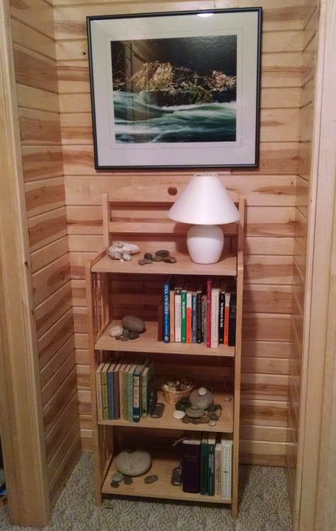
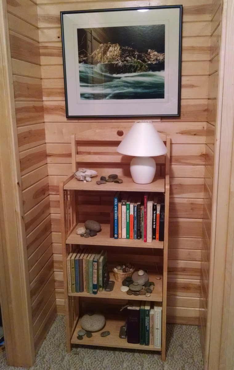
In our house, at the end of the hallway to the bedrooms there’s this funny little space that’s hard to use. It’s had this flat pack book shelf there for years but it’s time to do something different. The walls are paneled in birch car siding and we’d like to do something a little more rustic and yet keep a bit of a modern look to it. The other day my wife and I were talking about what to put in there.
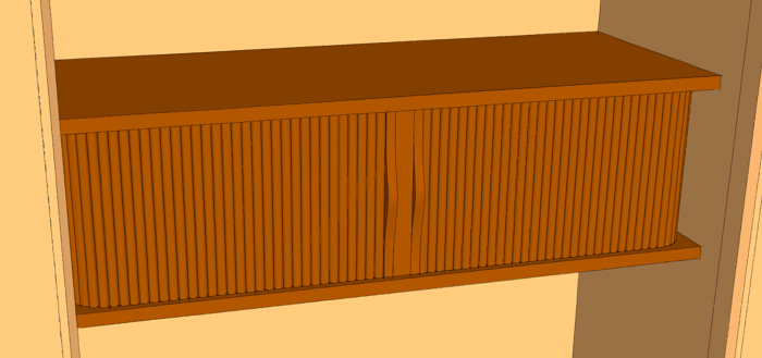
I’ve been thinking about a small wall-hanging piece that would run the full width of the hall. Since hinged doors wouldn’t be a great option, I’ve been trying to work out other good options. Sliding doors would be one option. When I asked my wife how she felt about tambour doors, she asked for a visual. I guess she’s figured out I’ve been using SketchUp long enough I should be able to show her a drawing instead of waving my hands about trying to describe it in words. So I was off to the computer.
I decided while I was at it, I should figure out the geometry of these tambours to see that they’d work as I hoped. No point in selling a design that won’t work anyway.
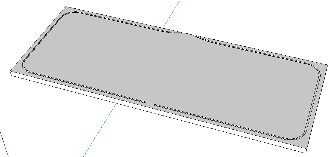
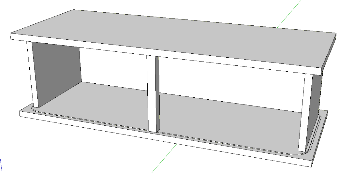
I didn’t want to spend a whole lot of time on this in case she nixed the idea so a quickie sketch was in order. After measuring the space I drew the bottom of the cabinet with trackes for the tambours to run in. This was done by first using Offset to get the straight portions set in a bit from the edges of the “board” followed by drawing some arcs for the corners and the entry into the track.
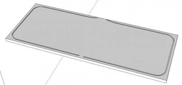
I also drew the rest of the case very simply. Of course the bottom was made as a component which was copied up and then flipped along the component’s blue direction. The sides, center divider and the back are simple rectangles extruded up to fit the space between the top and bottom.

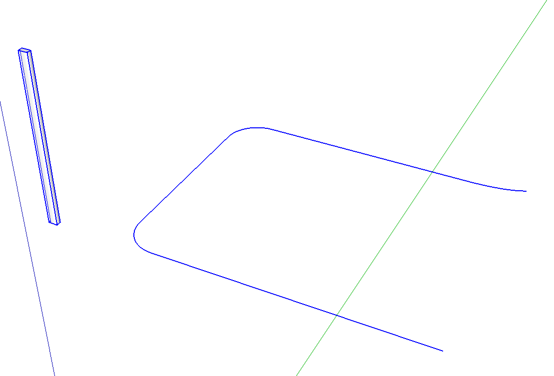
The next trick is to put the tambours in. I figured the Path Copy plugin would be handy for this. First, though, I needed a slat component and I needed a path to copy it along. To get the path, I opened the bottom component for editing and selected the bottom edge of the groove. This was copied to the clipboard. Then closed and hid the bottom and used Edit>Paste in place to create the path.
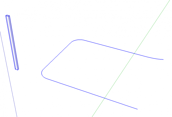
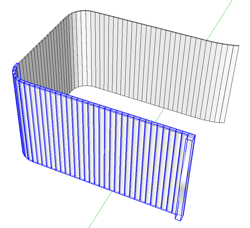
That’s really all the set up you need for the plugin. Start the tool and follow the on-screen prompts. Select the path and then the component. The measurements box will show the spacing which by default is 10′ or 120″. Since my slats are drawn at 1/2 in. wide, I typed 1/2 and hit enter to reduce the spacing.
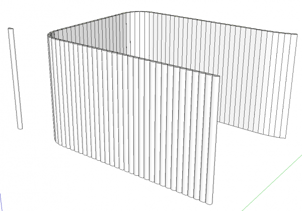
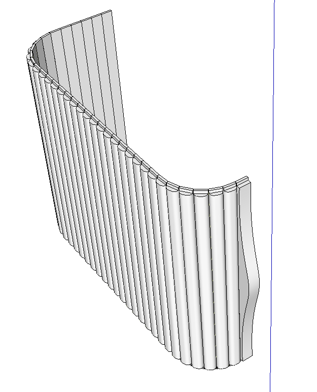
In an instant there’s now bunch of slats. More than needed but it’s easier to erase the unneeded ones after the fact than it is to figure out how many I actually have to have. The slats running around the corners need a little adjustment because of the way they get rotated to follow the curves. The plugin places the origin on the edge and roates the component so its red axis lies on the edge.
I decided to show my wife roughly how the cabinet would look with the doors opened and closed. This is where layers come in handy in SketchUp. After replacing the end slat with a pull slat, I made layers for the tambours in the closed position and in the open position. Then I selected the slats running from the pull slat to where the pull would be in the open position. Entity Info tells how many slats are selected and we’ll need that number in a moment. While those slats were selected, I hit Edit>Copy to put a copy of them on the clipboard for later.

Next, I counted out the same number of slats going around the corners. and I assigned the “Tambour Open” layer to them. This shows how far the slats will extend when the doors are open.

I deleted the rest of the slats and added a copy of the pull slat at the beginning of the run. This pull slat component was also assigned to the “Tambour Open” layer. I also made the collection of slats in the open position a component so they’d be easier to handle. That’s optional, though.
After turning off the visibility for the Tambout Open layer, I used Edit>Paaste in place to paste the copies of the slats from earlier. While they were still selected, I assigned the “Tambour Closed” layer to them. Again, I made a nested component of this bunch of slats to make them easier to select but that’s an optional step.
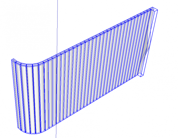
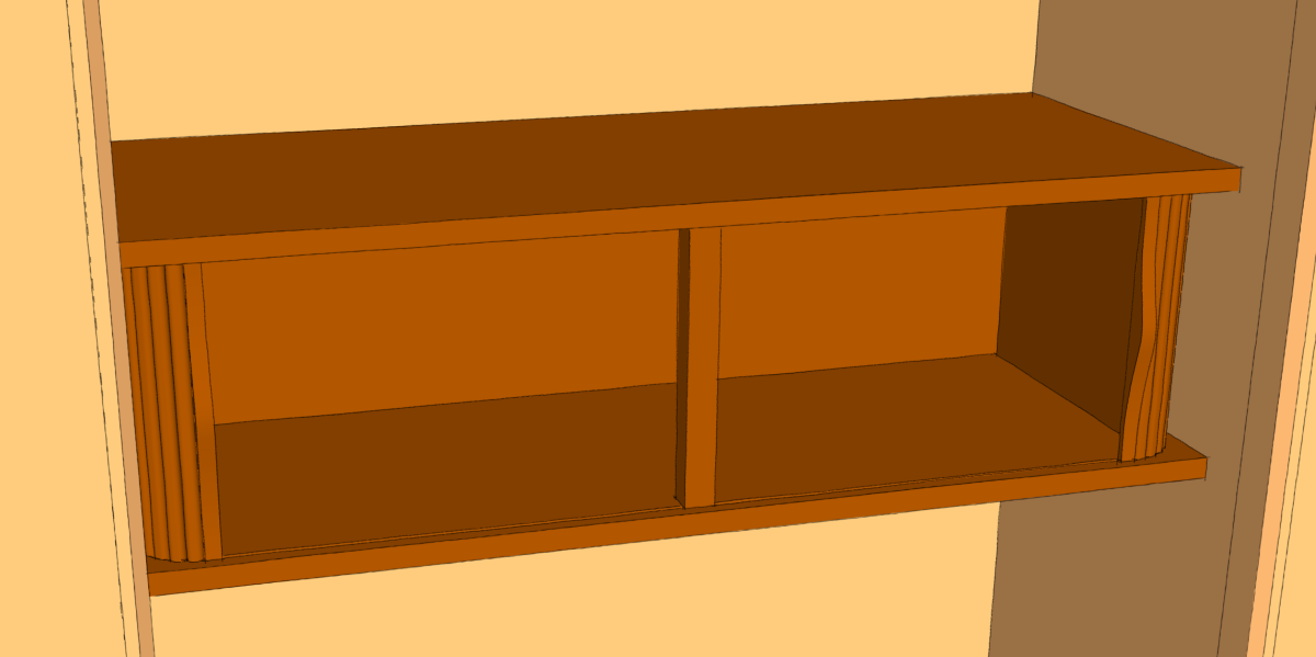
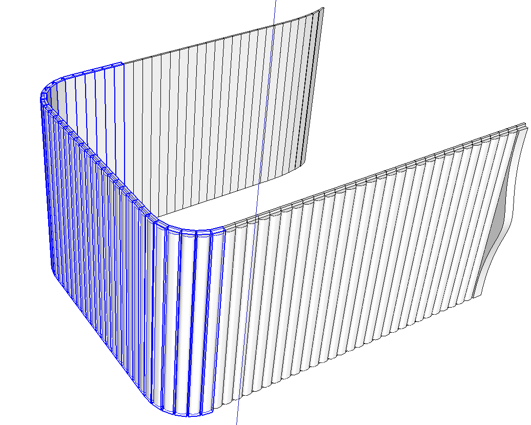
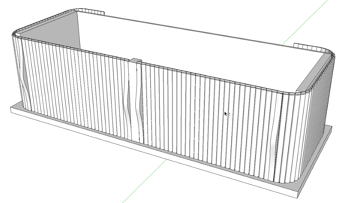
At this stage, then, there’s a set of slats in the open position and another in the closed position. These were copied with Move/Copy and flipped along the red direction to make the right hand sets of slats. In the following screen shot you can see both the closed set as well as the open set of slats are showing.
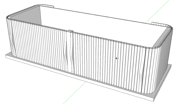
So as to make it easier to show my wife, I tuned off the Tambout open layer and create a scene. Then I turned that layer back on and turned of the Tambour closed layer and created a second scene. Then it was easy to switch back and forth between scenes.
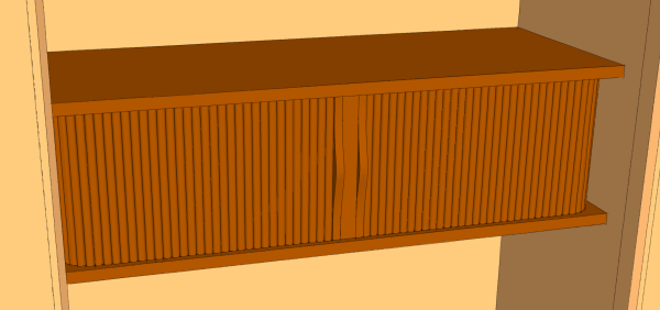
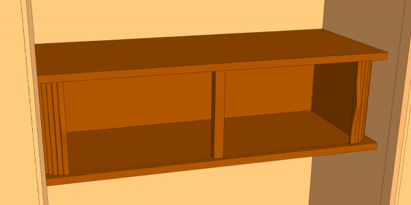
These quick views were good enough to get the idea across. If you were doing something like this you could continue detailing the drawings to the point of creating a plan if you needed it. In this case, though, the simple sketch did the job. Now it’s just a matter of time until I find out which way my bride will choose to go.
–Dave








Log in or create an account to post a comment.
Sign up Log in