Make FWW projects your own
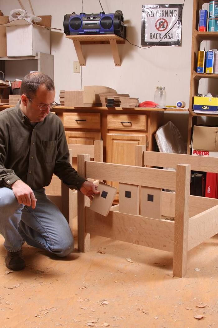
Mock-ups leave little doubt: I used MDF pieces (close in color to white oak) to dial in the size and placement of the slats, and I drew on them with a Sharpie to simulate the holes. Once the array looked good from every angle, I marked the placement on the rails and was ready to move ahead.
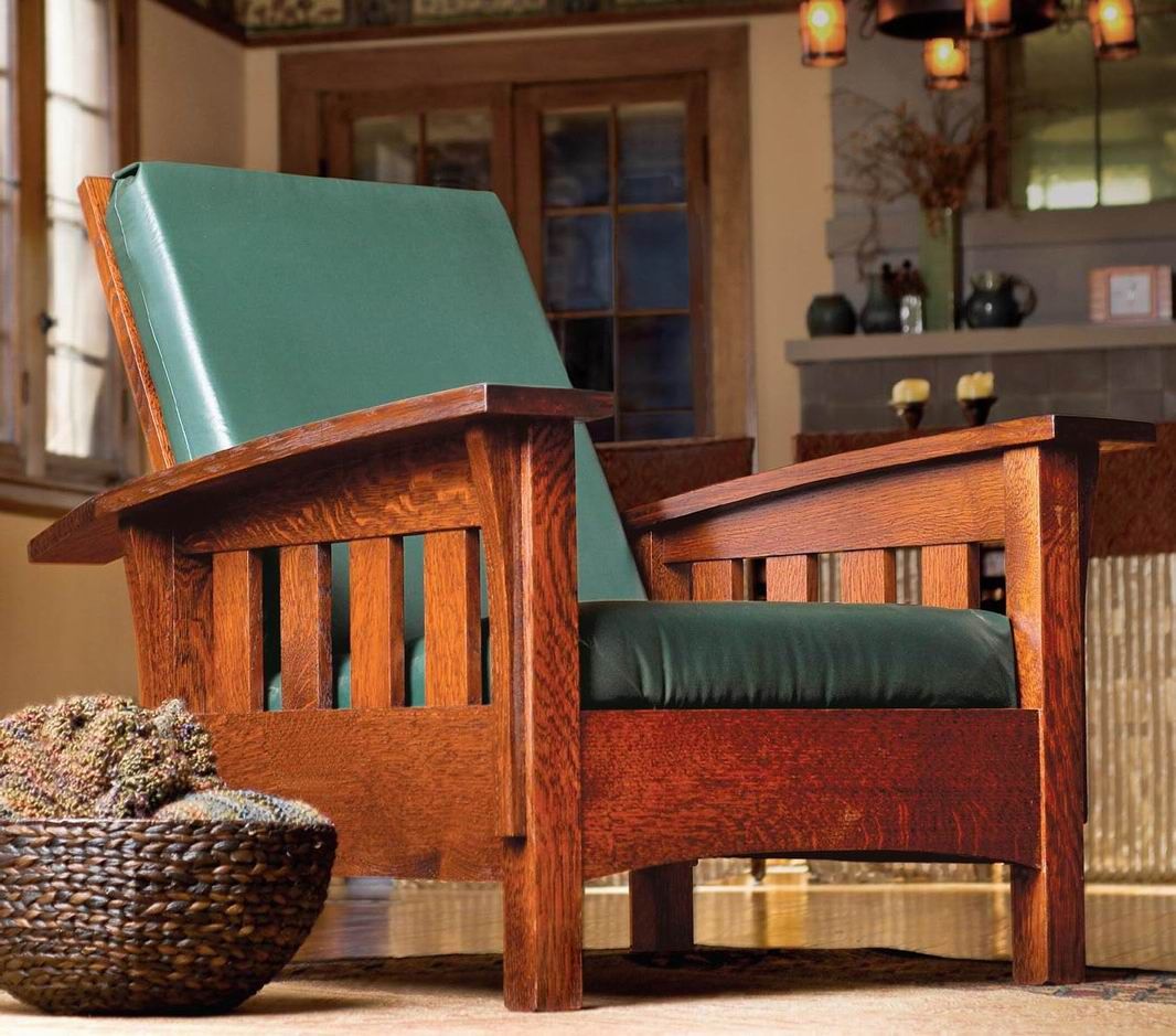
I’m not only the Hair Club president, I’m also a client. What I mean to say is that I’m not only the Fine Woodworking editor, I’m also a reader. I just finished a set of two bow-arm Morris chairs, based on the recent article in the magazine, by Greg Paolini, who also did a complete video workshop here on FineWoodworking.com.
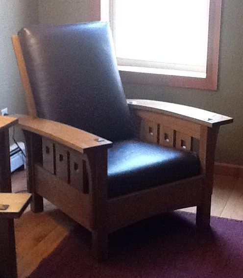
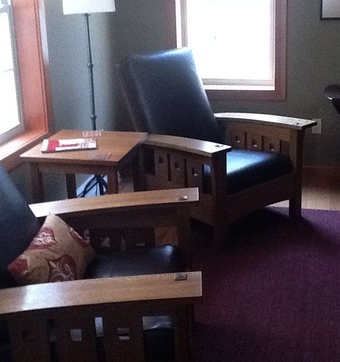
But I made a slight design change to the project, trading in the basic row of slats in the side frames for a snazzier array of three wider slats, with square piercing in each, a la Charles Rennie Mackintosh.
I suggest that you make FWW projects your own, too. Change the wood or the dimensions based on the materials you have on hand, or your own needs. Add some decoration to take the piece to the next level. I can tell from many of the letters we get that some woodworkers follow our dimensioned drawings to the T, feeling like they are doing something wrong if they don’t. Trust your eye, and make things your own.
I understand the hesitation. When you want to make a serious change, how can you be sure it will blend in with the style of the piece, and be proportioned nicely? One lesson is to stay within the style. In this case, a ogee molding, for example, which is characteristic of period furniture, would have been a turd in the punchbowl, but the Mackintosh details fit in nicely with the overall Stickley design. The Arts & Crafts movement flourished on both sides of the pond, and you can mix and match pretty well within the various branches of the style.
Next, you want to dial in the proportions of any change you make. The best approach is to brainstorm with sketches and drawings, and then use mockups to see things in real space. With FWW projects, you can just photocopy the drawing in the magazine, and go from there. I whited out out the existing slats, and then drew in a variety of new ones in pencil. That got me close, but I needed mockups to really lock in the size of the slats, how far apart to put them, how big to make the square holes, and where to put them on each slat.
Simple MDF pieces did the trick, and I knew when it was right. I’m ecstatic about the finished chairs. The only mistake I made, maybe, was just marking squares on my mocked-up slats, instead of actually cutting square holes. The actual square holes are just a bit large to my eye. What do you think? Perfection is always just around the corner on this journey.
|
More on Mockups |








Comments
If you model plans in SketchUp, or purchase SketchUp plans, you can easily see how changes will affect the overall look of a piece. You can then print revised plans--with the new dimensions--right from SketchUp.
And if you aren't familiar with SketchUp, I urge you to get a copy of Dave Richards's new video: SketchUp Guide for Woodworkers The Basics; you can learn all about it on the Design.Click.Build blog here at FWW.com
dh
Yup, I'm well are of SketchUp, but it is a great tip for those who aren't. It's free, and very powerful. Lately On my iPad I've been using a 2D program called TouchDraw. It is great, though not 3D like SketchUp.
oops means to say "well aware." Darn auto-correct!
Turd in the punchbowl...haha, you crack me up, Asa! BTW, nice job! I'd like to tackle a Morris chair someday, once my skill set develops a bit further.
Log in or create an account to post a comment.
Sign up Log in