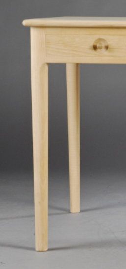
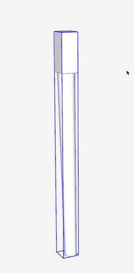
I’m starting a new project for the grandchildren – desks. Modern Danish style seems to work well in this case, so I’m working on the SketchUp model for the interesting shapes of the legs. There is a square section at the top of the leg, while the bottom is turned, offset, and tapered. See shape below.

As in many cases for my furniture reproduction, I start with imported pictures and trace over the shapes as shown below.
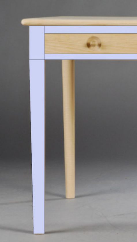
As you can see, there is a difficult transition from the square (at the top of the leg) to round at the bottom. The inside edge of the leg is perpendicular (on the blue axis), but the outside edge of the leg tapers as it approaches the floor. This will mean an offset centering on the lathe, and a difficult transition from square to round.
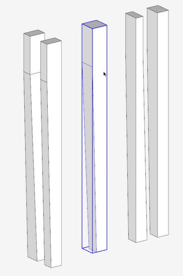
My first action was to create two solid shapes from the leg profile and do an intersection. I used Solid Tools for this intersection, but it can be done with traditional intersection in the free version of SketchUp.

After using the Split Tool for Solid Tools Intersection, I had three groups two of which are waste pieces. The center group is the one to save – it is square, offset, and tapered, but not yet turned in the bottom segment.
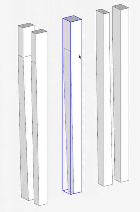
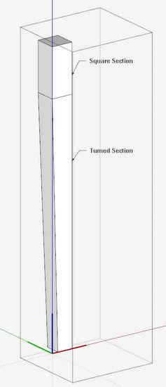
The top section of the leg is partially square-shaped, but the bottom section is turned. So I’ve decided to separate these segments and work them independently. I’ve created an overall Component called Leg, with two embedded components – the Square Section and the Turned Section.
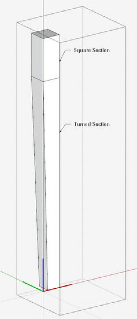
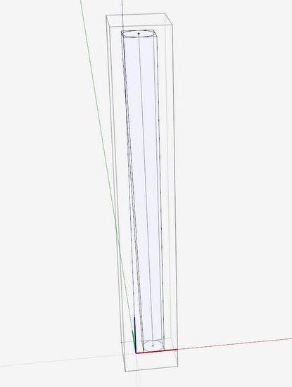
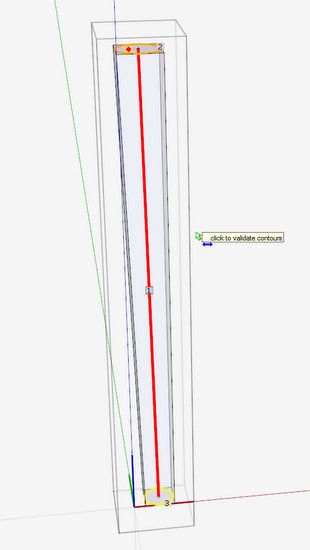
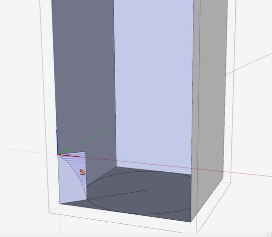
I’ve decided to use a plug-in for the turned section – Curvaloft. I don’t use this often and forget how it works. After some fiddling I finally was able to create the turned section within the tapered square. The first steps were to create a circle on the bottom and top faces, and then draw a centerline path.
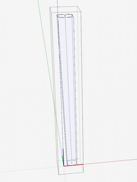
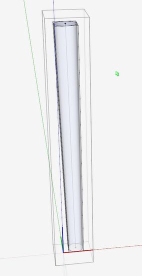
After selecting the path and the two end shapes, the plug-in fills in a perfect tubular shape.
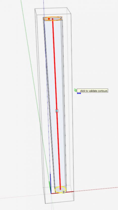
As an option you can use Follow Me, but it takes some work because of the tapering offset conditions. After creating the tube shape inside the square section, I used the Eraser Tool to delete the waste, leaving the turned section only.
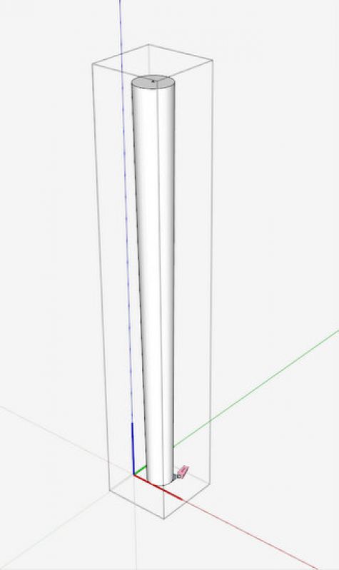
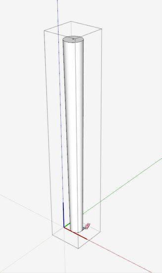
My assembled overall leg component automatically included the new turned bottom section as shown below.
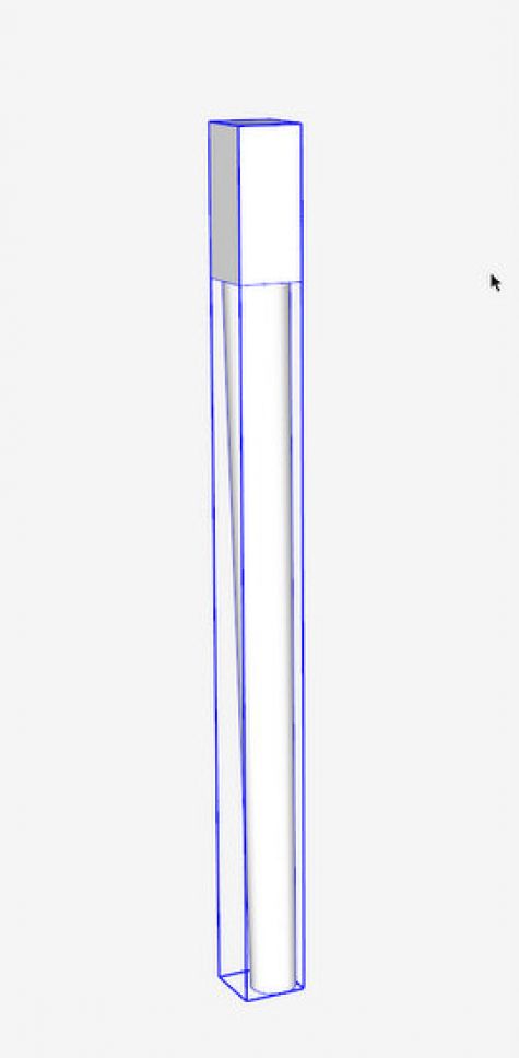
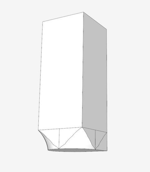
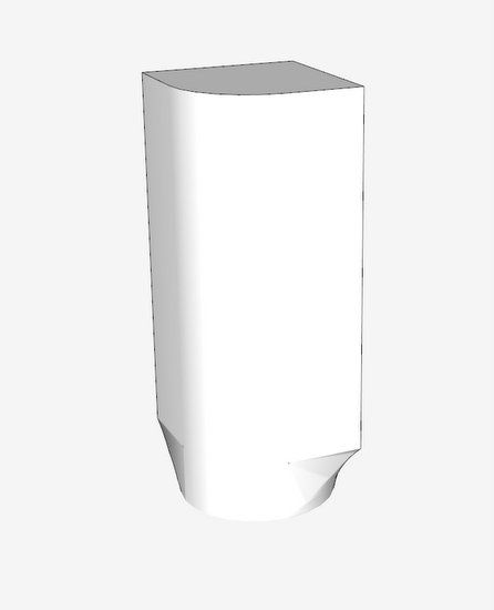
As the turning is complete, I began the work on the top square section. As with many legs, there is a transition from the square-to-round. This transition occurs in a 3/4″ length. I hide the front face of the top square section and create a cove shape for the transition. This shape is created on the diagonal and will be “spun” around the bottom face using Follow Me.
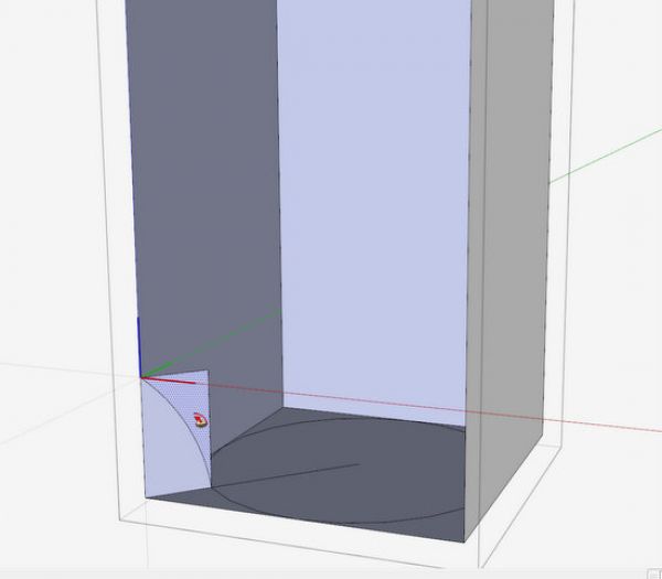
The following illustration shows the results of the Follow Me. There is plenty of waste to be deleted after executing Intersect with Selected.
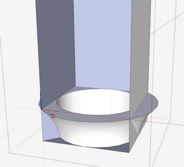
After using the Eraser, and before doing any Softening, here is the result of the erasing of waste. Note that the back inside corner of the leg will not have a transition but remain square.
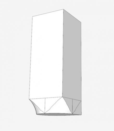
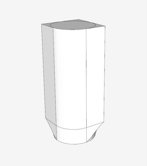
The front outer corner of the top portion of the leg is also rounded to match the turned section. Here I’ve created a circle on the top face and used Push/Pull to create that rounding.
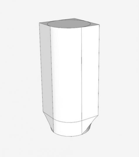
I selected all of the graphics and applied Soften/Smooth Edges. I also performed a Hide function on the bottom edge of the square section. This will hopefully present a smooth connection to the bottom turned section without a seam.

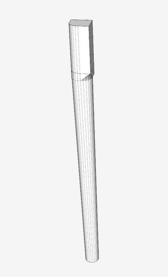
The overall assembled component was automatically updated with the top square section and bottom turned section updates. Here I’ve show the component with Hidden Lines exposed. I think the hidden lines make it easier to see how the shapes fit together.
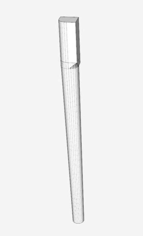
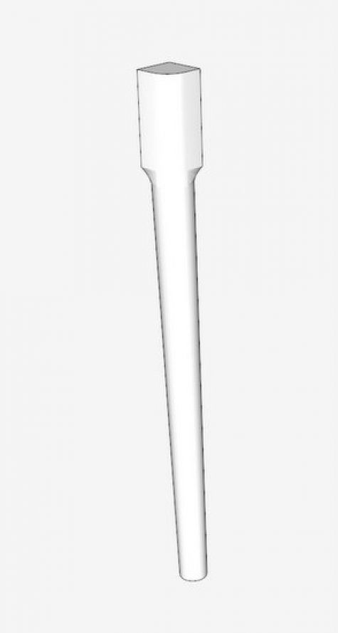
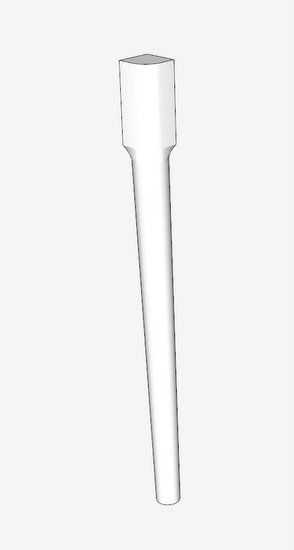
Here is a final shape without hidden lines. The next actions will be to create the mortises and dovetails to connect the rails and skirts that connect the four legs.










Comments
That's a fine looking leg and no mistake. I tried something similar a few weeks ago - an offset, conical leg, with a mortise joinery - and was able to get something that rendered really well, using SketchUp v8 free, in very little time at all. Trust me, I'm a SketchUp beginner so I was pleasantly surprised. However, having got something that rendered so well, without being a 'perfect' model of what I would eventually make, I asked myself the question 'at what level of detail do I need to go for client pictures or workshop drawings?'. I just wondered whether if you hadn't been posting this leg to the blog, you might have stopped short of the curved, square to cylinder transition, especially as you already had a picture of an actual leg you wanted to replicate? I do worry that some makers may end up spending too much time building virtually; feeling that since such detail is shown in tutorials, that they would be failing if they did less.
Reminds me of the joke: How long does it take a perfectionist to change a lightbulb? - I'll have to get back to you later, he's still doing the feasibility study!
Please keep up the posts, I learn something from them all.
To Lignin: I know what you mean by overdoing the digital work. My philosophy with SketchUp is to do what is necessary for my building in the shop. For me this still means a lot of detail content in the model. I don't like to figure things, dimensions, shapes, etc. while in the shop. I find that the work in the shop is much more efficient with a complete SketchUp model with all components. Also all joinery and shapes must be established in the model.
I don't need materials, grain, and colors to show off how realistic I can make the model look. Most of my customers and students can live with my level of detail. However, I do go beyond my shop requirements when making Layout documentation for my students or for sale.
Tim
Log in or create an account to post a comment.
Sign up Log in