Designing a Small Cabinet
Shape and style spring from intended use and furniture around it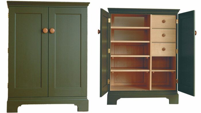
I enjoy the kind of furniture project where a client gives me a list of specifications and asks to see what I can come up with. The client’s list may be short, which gives me lots of leeway, or long and detailed, which restricts my options. In either case, a successful design melds the client’s preferences with my own sense of proportion and shape.
Not long ago, a client for whom I had built several pieces called to discuss a cabinet that would house a CD player and other electronic equipment. Her house is decorated with a tasteful mix of antiques, family heirlooms and custom furniture. So the first requirement for the new cabinet was that it not look out of place with the furniture she already had. Then there were the nuts-and-bolts requirements. The cabinet would be set against a short section of wall, giving me no more than 54 in. with which to work. Because of a wall switch, the cabinet would have to be less than 48 in. high.
Two pieces of electronic equipment, a CD player and an amplifier, would be stored inside the cabinet. Each piece measures 4 1/2 in. by 17 in. by 17 in. The client wanted enough room inside to allow additional equipment later, and she wanted enough drawer space to store at least 60 CDs.
In addition to the functional requirements for the new cabinet, there were questions of proportion and style to be settled. Some of them were easy to understand, and others a bit more nebulous. We took a tour of the two adjacent rooms to look at some of the design elements that were particularly pleasing in the existing furniture. I noticed some pieces had bracket bases, with cutouts neither too plain nor too ornate. There were paneled doors and mushroom knobs, and I took note of the different molding profiles that I saw.
Before I left, we had roughed out the basic requirements. The cabinet was to be painted (color to be determined), molding should be installed along the outside edge of the cabinet top, and the cabinet should have two flat-paneled doors with mushroom knobs. A bracket base would add visual interest to the bottom of the cabinet, with the exact shape of the cutout to be determined later. I agreed to have an initial sketch in a few days.
 Shop plans the next step
Back in the shop, the design began to take shape. I had a list of specifics—the cabinet’s maximum height and width, for instance, and a good idea of what had to fit inside. I tried to distill design elements I had seen in the house into a list of features that I would use in the new cabinet.
I started by firming up the dimensions. Figuring on two rows of CDs per drawer, two 1/2-in. drawer sides and a center divider plus the spacers to hold the CDs, the total drawer width would be 13 1/2 in. The 3/4-in. cabinet sides and center divider added up to 2 1/4 in. To that, I added the 17-in. width of the electronic components plus 3/4 in. on each side for ventilation. Allowing 7/8 in. for molding on each side of the case, the total cabinet width came to 36 in.
In determining the height, I had a bit more flexibility because I anticipated lots of open space in the lower section of the cabinet to allow for future expansion. Nonetheless, I had to keep the height below a light switch and at a reasonable height for a dictionary stand I had been asked to make for the top of the cabinet (photo 4). I wanted to try for the maximum height to avoid a square, boxy appearance. Using a scale ruler and some scrap paper, I sketched out a few options and thought that 45 1/2 in. looked like a good compromise for the height. An inch in either direction probably wouldn’t have mattered much, but 2 in. would have made a big difference to the eye.
The cabinet depth was the easiest dimension to settle on. It consisted of door thickness, 17 in. for the components, 2 in. for wiring and 1/2 in. for the back. In all, that was about 20 in.
Door panels for a tall look
Once the crucial dimensions had been established, I had to fill in the details. Those included molding profiles, the shape of the cutout on the bracket base, widths of the stiles and the rails on the door—all of the elements that would determine the look or character of the cabinet.
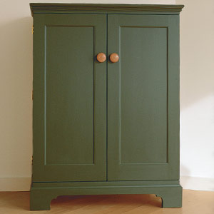
I started with the biggest surface area, the doors. We had agreed on flat panels with 1/4-in. quarter-round molding applied to the inside edge of rails and stiles. The first question was the number of panels in each of the two doors. I wanted the cabinet to look as tall as possible, so I ruled out a center rail, which would have added a horizontal band to the doors and diminished their vertical impact.
The thought struck me that I might get an even more vertical look to the doors by dividing the single panel in each door into two narrow panels. I sketched it out. With three 2 3/4-in. stiles on a 17-in. door, each of the two panels would measure only 4 1/4 in. wide. This configuration wouldn’t work because it made the stiles appear too wide and the door appear too busy. It was not the look I was after. The single door panels won, and I decided to leave the stiles and the top rail 2 3/4 in. wide. The bottom rail would be 3 3/4 in. wide to make the doors stronger visually and structurally.
Originally, I intended the knobs to be large mushrooms roughly 2 in. in diameter and 1 1/4 in. deep. Obviously, you can’t put a 2-in. knob on a 2-in. door stile because you wouldn’t be able to get your fingers between the knobs. So in addition to increasing the stile width slightly, I decreased the knob size to 1 3/4 in.
Choosing overlay door style
I had decided early on that the doors would be overlaid instead of inlaid, meaning the doors covered the front of the cabinet instead of being set inside a face frame or the cabinet sides. When using butt hinges (the style of hinge more in keeping with the look of this cabinet than European hinges would have been) it’s a real advantage to use an overlaid door. First, the hinge barrel extends out to the side of the piece, not to the front, which keeps the look cleaner. Second, there’s a real advantage in the function of the door. It only has to be opened 90° to pull out the drawers. An inlaid door must be opened 180° for the drawers to be opened. For closures, I used 1/4-in. bullet catches. I like the positive engagement and commanding click these catches make when the door closes.

The only other consideration for the doors was what to make the panels from. I ordinarily use solid wood, but because this cabinet was to be painted, I settled on 1/4-in. birch plywood. The plywood is dimensionally stable, so the panels won’t shrink and show paint lines in the winter as solid panels might.
Base, molding and wood choices
The bracket base for the cabinet was fairly simple. I decided to use 1 1/4-in. stock with a 3/8-in. cove cut out of the top edge. The cutout section featured two intersecting curves at the corner that resulted in a small point. The shape was not too plain and not too busy, in keeping with the rest of the furniture in the client’s house.
I gave the client six options for the molding profile (right) that would cap the cabinet. I thought any of them would be suitable, so I left the final choice to the client.
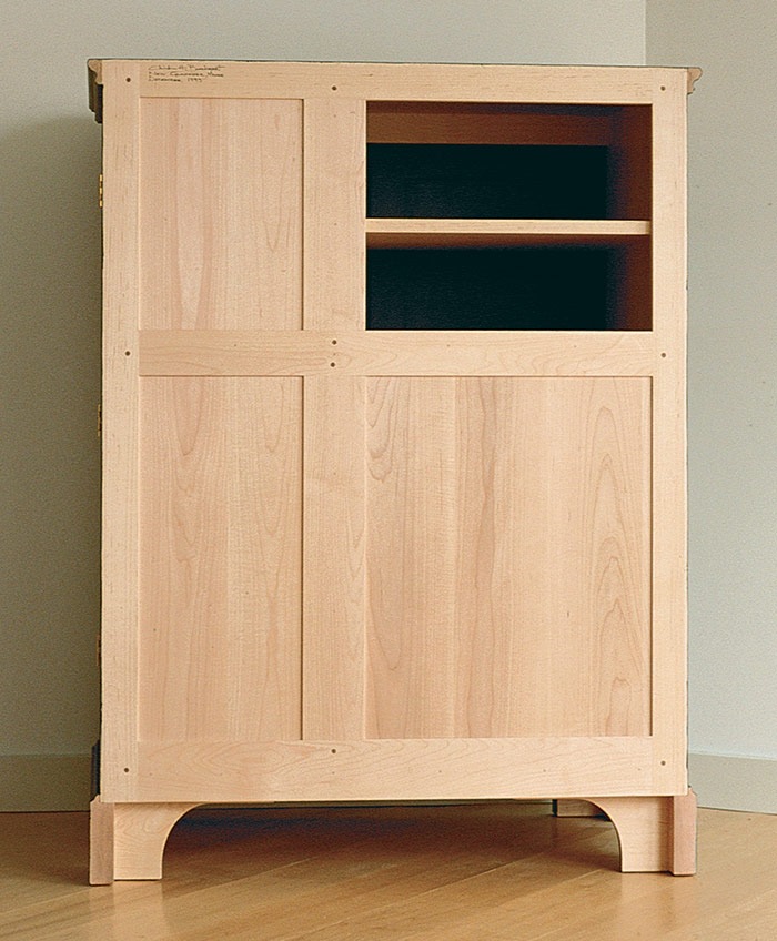
Ordinarily, I build in cherry. But I just couldn’t bring myself to cover up cherry with paint. I also wanted a light-colored interior (photo 2) to offset the black electronic components, something with no color streaks and something that would have minimum seasonal movement. The wood had to be readily available because I didn’t want to travel a long distance for it or pay high shipping costs. Soft maple met all of my criteria, and I picked through my supplier’s pile to find pieces that were entirely sapwood, not the darker heartwood.
Paint and finish considerations
When I sent the sketch and the paint color card to the client, I recommended Stulb’s Old Village Paint, a satin sheen, oil base in what I consider authentic colors for period and reproduction work. The paint is available from most paint and hardware stores in my area or from the Stulb Company (P. O. Box 597, Allentown, Pa. 18105; 215-433-4273).
When I stopped by the client’s house a few days later, we looked over the area where the new cabinet would go. Behind it would be a white wall, and about 6 ft. away was a fireplace surrounded by gray tiles with just a suggestion of green. She chose forest green for the cabinet color and settled on a molding just like the one on a sideboard I had designed and built for her. The paint color blended well with the room and with the cherry knobs on the door and the cherry dictionary stand.
When the cabinet was built, I finished the back, the interior surfaces and the drawers with a 60-40 mix of satin polyurethane and citrus thinner. Citrus thinner is an alternative to petroleum-based paint thinner or turpentine. It’s a pleasant-smelling product made from citrus fruit, and it works well. Chris Becksvoort is a furnituremaker in New Gloucester, Maine, and a contributing editor at Fine Woodworking magazine.
From Home Furniture #1
Fine Woodworking Recommended Products

Stanley Powerlock 16-ft. tape measure
Dividers
Compass




Log in or create an account to post a comment.
Sign up Log in