Going Over Edges
Understanding the design implications of edge treatments will improve the look and feel of your work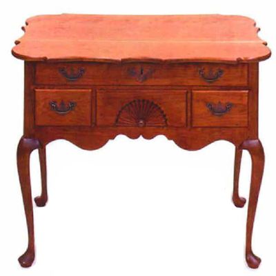
Synopsis: Will Neptune focuses on 18th-century edges in this article, which illustrates how small details distinguish one style from another. In designing a piece, he suggests sizing the top first, because you register the thickness of the top and degree of its overhang before you take in small details, such as the profile of the edge. Next is shaping the top, because a top with a visually active shape leads the eye around its edge. In molding the edge, he offers a few principles: round surfaces are softer than flat; vertical and horizontal lines have a more severe effect than angles; 90° corners have a harder look than obtuse corners; the viewer reacts to shadow and light as much as to volume and shape. The article includes a glossary of edge profiles, including square, half-round, astragal, segmental, thumbnail, and ogee.
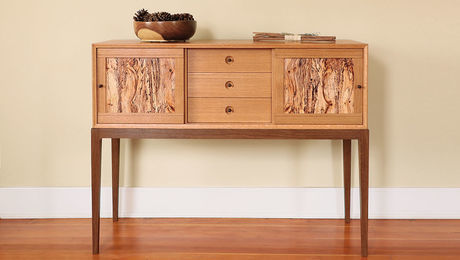
Top edges are an opportunity, a chance for a furniture maker to reinforce and enhance the overall design of a piece: to emphasize the horizontal or vertical aspect, to draw attention away from the base and toward the top or vice versa, to repeat an element or quality of the base, or to take the piece in a new direction. But a top edge, whether on a table, a desk or a case piece, is not experienced in isolation. Rather, the edge affects you in concert with the rest of the piece.
An edge is a kind of hot spot, a place where the top and the base come together. An edge is also just one part of the top. When you design an edge, you must consider the size and the shape of the top, as well as the edge profile itself.
I’m going to look at 18th-century edges because they’re the ones I’m most familiar with and because the 18th-century furniture makers worked out most of the moldings and edge profiles we’re still working with today. If edges themselves are an opportunity, so too is the study of edges. Whether you build 18th-century reproductions or your own contemporary creations, a close look at edge treatments offers you a chance to add another set of options to your designer’s tool kit.
The game of edge design is one in which little moves often have big consequences. Imagine two Queen Anne lowboys, similar in size and overall design. Both have rectangular tops with simple ogee moldings, but one has dimpled corners. In the latter, the small, curved creases in the molding soften the edge and lessen the severity of the otherwise rectilinear top. Or imagine that the top of a table you’ve made looks too thin once the edge has been molded. Should the top have been thicker or would a different molding have looked better? Either way, the slightest of alterations might have made all the difference.
Sizing the top
When designing a tabletop, you should consider the size of the top before the shape of the top or the treatment of its edge. This is because you first take in the overall stance of a piece. You register the thickness of the top and the degree of its overhang long before you take in small-scale details such as the profile of the edge. From a distance, the elevation (front) view dominates the plan (top) view. A thin top tends to make the entire piece seem more delicate; a thick top tends to have the opposite effect. Large overhangs emphasize the horizontal; small overhangs allow you to grasp the relationship between the top and the base.
From Fine Woodworking #132
For the full article, download the PDF below:
Fine Woodworking Recommended Products
Starrett 12-in. combination square
Festool DF 500 Q-Set Domino Joiner









Log in or create an account to post a comment.
Sign up Log in