Breaking with Convention
For a cutting-edge bureau design, you sometimes have to bend the rules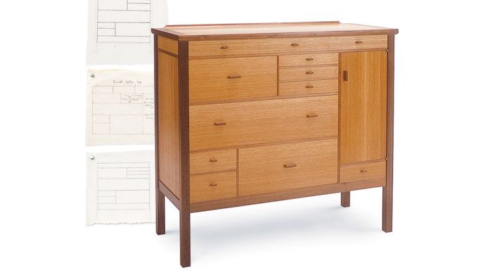
Synopsis: Tired of symmetrical cabinetry? This furniture designer likes having several things going on and elements that keep the eye moving. Thus, he designed a tansu-style apothecary chest — the piece has an organization of small compartments but also exhibits a playful form of proportion. He selected walnut and white oak to set off the cabinet’s construction details. Read about his inspiration and construction techniques.
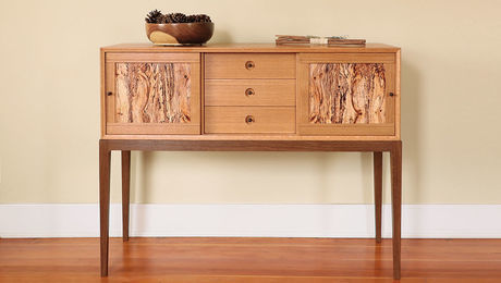
While studying under James Krenov at the College of the Redwoods, I gained an appreciation for his flirtation with weights and balances. There are always four or five things going on with one of his cabinets that tend to keep the eyes moving and the mind involved. Thinking of this, I spent a day sifting through back issues of Home Furniture magazine and found the perfect starting point for my second project at the school: an apothecary’s chest.
Having grown up with a traditional chest of drawers, I had come to detest the symmetry of it. I find the active jumble of drawers inherent in the tansu style appealing and decided to blend that into my design. Tansu chests are similar to apothecary chests in their organization of small compartments but also exhibit a playful form of proportion. Borrowing what I needed from both chest styles, I created a bureau design that was both active and calm.
Once I had worked out the drawer configuration on paper, it was time to make a full-size mock-up. I used large sheets of cardboard for the body and top of the piece and some scrap lumber for the legs. I chose dimensions by referring to other furniture but ultimately scaled them to what looked and felt right.
Next, I used some black-walnut scraps to mock up the drawer configuration on the face of the cardboard carcase. Double-faced tape allowed me to reposition the scraps until I was satisfied with the proportions and balance of the drawers. Realizing that the dark tone of the walnut would drive the activity of the piece, I decided to use it as the face-frame material.
I wanted the drawer fronts to function as a calming field of color and grain. So my main concern in the wood choice was aesthetic. After laying many samples of wood next to the walnut for consideration, I chose a piece of white oak.
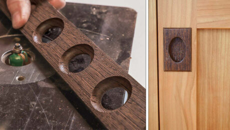
The tone of the pulls also would be a significant and playful element. I settled on kwila because it matched the walnut and had gorgeous end grain. Kwila also is easily shaped by machine.
The carcase was doweled at all four junctures, while the frames were joined with slip joints (open mortise and tenons). All of the frames were attached to the carcase with splines. The top was splined all around its frame, including its miters and pencil-roll edge. I chose traditional dovetail drawer construction with loose bottoms. The top, sides, back, door and any vertical element within the drawer/door configuration all were veneered with shop-sliced 3⁄32-in.-thick veneer.
I finished the piece with Liberon oil. I often heard Krenov emphasize that “furniture should be true and honest and yet catch one’s attention.” I hope that my bureau lives up to these Krenovian ideals.
From Fine Woodworking #164
For the full article, download the PDF below.
Fine Woodworking Recommended Products
Dividers

Sketchup Class






Log in or create an account to post a comment.
Sign up Log in