The ABCs of Letter Carving
Create elegant characters using two chisels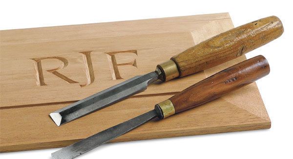
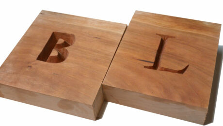
Synopsis: T.J. McDermott’s straightforward letter-carving technique uses only two chisels, but it can transform a piece of furniture or other articles into a personalized heirloom. In this introduction to letter carving, McDermott gives advice on choosing a typeface, learning to trust your eye, tips for good layout, transferring a layout from paper to wood, developing a methodical carving rhythm, and keeping your mind and your chisels sharp as you work.
Letter carving is well worth learning because it transforms and personalizes otherwise ordinary objects. When someone receives a jewelry box or a piece of furniture that you’ve made and inscribed with their initials, they know they have an heirloom.
 I began carving letters more than 30 years ago while studying to be a boat builder. An extraordinary craftsman who made bagpipes and did wood carving inspired me. I was awestruck by how quickly and effortlessly he could carve perfect letters. I began to practice sign carving myself, and in 1981, I carved a sign for Cole-Haan shoes when it opened its first store in Freeport, Maine. That led to signs for Polo Ralph Lauren, Tommy Hilfiger, Gant, Calvin Klein, and others.
I’ve developed a simple and straightforward technique for letter carving that has served me well over the years. You can do most of the carving with a 3⁄4-in. bevel-edge chisel. The only other tool you may need is a #7, 14-mm gouge. Both are shown in the photo above.
Good letter carving depends largely on learning to trust your eye and developing a rhythm in the work with a feel for how the chisels move through the wood. You’ll eventually learn the most comfortable way to hold a chisel, which chisels work best for you, and which woods work well for carving.


Good carving starts with good layout
 Any large bookstore will have books on letter styles, letter spacing, layout, and the like. For simplicity’s sake, you might want to start with a typeface that’s available on your home computer. The font shown here, usually called Palatino, adapts well to letter carving and has some distinctive touches, such as the extra long curve on the letter J. Fonts such as Times Roman and Garamond are also good choices.
On the computer, type the characters you want to carve and enlarge them to the size you want. Take advantage of options that let you modify characters, making them bolder, for example, or stretched out. When you’re satisfied, print out the letters.
Draw a horizontal guideline across the bottom of the characters to help keep them aligned. keep in mind that rounded capital letters (C, G, O, Q, S) will extend above and below the guideline. If they actually lined up with the others, they’d look too small.
From Fine Woodworking #187
For the full article, download the PDF below:
Fine Woodworking Recommended Products
Starrett 12-in. combination square
Suizan Japanese Pull Saw
Veritas Precision Square











Log in or create an account to post a comment.
Sign up Log in