Give Legs a Kick with Dazzling Inlay
A figured panel with border adds interest, and it's fun to do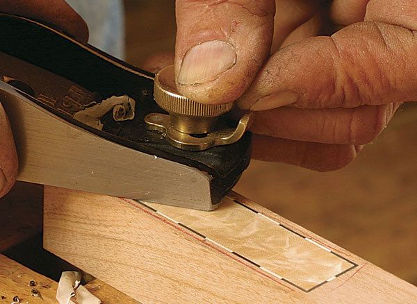
Synopsis: Add spark to your furniture designs with inlaid panels. By adding a simple rectangular panel of crotched wood surrounded by a contrasting dot-and-dash border at the top of the legs, Garrett Hack elevates a table from functional to fabulous. Here, he gives tips on locating the panel and choosing the material, how to make it pop, and a step-by-step guide to cutting the recess and putting the inlay together.
From Fine Woodworking #207
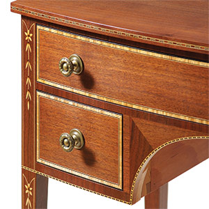
Learning to design furniture means building your own visual vocabulary. You can glean these tidbits from nature and your surroundings, but also by studying furniture of the past. I love details in furniture, and I enjoy seeing how past designers used small details to draw a viewer’s eye around a piece. The exuberance of inlay on many Federal-style pieces always caught my eye, especially the inlaid panels at the tops of legs or prominent on front aprons.
Inspired by those inlay forms, I’ve played with panels of many sizes and shapes over the years. These inlaid panels—some with simple borders, others outlined with fun dots and dashes, surrounding highly figured birch crotch harvested from my Vermont woodlot—have become an active part of my woodworking repertoire.
I’ll show how you can add spark to your own designs by inlaying a simple rectangular panel in the top of a leg. With the dashed border, this design works well with the fan inlay and matching stringing I illustrated in “New Spin on Fan Inlays” (FWW #204). The design is not that hard to make and can be resized to fit almost any location. What’s more, it looks at home on many different styles of furniture. Let’s take a look at the layout and materials first.
Tips on design: location and material: You always want the orientation of the wood inlays to be face grain—never weak end grain—so they will be especially strong and show the brightest colors. Aligning the grain of the panel with the leg helps ensure that wood movement won’t be a problem.
I try to align the panel with a detail on the apron, say the quirk of a bead, the bottom of a drawer, or even the bottom of the apron itself. Sometimes, though, simply centering it vertically on the apron turns out to be the most visually pleasing option.
I also like to center the panel horizontally on the leg, leaving at least 1⁄8 in. of material on both sides of the panel. If the leg tapers in this area, the panel should, too.
Make the panel pop- You don’t need a large panel to make an impression. The color combination is critical, though, because you want to create contrast; otherwise, the inlay will simply blend into the background. I prefer to use wildly figured crotch or burl, but even straight-grained wood will work.
Dashed border is dynamic— Whether solid or dashed, the border should contrast with both the panel and the primary wood in order to set the two off. In this example, nothing beats the pop of ebony and holly dashes against the light-colored cherry primary wood.
How you divide the border into segments depends on the level of contrast you’re after. In general, increasing the number of contrasting segments increases the dazzle factor of the border. You also could add interest by using different-size segments.
For the full article, download the PDF below:
Fine Woodworking Recommended Products
Whiteside 9500 Solid Brass Router Inlay Router Bit Set

Bahco 6-Inch Card Scraper







Log in or create an account to post a comment.
Sign up Log in