UPDATE – June 20, 2011: Plans featured in FineWoodworking.com’s Free Plans blog expire after a period of one year. This plan has already expired but is still available to members for free download.
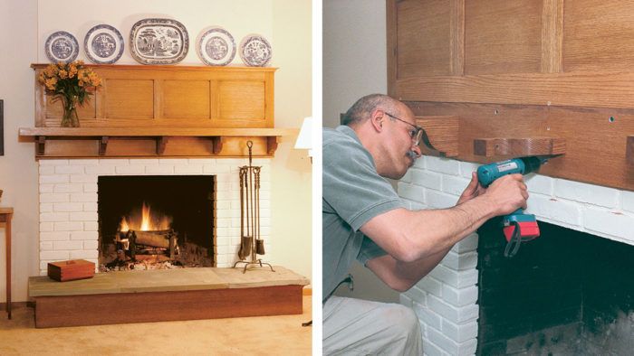
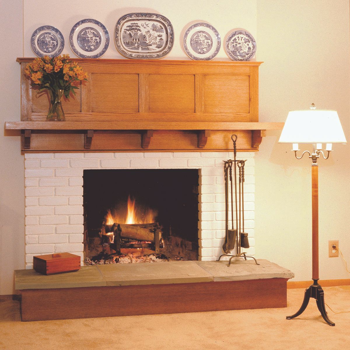
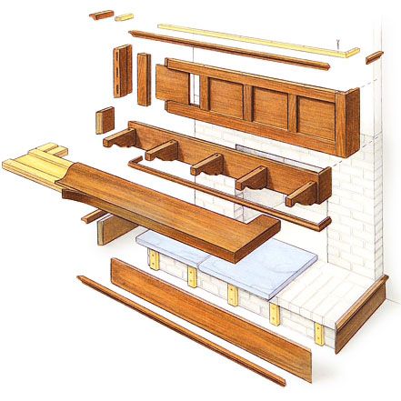
Very often there are projects that don’t strictly fit into the realm of fine woodworking because there is a homebuilding aspect to them. Built-ins are one example, and this Arts & Crafts mantel is another. Mario Rodriguez shows how to update an old fireplace. He takes you through the design phase, prepping the site, and a smart way to cut the mortises and tenons on the frame-and-panel overmantel. And after a step-by-step installation, Rodriguez ages the wood with a gel finish and naturally blends the new project into an existing room.
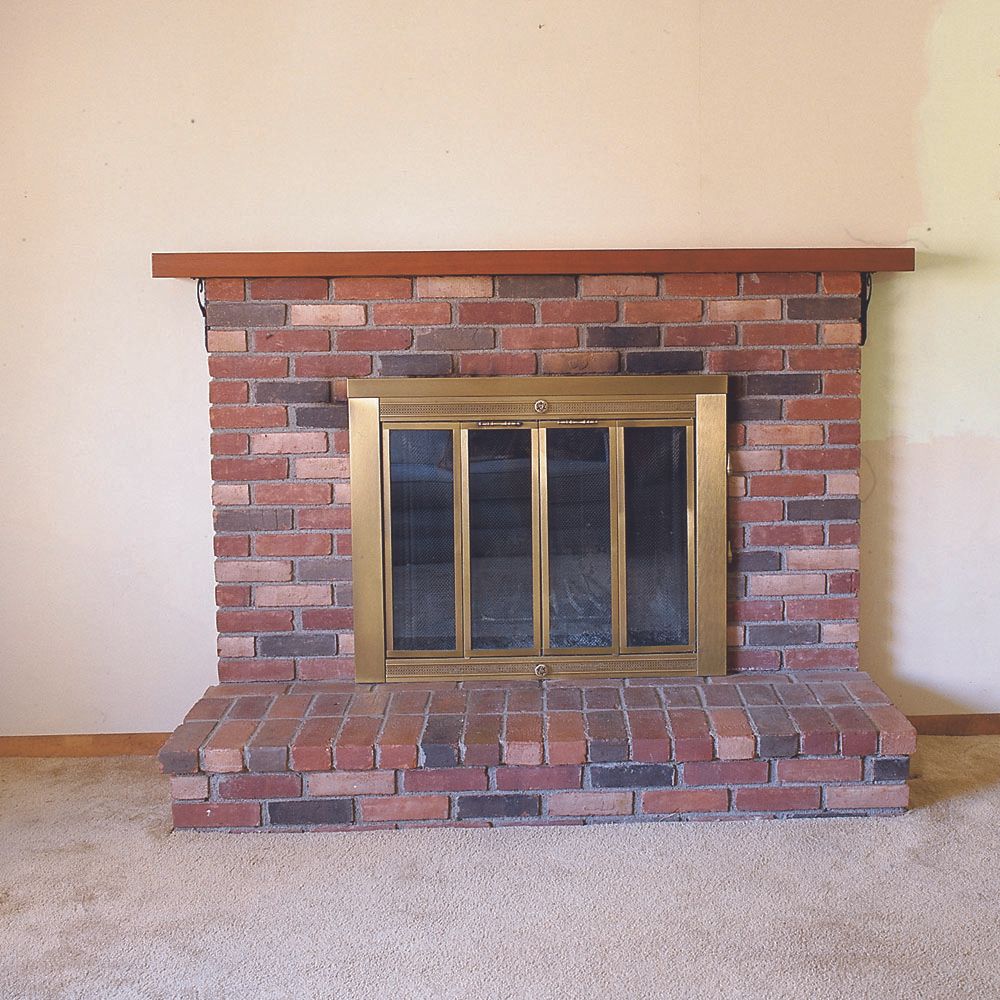
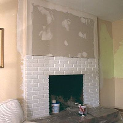
Start with surface preparation. For Rodriguez’s design to work, he had to frame the area above the fireplace flush with the brick.
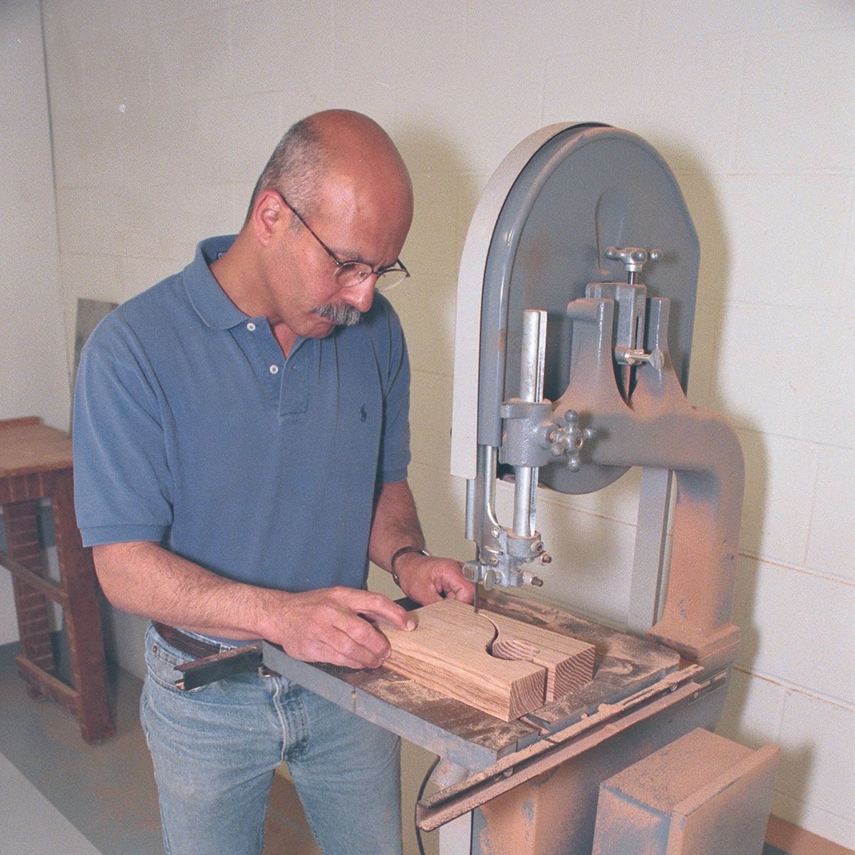
Frame-and-panel joinery is quick and easy. Rodriguez cuts the mortises, which also are in line with the grooves for the panels, in one pass on the tablesaw with a dado blade. The tenon shoulders are cut on the tablesaw, and then he moves to the bandsaw to quickly remove the cheeks.
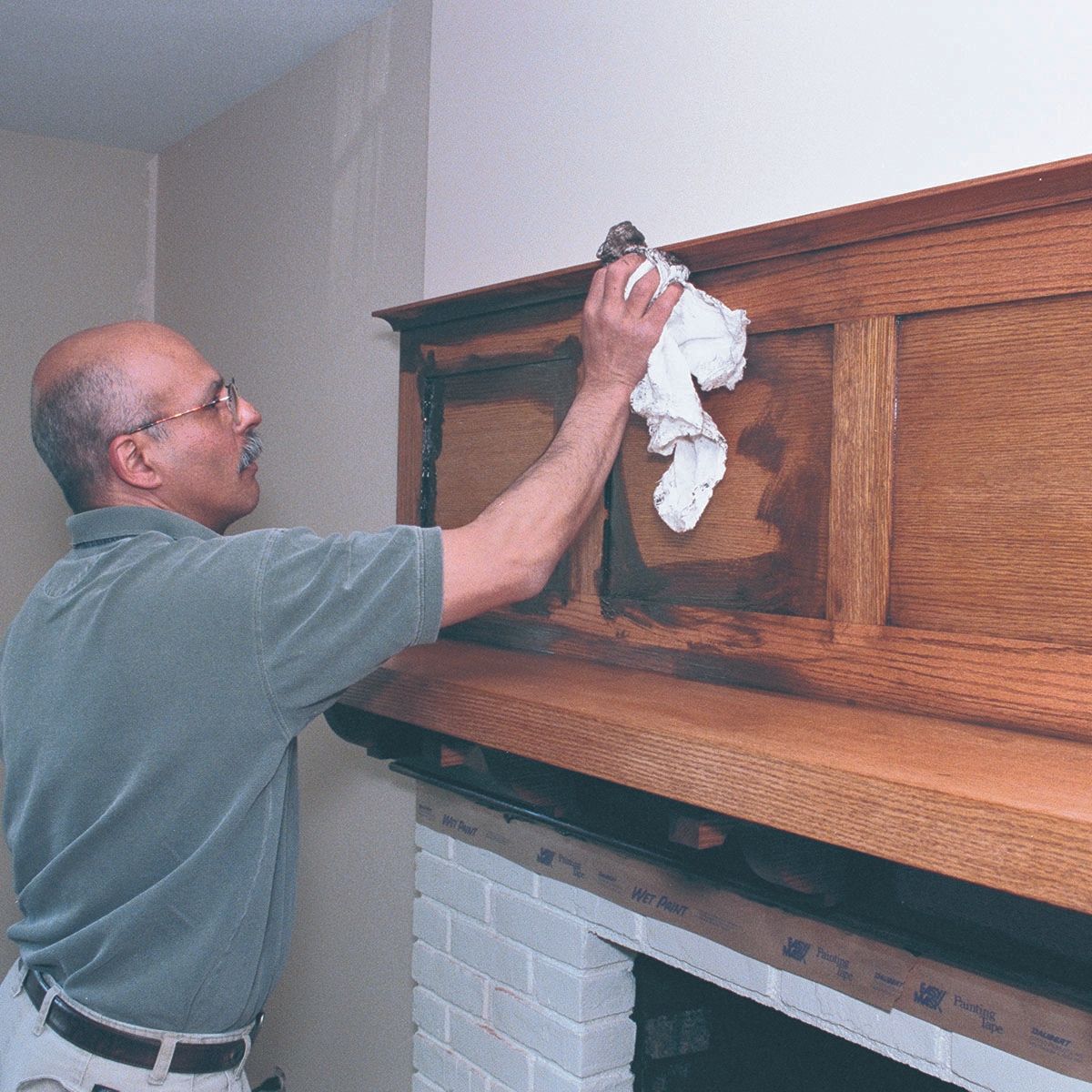
An antique finish on a new project. McCloskey’s glazing gel combined with Japan color creates a warm, aged look that fits into the existing space.
This free plan has expired, but members can still download the original article and plan online.







Comments
I really like the overmantle, but I think painting the brick white was a mistake. Am I the only one who thinks the whole arrangement looks top-heavy? The overmantle looks as though it's suspended in thin air (and with plates on top that don't go with anything) when it really should look anchored. If anything, I think the brick should've been left as is or given a glaze making them darker than the wood. Nice finish on the overmantle though.
I agree with Ellesson. I really like the mantel -- its a beautiful piece of work -- but the arrangement is too top heavy with no visual connection between the mantel and the platform. Where I'm not a huge fan of multi-colored brick either, it at least would have given that connection. For a similar, much smaller project, I tiled over the brick using a deep colored rustic tile, and added boxed pillars to help bridge the gap.
I agree with Ellesson, as well. Perhaps instead of painting the brick, veneering it with stone would have added the weight, and been more to the liking of the Arts & Crafts style. Beautiful manthel!
Top heavy it is. Dishes on top are a huge distraction to the beautiful woodwork. Like to see a plan with columns
I would like to build this.If only it was redeigned with columns on each side. Hoping this will happen!
Log in or create an account to post a comment.
Sign up Log in