The Right Way to Use Contrast
Make your furniture stand out by combining different grain, figure, and colors. Just don’t overdo it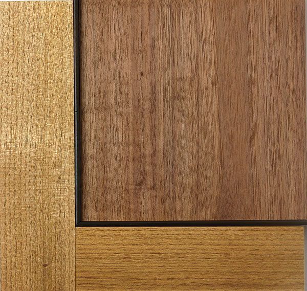
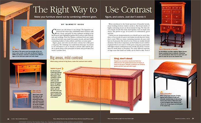
Synopsis: Using different woods, grains, and color to add contrast is a great way to make your furniture stand out from the crowd. The trick is to do it effectively, understanding what type of contrast to use and where to use it. Overdo it and the effect will be garish; do it right, and you will take your work to another level. Garrett Hack lays out some rules of thumb for using contrast in your designs, showing examples of pairings that work beautifully as well as some that take the idea a bit too far.
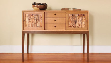
Contrast can add drama to any design. The Egyptians understood this when they embellished their furniture with ivory, ebony, and gold. It’s why craftsmen working in the Biedermeier style highlighted golden birch surfaces with dark details and moldings. Even the Shakers combined bird’s-eye maple drawer fronts with cases made from quieter woods, and used bright contrasting washes of reds, yellows, and blues on some parts.
Figure, grain, and color can all create contrast, but a little goes a long way. The challenge is to understand what type of contrast to use and where to use it. Overdo it and the effect will be garish or gaudy. Keep a few principles in mind, and you’ll take your work to another level.
When introduced to the broad spectrum of beautiful woods, many budding furniture makers overdo it. But broad swaths of highly contrasting wood can shout instead of sing. The first rule is to choose woods that relate well together, such as maple and cherry. The photos on pp. 42–43 show 15 combinations, good and bad.
Unless you are doing marquetry, you should use no more than three or four woods in a piece (secondary woods that don’t show don’t count). With too many contrasting materials, the piece will have no focal point. One wood (or two if they are similar) should dominate. Hierarchy is important; use the boldest wood to deliver emphasis where you want it. A little goes a long way, particularly with high-contrast combinations such as holly and ebony. I reserve them for small inlays or flourishes. Too many different materials or large areas that stand out boldly can be hard to take. Even if that’s the intent, give the viewer some quiet areas to retreat to—areas that use a bland grain or a neutral color.
Use contrast as a road map
Mixing dark and light woods makes both seem brighter or more intense. The viewer’s eye is drawn to this difference, which is useful if you want to accentuate some area of a design, such as the shaped edge of a light wood table outlined in ebony, or a door panel highlighted with wood of dramatic color or figure. I like to play with this idea by embellishing legs or table aprons with string inlay. These fine lines of contrasting color act almost like the center line of a highway to guide the eye.
The stronger the difference in color or figure between the parts of a piece, the more each stands out from the parts around it. For example, you can visually separate a tabletop from the base by making it a distinctly different color or material. I like to use contrast at transition points. The contrasting element need not be large, just bold enough to be noticed. At the cuff of a leg, for example, where I often start a secondary taper, I’ll inlay a banding of ebony and holly. A waist molding between two cases can stand out in the same way. A dark inner molding around a door frame creates a frame within a frame.
To view the entire article, please click the View PDF button below:
Fine Woodworking Recommended Products
Compass

Drafting Tools

Sketchup Class









Log in or create an account to post a comment.
Sign up Log in