

One of the strengths of using SketchUp for woodworking projects, or, for that matter, just about any project, is that it can help you communicate clearly with your client even if that client is a family member. It’s kind of embarrassing when you deliver a nice cherry dresser to the client and they are disappointed because they were expecting a tire swing. I do some design work for various clients and there’s almost always a bit of back and forth until the design is finalized and the client knows what they are getting. In the earlier stages of this design process I want to communicate to the client that we aren’t at the final design. The straight output from SketchUp seems to me to be a little stiff for that so I like to use various sketchy line styles. As the design gets closer to being finalized, I choose tighter line styles and generally use essentially straight SketchUp output for the final version. Some folks like to use various rendering applications to create photo-realistic images but I don’t do much of that.
There are a number of Sketchy styles included with SketchUp and there are various sources, both commercial and free, for other styles. Form Fonts offers a number of various styles commercially and SketchUpArtists.org offers a number of styles for free including some that I have created. Even the 3D warehouse has some styles to download. Search using with keywords like Sketchy Style. There was a style competition a few years back and a number of the entries are available there. The winners included with SketchUp in the Style Builder Compettion Winners library.
You can make your own styles by mixing and matching various existing line styles with images used as watermarks or various background colors. In addition, you can make your own line styles with Style Builder if you have the pro version of SketchUp. Style Builder is part of the pro package. Here’s a quick little demo to show you how I create line styles.

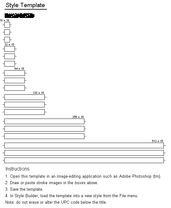
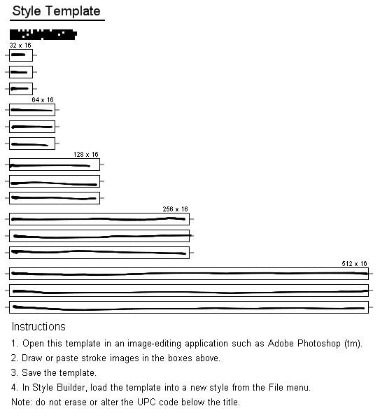
The first job is to open Style Builder and generate a template to work with. You’ll do that under the File menu. the template will be a PNG image as you see above. You can choose the number of line lengths in pixels and how many of each length. This template is for lines from 16 pixels long to 512 pixels. The boxes are set up to be 16 pixels high in this case but there are several variations available for that as well.

Next, fill in the boxes with your lines. You could print the image and draw the lines by hand. Then scan the image to get it back into your computer. Or you can use any of a number of programs such as PhotoShop, Corel Painter and MyPaint to draw the lines digitally. Choose a brush and use it to draw the lines in the boxes. You can do this with a mouse but if you have access to a pressure sensitve table and stylus, you’ll have even more control over the sorts of lines you’ll get. After you’ve drawn the lines, save the image. this will be your lines template to load back into Style Builder. whatever you do, you want to make sure that the image size isn’t changed. there’s a bar code right under the Style Template title that Style Builder will be looking for. If that isn’t in the right place or isn’t the right size, the program won’t be able to load the template.
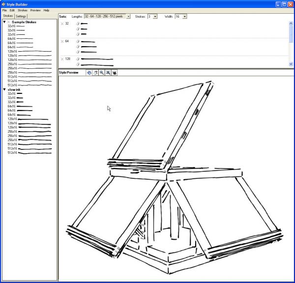
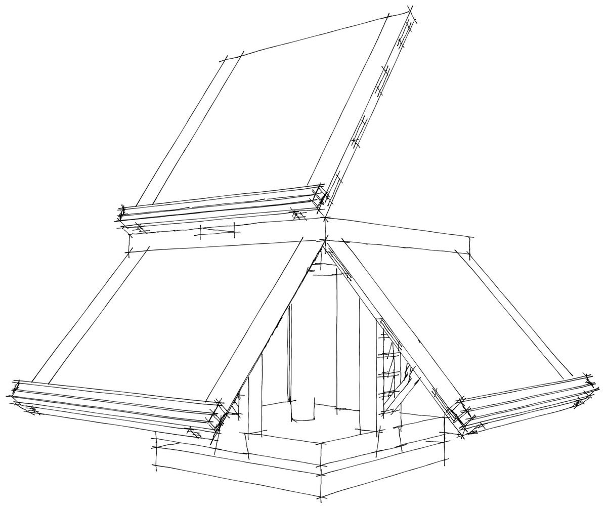
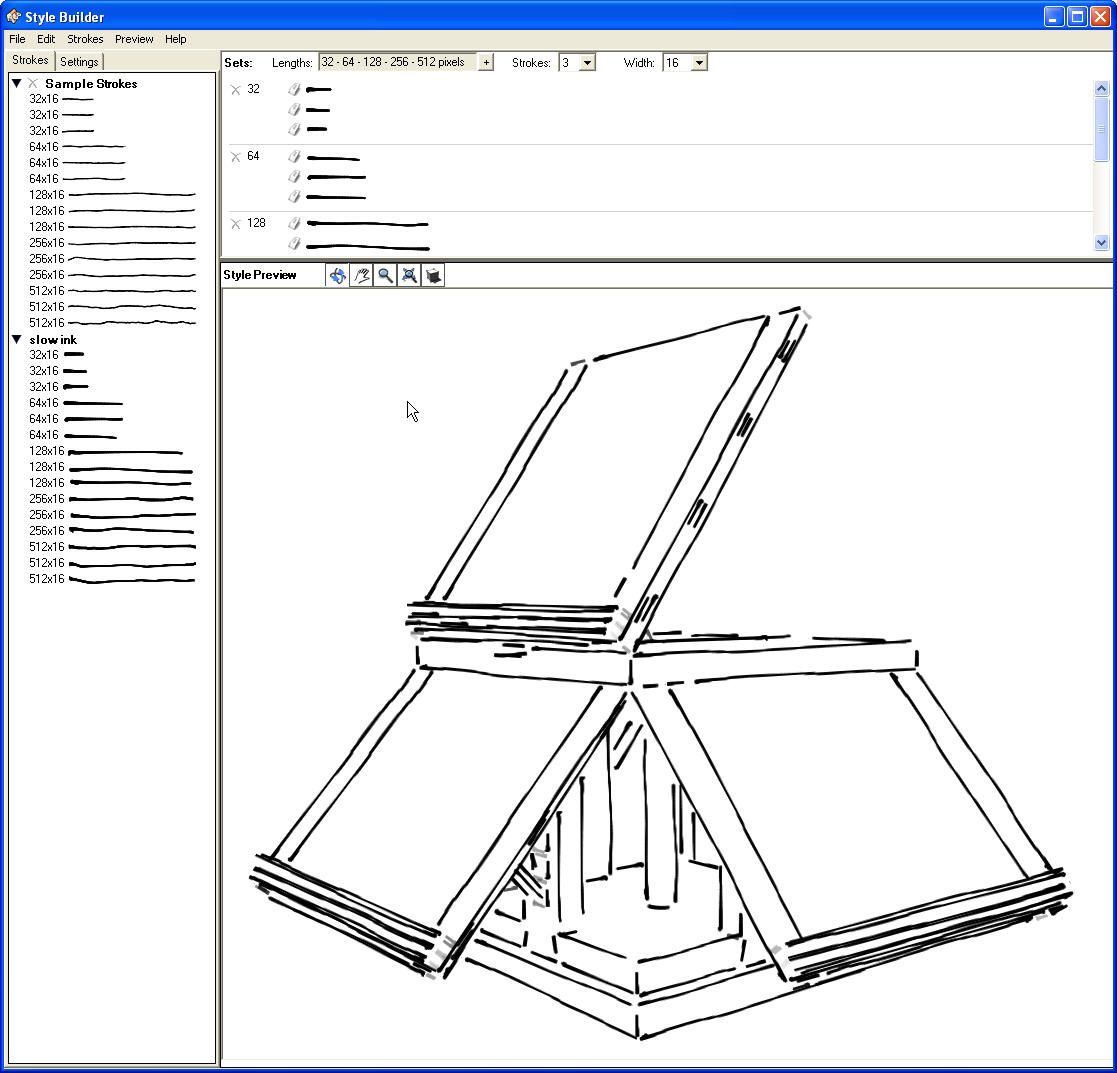
Open Style Builder and go to the File menu. Choose Load Template and select the template file containing the lines you’ve drawn. they’ll load in the left hand pane of the screen. They’ll also be applied in the appropriate slots in the top right pane. The lower left pane is a SketchUp model to which the line style will be applied as an example. By default a model of a house but for this example I’ve replaced it with a model I drew of Thomas Jefferson’s book stand. I think it is a good idea to use a model that would be typical of the sorts of things you draw so you can get an idea of how the details will render out. You can orbit and zoom in this window to look at various parts of the model as needed.
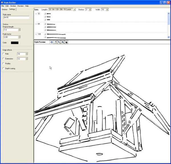
In the previous image you can see some gray lines at the ends of the book supports on the easels These appear that way because in the view, those lines are shorter than the “dropout” setting will allow to be delayed. The default is 1.0. In the image above you can see some longer gray lines along the edges of the easels. This shows that some of the lines I drew aren’t centered. If you want you can delete some of the lines from the top pane or you can exchange lines. You can use the same line for all three versions or even mix and match lines from different styles if you want.
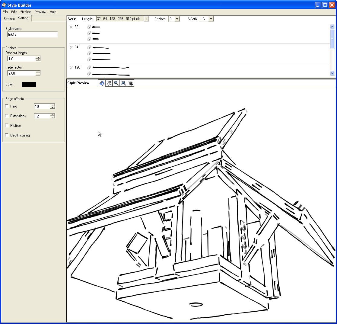
Click on the Settings tab and you can make style adjustments to suit your tastes. Dropout affects the level of detail you’ll have in your model the lower the number, the more detail you’ll get. You can change that in SketchUp directly as well by adjusting the Level of Detail slider in the Edge settings of the Edit tab in the Styles browser. You can adjust the Fade Factor, line color and details such as how long extensions and halos are. Extension and Halo are defined in pixels and these are also adjustable later in SketchUp.
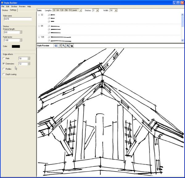
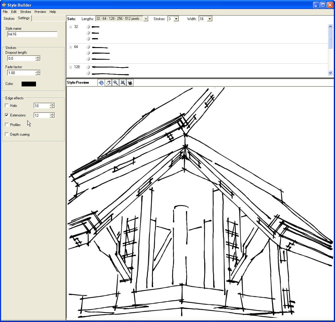
In the image above, I’ve set Dropout to 0, Fade Factor to 1.0, enabled extensions and set them to the default 12 pixels. You can see the lines cross over each other and there’s better detail in the short lines. You can experiment with these settings as well as play with the scaling of the lines b changing the width in the upper pane. for this example I left the line width at 16 pixels.
Once you’ve got the line style looking the way you want it, give it a name under the Settings tab and then use File>Save to save the style. You can modify the style and use File Save as… to create other styles from the same lines if you wish. When you save the style put it into a folder under …/Google SketchUp 8/Styles. You can make a new folder or use an existing one. By putting it there you’ll have it available immediately for use when you open SketchUp.
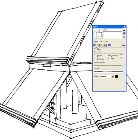
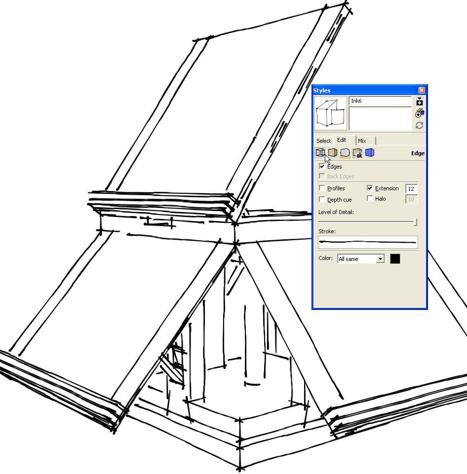
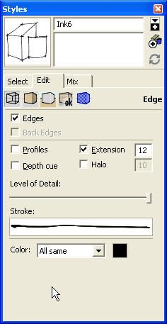
Now I’ve got the Jefferson book stand model opened in SketchUp and the line style from above applied. In the Styles dialog I’ve clicked on the Edit tab and then the little wireframe cube below the word ‘Select’ to get to the Edge style editing options.
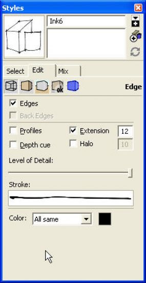
You can see the settings I made in Style Builder show here and they can be changed as desired. These settings can be changed from model to model if desired without modifying the original style.
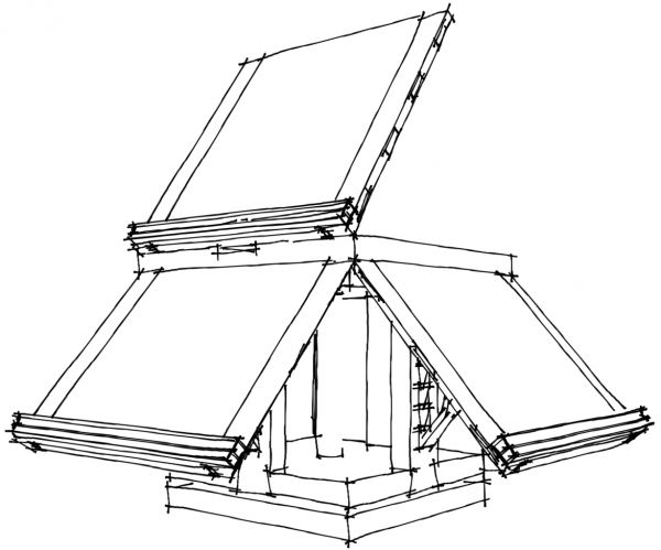
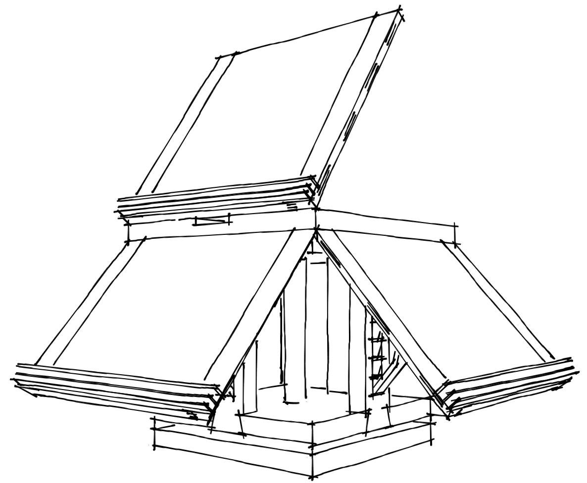
This is an exported image of the model with the style applied to it. This was exported at screen size which on my computer is 1600 pixels wide. I cropped the image after export to eliminate unneeded background.
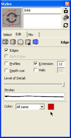
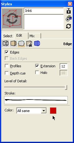
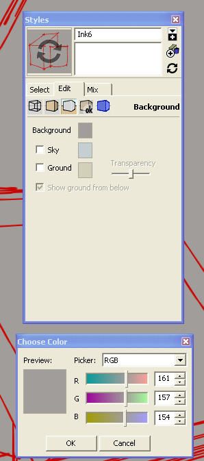
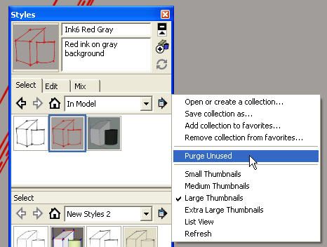
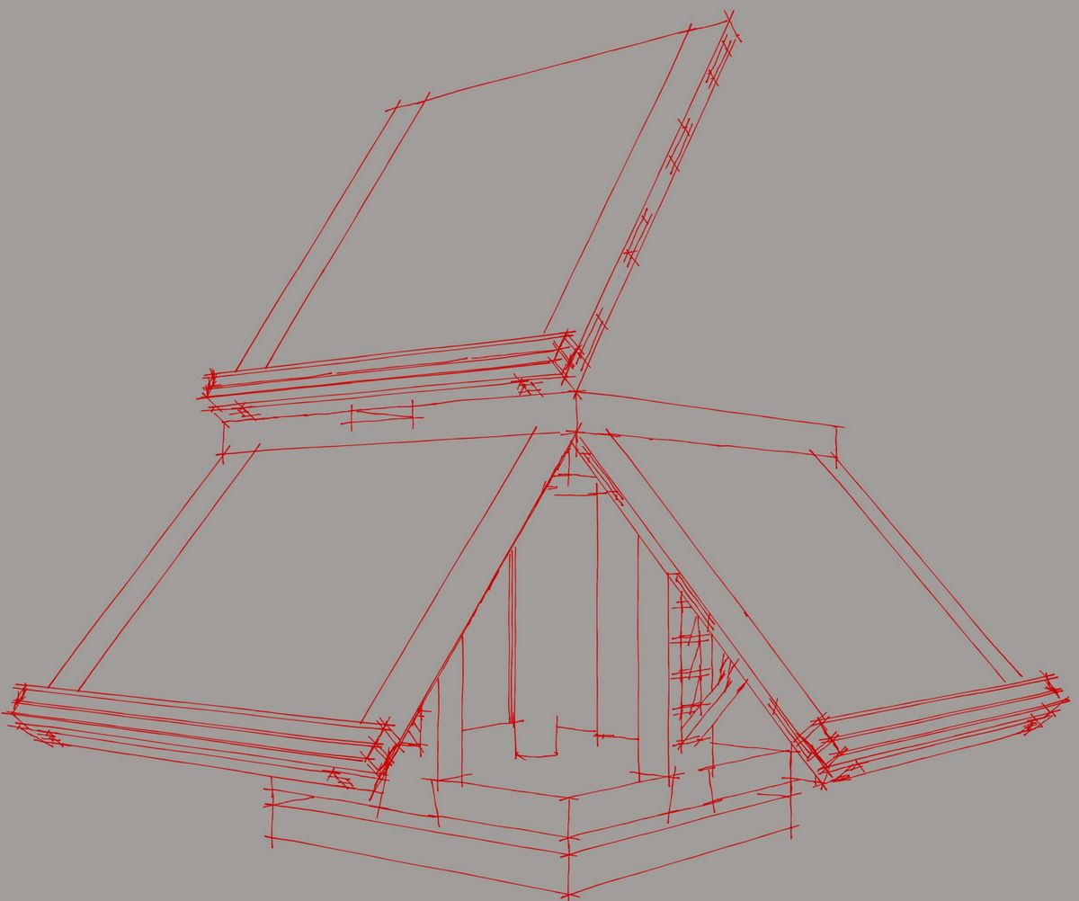
In the above image, I’ve changed the line color to red by clicking on what was the black box and making the color adjustment. As you can see in the thumbnail I’ve also changed the background color to gray. this was done under the Background edit settings which are accessed by clicking on the center cube icon of those five below the edit tab. the circular arrows indicate that the style has been modified.
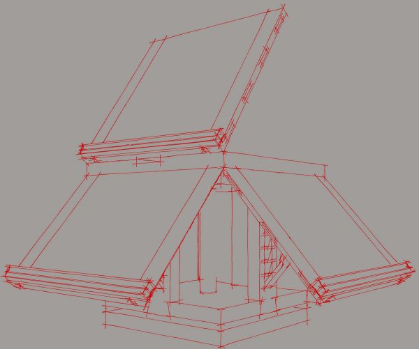
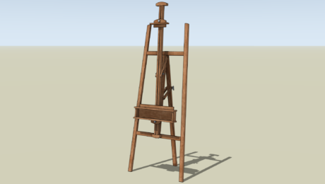
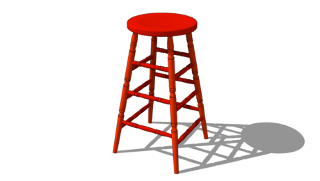
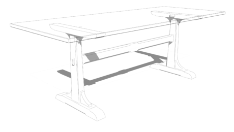
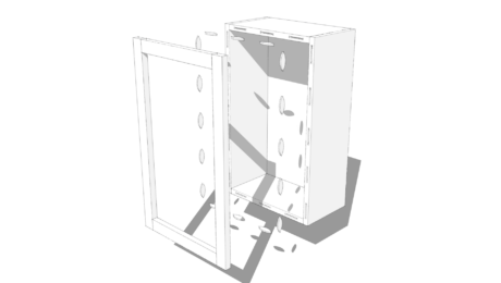
This is the result of those changes to the style. In this image as well as the one at the head of this post, the lines appear much thinner than they do in the screen grab. This is because these images were exported at 4000 pixels wide. The image was then cropped as before to get rid of the unneeded background on the sides. When you make styles, you’ll want to consider the resolution at which you intend to export images from SketchUp. The same style can look quite different at different resolutions. You’ll notice with the higher resolution images there are more short lines displayed. Just be aware that if you set the resolution too high, it is possible that some lines may be very faint or disappear altogether because they are so thin. due to image compression for the blog, the images aren’t as sharp as the originals exported from SketchUp.
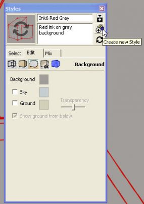
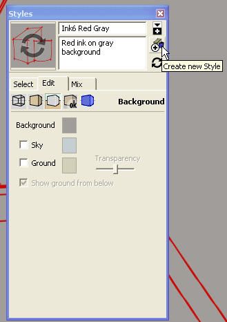
After you’ve modified a style in SketchUp you can update it by clicking on the thumbnail for it or the circular arrows button on the right hand side or you can create a new style. If you want to create a new style, type a new name for it or modify the existing one. Add a description if you wish. this can be useful if you are combining parts of other styles so you can later identify which styles you’ve used. Then click on Create new style. this creates your new style in the In Model library but doesn’t add it to a library for future use. to do that, click on the button immediately above the Create new Style button. this will open a second Styles browser pane.
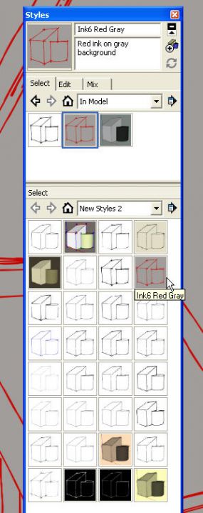
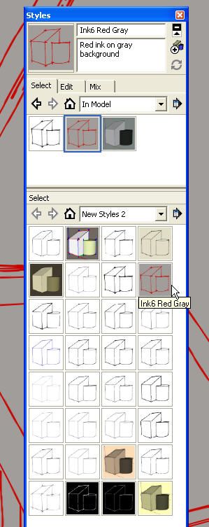
With the second pane open, set the top pane to In Model. You can just click on the little house icon for that. Set the lower pane to the desired library. Here I’ve chosen New Styles 2 which is a library I made for some of my styles. then click on the thumbnail for the style in the In Model library and drag it down to the other pane.

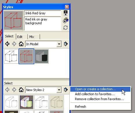
If you want to make a new library, you can do it from the Styles browser. Click on the arrow that points out to the right to the right of New Styles 2 in the example. Then click on Open or Create a collection… You can then select an existing folder or create a new one. After creating a new library you’ll want to click on the arrow again and click on Add collection to favorites… to make sure it shows up the next time you want it.
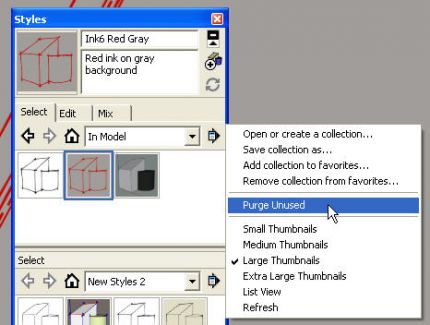
It is important to note as you are experimenting with styles that every style you test gets added to the In Model library. This means that they add to the file size of your model even if you aren’t using them. It’s a good idea, then, to Purge Unused styles. Notice that this menu option is only present when you open the menu for the In Model library. If there are no unused styles, Purge Unused will be grayed out. If there are styles there that you want to save, make sure you save them before purging.
As with styles, components and materials that you have used in your model, even if they aren’t currently used in the model are saved as part of the In Model libraries. You should purge those libraries in the same way if you won’t be using those things later. Purge unused components before unused materials.
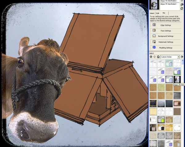
Admittedly the image above is kind of silly. It uses the Ink6 line style I created for this blog post and an old watermark image style which was a collaboration with a friend a few years ago. The old camera view finder and the cow are images added as watermarks.
To mix parts of various styles, click on the Mix tab. Then click and drag on the thumbnail for the style you want and drag it up to the line representing the portion of the style you want to use. If you’ll want to use this new style again, follow the steps above for saving the new style.
I hope you’ll explore the Styles options and give some of this a try. Even if you are using the free version you can at least download a few new styles and try them out. Maybe edit them to make different styles. If you’ve got the pro version of SketchUp and never tried Style Builder, give it a go. You might come up with a signature style for your drawings.












Comments
Dave, your post reminds me that I wanted to ask whether SU is compatible with those digital "pens" some designers use in lieu of a common mouse. I suppose you would need to lift and tap the pen to start a line and that sort of thing, but it seems like it might be an intuitive way to use the system. Do you know if this is an option for this program when using a PC?
@JFink-
Have a look at the Wacom Tablets. I use one on the office computer and LOVE it with SU. They aren't cheep, but are amazing!
@JFink-
Have a look at the Wacom Tablets. I use one on the office computer and LOVE it with SU. They aren't cheep, but are amazing! You can get away with most inexpensive and small ones. IMO.
Hi JFink,
I've tried using both my Intuous 4 tablet and Cintiq display/tablet with SketchUp. It works after a fashion. the stylus tip runs the cursor around just fine. I found it clumsy though and I missed the center mouse wheel/button for zooming and orbiting. To be fair there is a touch ring on the Intuous 4 and a touch strip on back of the Cintiq for zooming. I've heard from several others that they have tried SketchUp with a tablet and didn't like it so much, either. I'm left handed, too although I use the mouse right handed so it might also be that I find it difficult because I have to swap hands for tasks.
That said, I wouldn't want to talk you out of trying it if you have the opportunity. I wouldn't buy a tablet exclusively to try it but if you were going to get one anyway for other things, give it a shot. You might find it suits you.
-Dave
The problem I've noticed with tablet/pens is that although they seem like a nice way to *draw* they are lousy ways to *navigate* in SU. A mouse with a scrollwheel makes it really easy to zoom out rotate, zoom back in and get to a new viewpoint in double-quick time. For me, that ends up being more of the time than might be saved by having a nice pen to draw with. Having to frequently swap would become terribly annoying.
Perhaps a pen with a scrollwheel would work? You could possibly find other useful things to do with a wheel on a pen.
Tim, I think you said what I was trying to say much better. Thank you. In defense of the Wacom tablet and display that I own, there is a control for zooming built in. It's a nice touch strip on the back of the Cintiq but after much time using the mouse, I think it is difficult to get used to. And the Orbit tool would be even more difficult to use although you could probably assign key shortcut to one of the keys on the tablet to get to the Orbit tool.
As far as input devices go, some folks like the Space Navigator for navigating in SketchUp. I didn't like it because it takes my left hand away from the keyboard. For me a simple mouse and keyboard are best but it might be that others will have the same sort of experience as PORC.
Dave,
Thanks for the great explanation of SU styles. You may want to give the Space Navigator another shot.
Whether you are using a Space Navigator, a Intuos4 or a mouse the key to productivity is the custom programing of the buttons.
I too was bothered by having to take my hand away from the keyboard. I knew which commands I used most and looked for ways to assign those commands to the Space Navigator and the Mouse.
The space navigator is a superior way to navigate through a design quickly. The two button were programmed to SketchUps "Zoom Extents" and "Space Bar". The space bar is the main reason I needed a hand on the keyboard to back out of a command.
I use a Logitech MX Revolution mouse and programmed those buttons to cover the following commands,
Forward button = Move
Back Button = Push/Pull
Bump Scroll wheel left = Tape Measure
Bump Scroll wheel right = Rectangle tool
Search button = Rotate
With both devices mapped I only have to touch the keyboard to enter a precise value or name a component.
Even though I love this setup I finally bought a Wacom Intuos4 Small because I started using PhotoShop and Illustrator more regularly. Instead of switching between devices, I hope to find a combination that will be similarly efficient. Like others have mentioned, SU navigation is poor with a Wacom alone, but when combined with the Space Navigator you should be able achieve great productivity. The Wacom has a feature called Radial Menu which can be programmed to a button on the pen. When enabled you get an instant on-screen menu that allows you to select programmed commands for SketchUp and other programs. This is just the tip of the iceberg as far as the customization that is available.
It takes time to define your needs, but it is well worth the effort.
Thanks!
Thanks,
I think I'll leave my Space Navigators in their boxes (I have two of them) because I didn't like them with SketchUp. I did give it a try but I use more keyboard shortcuts than there are buttons to map. Since I use SketchUp on four different machines, I think it makes more sense for me to stick with the common, everyday old mouse with wheel/center button. Then I don't have to change my working process from machine to machine. Besides, after seven plus years of using SketchUp with a simple mouse, it would be a pain to change.
The Cintiq is used with SketchUp as the second monitor for looking at reference materials. Otherwise it's my image editing tool.
Log in or create an account to post a comment.
Sign up Log in