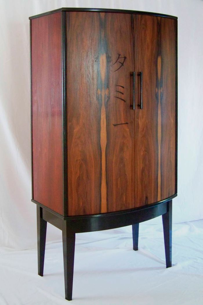
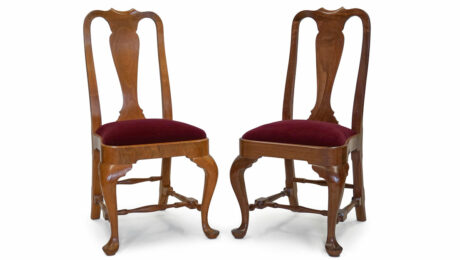
Here's the original. This is a nice piece, but it does have a few problems.
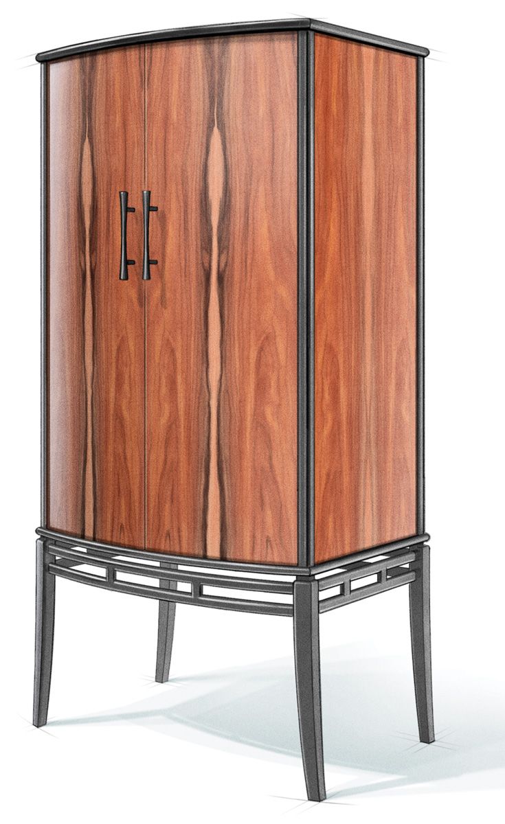
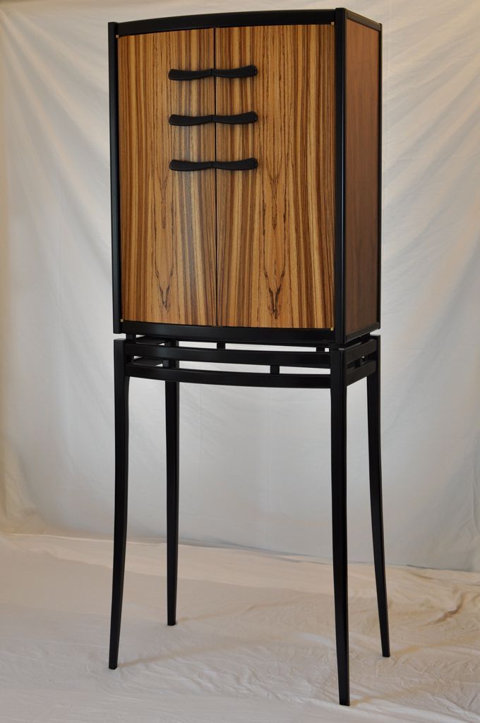
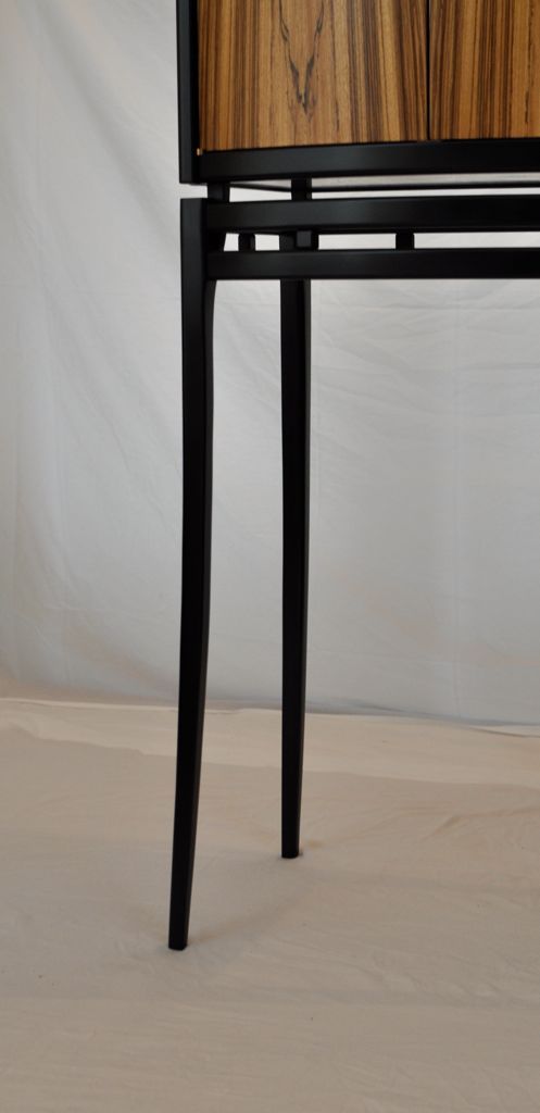
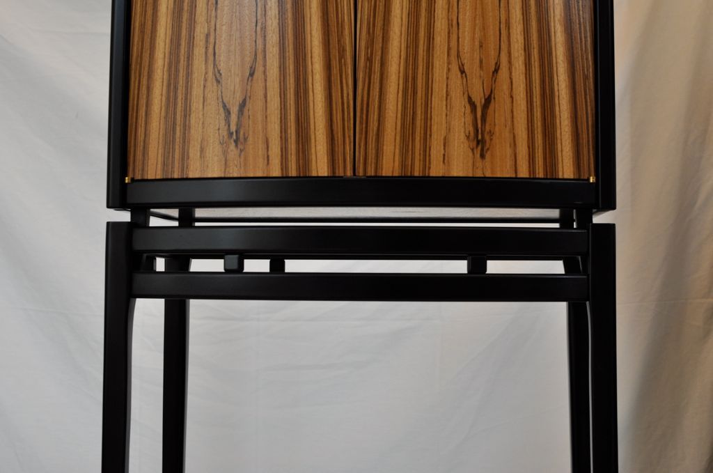
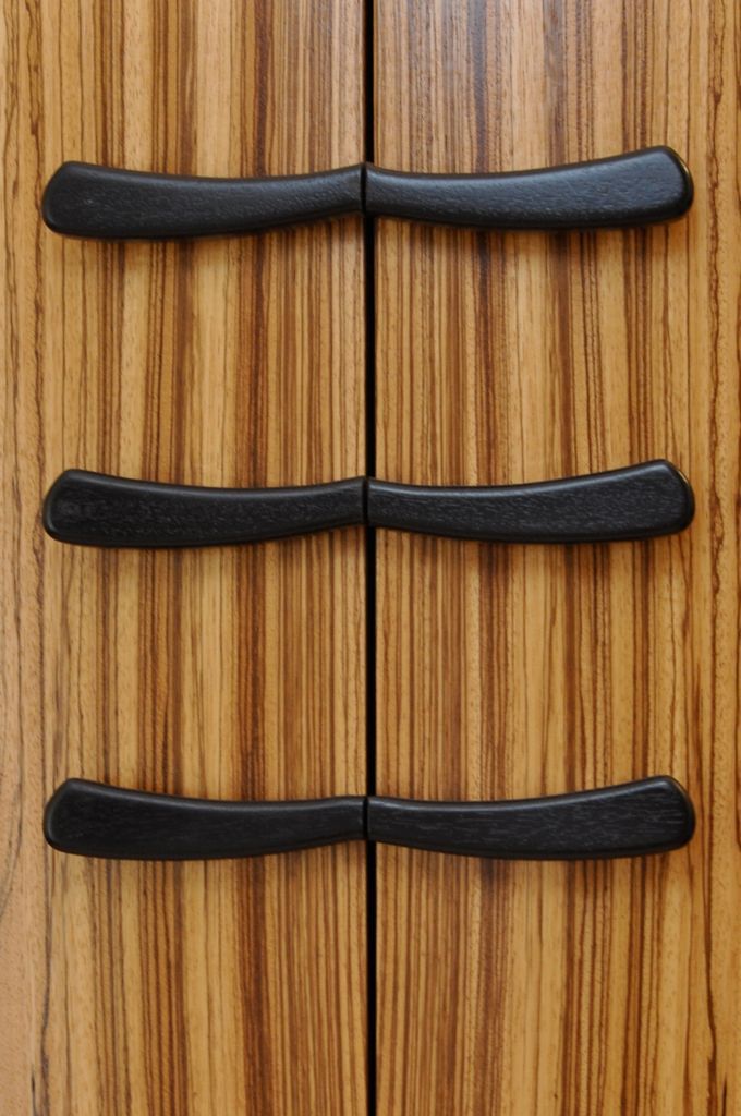
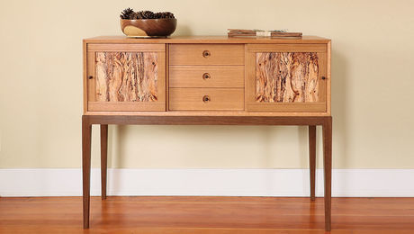
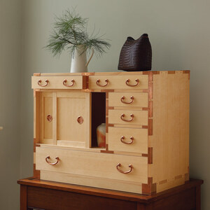
Some of you might remember the article “A Visit to the Design Doctor” (FWW#214, p. 60). Designer and furniture maker Hank Gilpin offered design advice to three readers. And those readers were brave souls, because they actually sent Hank photos of a piece of furniture they had made and he gave them an honest evaluation of its merits and shortfalls. Two of the readers, Stephen Harding and Brian Havens, later remade their pieces with Hank’s advice in mind. Brian recently sent me photos of his second take on his Asian-inspired cabinet-on-stand. I think he did a great job, and so does Hank.
Take a look at how well he did, and give him your congratulations in the comments section. He really is to be commended for volunteering in the first place, and for reworking his design.









Comments
Awesome Brian. Cool to see real world example of good, better, best (as Albert Sack would say http://www.amazon.com/New-Fine-Points-Furniture-Masterpiece/dp/051758820X)
It's a work of art! Thanks for sharing.
Yes. Wow. A quantum leap finer. Excellent design and execution. How's the view from up there, Brian? Hope to get there myself someday.
I am impressed. Brian, you really took the advice and pulled if off. The piece has a delicate, modern flavor with a hint of Asian inspiration. It really sits well, as the various elements work well together. Bravo!
It’s hard to design something that looks good against a grey or black backdrop; it’s much harder to design a piece that will also work harmoniously in a real room where real people live. Your cabinet is beautiful, but it’s also functional and easy to live with. Congratulations!
I like both of them! The new design is cleaner and fresher. However, the original design had the original builder's own stamp on it. Cleaner or original? How about both? :)
Log in or create an account to post a comment.
Sign up Log in