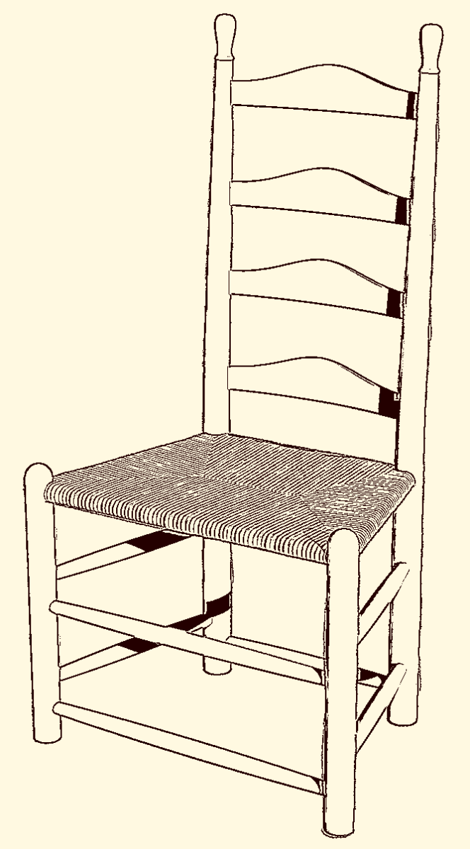
The other day I was looking through an old book and came across a ladder back chair with a rush seat. I thought it would make an interesting excercise in SketchUp and commenced to drawing it. I made a comment to a friend that it didn’t take a lot of time to draw because I used some handy plugins. He suggested I give a quick description of what I did so here it is.

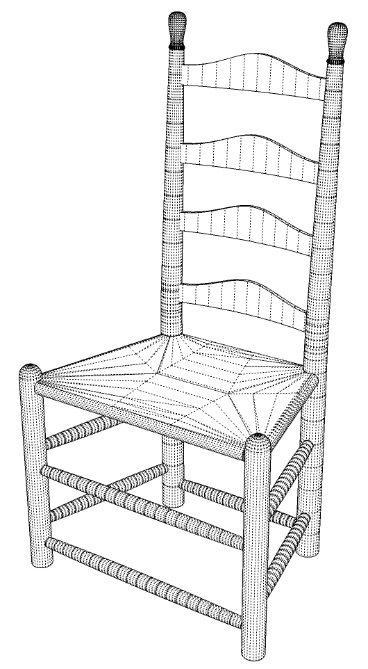
Here’s an overall view showing the hidden geometry. The basic process is very straightforward and like anything, if you go through it in a methodical way, it is quite manageable. Remember a few key things to make the work easier and more efficient. Draw parts in situ to avoid excessive move operations and potential errors. Make a component of one part before you move on to the next one. Get as much of the component completed as possible before moving on to the next part. This is especially useful when other components will be drawn in reference to the ones you already have.

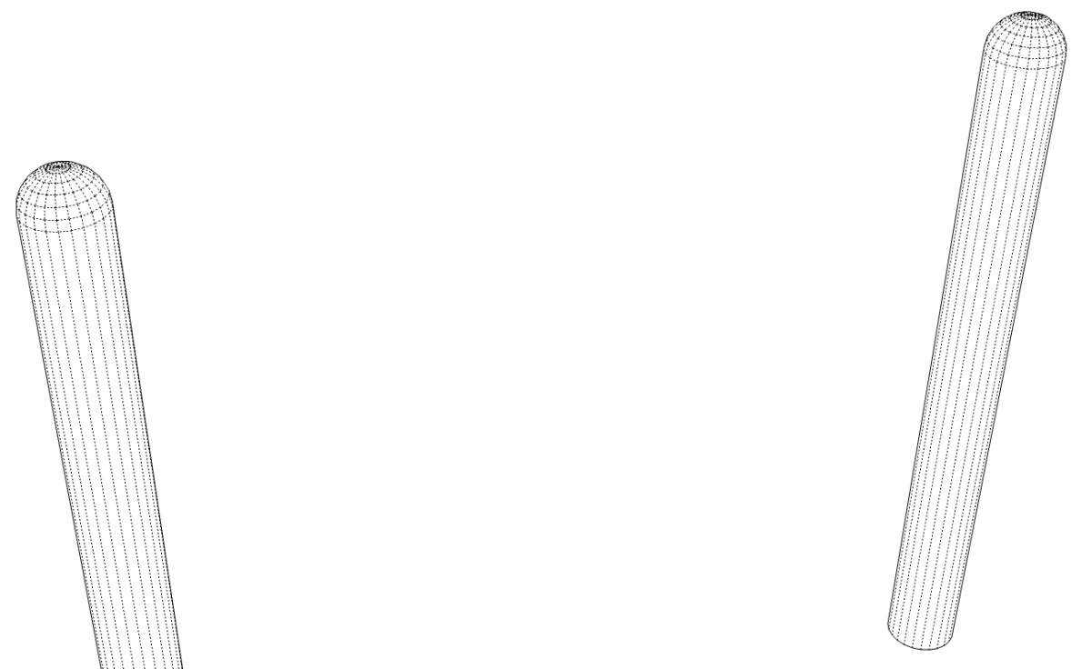
I started at the origin with the front leg. This is a simple cylinder with the top rounded over. There are several ways to round over the top including drawing a profile and running Follow Me. I used the Round Corner plugin, though. Select the top edge of the cylinder, activate the tool, set the radius and hit enter. After the first leg was drawn, I copied it over to the proper location for the other leg. I also made sure to flip the leg along the red axis so it would be mirroerd. It doesn’t look any different at this stage but later, when the mortises are put in for the runs, they’ll be located correctly in both component instances. I also took a few moments to change the component axes so they are located at the center of the bottom face. This will make it easier to precisely insert the post later if I wantt o bring it in from the component library.
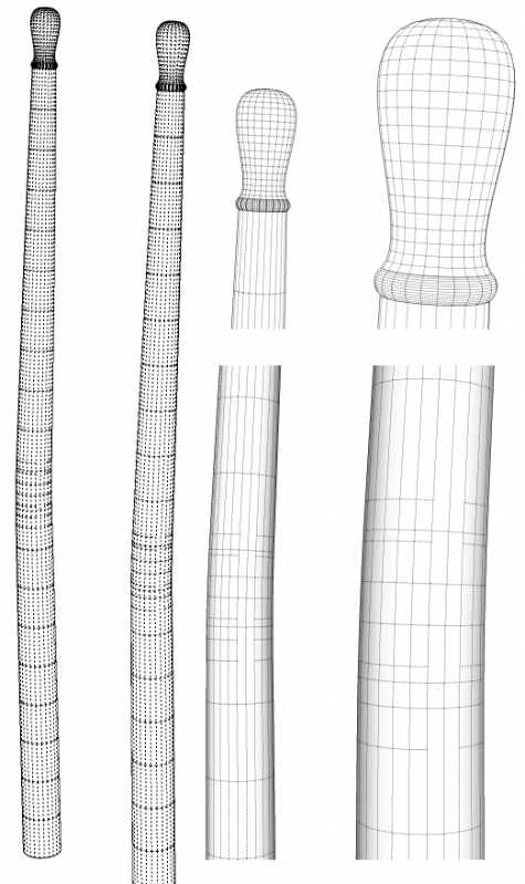
The back posts are slightly more involved. The original chair has a straight back but I decided to put a little bend in it. After using some guidelines based off the front legs, I located the centers of the back posts. I drew a vertical plane on which to draw the profile of the straight post. The posts have a bit of taper which I put in with Bezier.rb. I used Bezier to draw the knob as well. You could also use You could also use Bezier Spline Tools for this. The bead at the base of the knob was drawn with the arc tool.
Follow me made quick work of turning the back post. Then I wanted a 3° bend in the post. The bend occurs just above the seat rails. I used the Radial Bend tool in FredoScale for this. You can see the additional hidden lines in the vicinity of the bend. The post was then made into a component and its axes were changed so the origin is at the center of the bottom faces as I did for the front legs.
Since this post was drawn in place at the back left corner (as you’re facing the chair), I copied it over to the right and put that copy in the correct location. Then I made sure to flip it along the red axis.

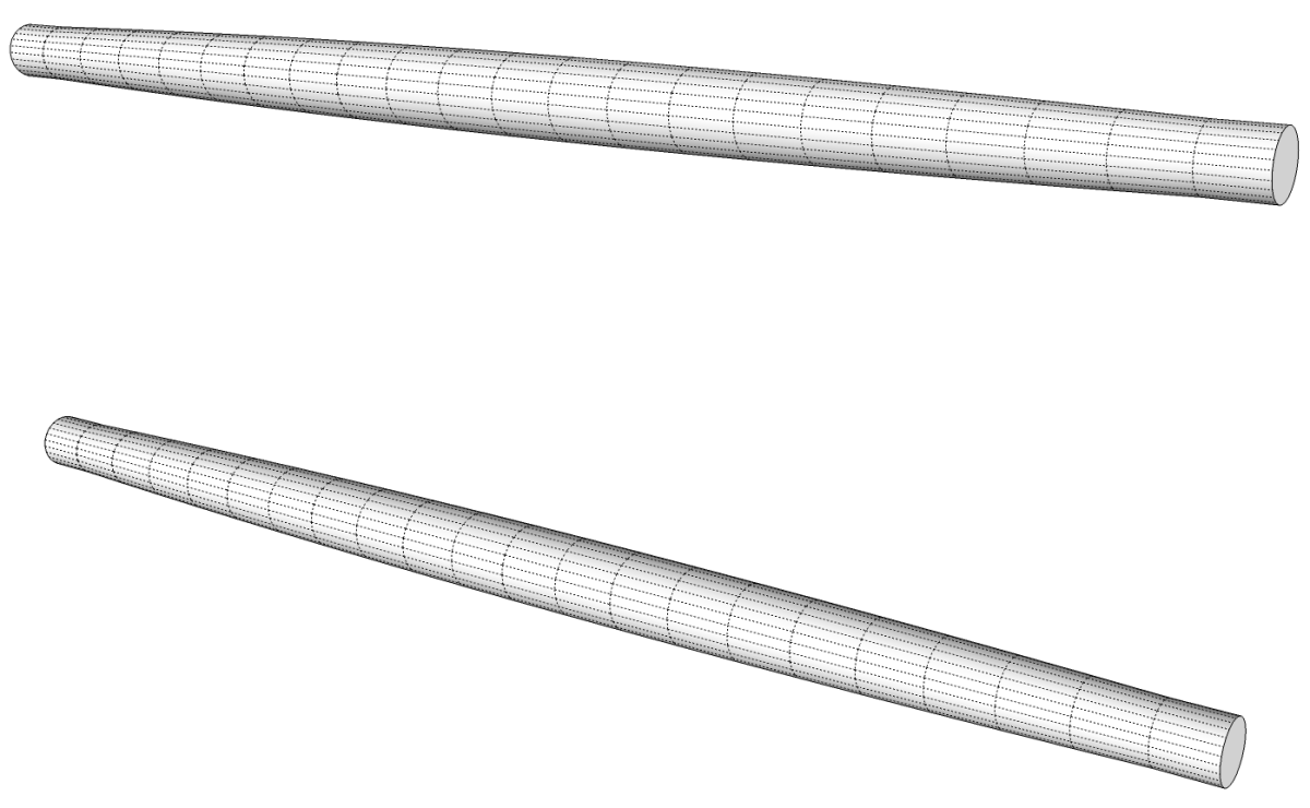
Next I moved on to the front rungs. Of course I only drew one and then copied it to make the other. I located the center line of the bottom rung between the two front legs at the correct height. Then I drew a profile using Bezier between the two legs. I didn’t bother with the tenons on the ends at this stage. The rungs only just fit between the legs.
After making the rung into a component, I copied it up to make the other front rung. Then I select both front rungs and copy/rotated them around the centerline of a front leg to make one set of the side rungs. After making those copies, they were made unique and moved up the proper distance. Then they copied to the opposite side and flipped along the red direction. Obviously these rungs were too long. I opened one of them for editing and used Scale to shorten up the rung. I scaled from the rear end and, rather than figuring out a scale factor, I scaled to the front side of the back post. If you were drawing these parts scattered about with the intention of moving them into place later, you wouldn’t have the post as a reference.
I copied the bottom front rung to the back, made the copy unique and scaled it to fit between the legs. I copied the rung straight back and scaled it while holding Ctrl to invoke Scale About Center. I was able to use the back post as a reference for the scale distance. Be sure you open the component for editing before scaling so that you modify the component definition correctly.
It’s not real obvious in the drawing but the end sections are actually the cylindrical tenons. Instead of drawing the tenon as part of the profile, I used Push/Pull to pull the ends out after using Follow Me on the profile. I left the tenons until all of the rungs were in place. Since I used Scale to change the length of the rungs, if the tenons had been drawn before scaling, their lengths would have been scaled, too.
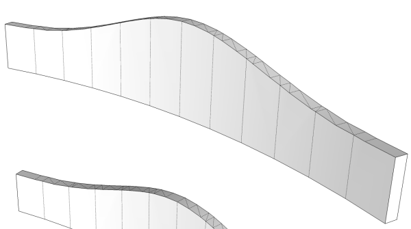
The back slats are identical so I only drew one. I started out by drawing a flat one and then used Shape Bender to bend it. I could have used Radial Bend as I did on the back post instead. I made an exception to the rule of drawing in situ for this part. Shape Bender rrequires that the original be drawn parallel to the red axis and the curve to which the component is bent must be in the same orientation. I drew the flat slat standing upright and after getting the bent one, I moved that into place at the top of the back posts. Then I copied it to make the other three and rotated them into the proper alignment. I selected all of them and rotated them together 3° to match the angle on the back posts.

The seat was perhaps the most involved part of the whole chair. I guess it would be in reality, too.
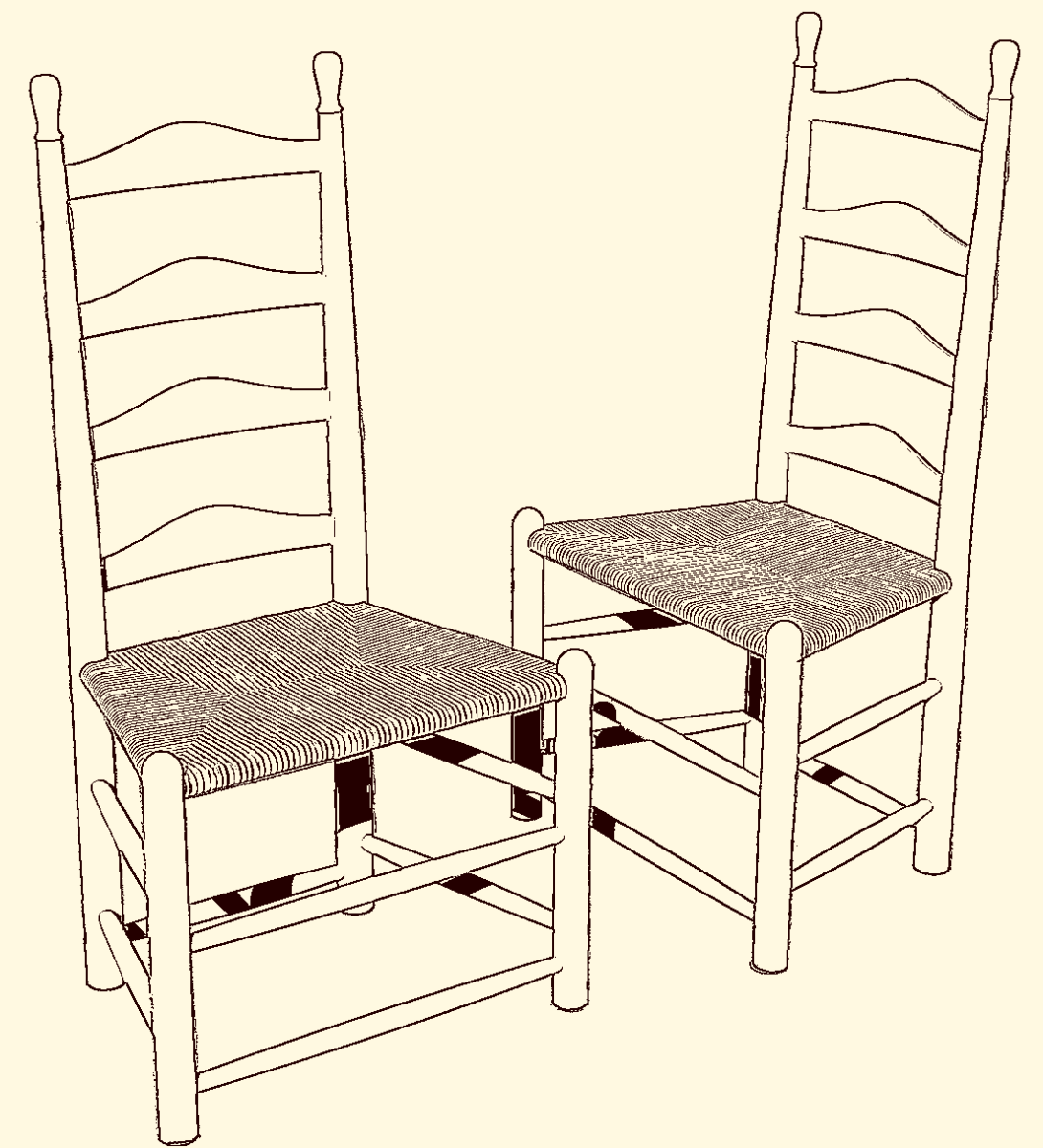
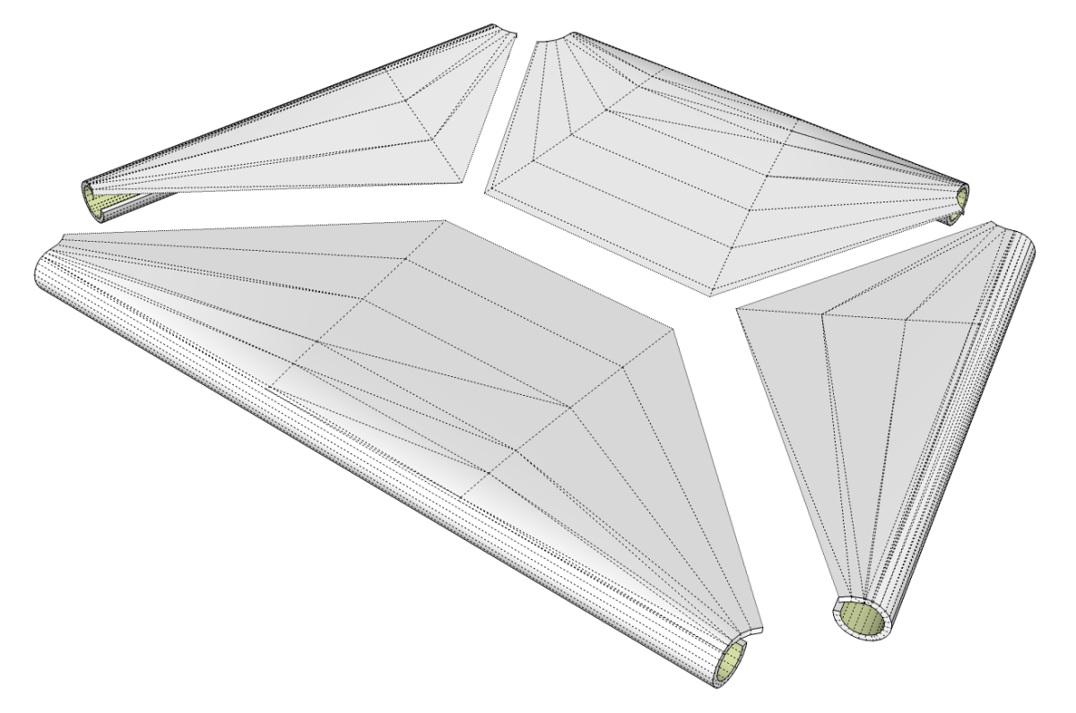
As you can see in the image above, I drew the seat as four quadrants. the left and right side are instances of the same component so I really only made three. I laide out the lines dividing the sections. This is where the rushes cross in the weaving process. I drew it flat and then pulled the middle line down a bit with the Move tool. then I drew around the legs and seat rails. I created the surfaces using the Skinning tool in Curviloft although there are several other plugins such as the Extrude Tools with which this could be done. After getting the surfaces, I wanted to give the seat a bit of thickness so the edges where the rushes wrap over the seat rails would be thicker. I used Joint Push/Pull for that. As you can see by the back face color, green in the image, there are no surfaces on the underside. Unless you were to look at the bottom of the chair, it wouldn’t show and leaving the surfaces out helps to keep the file size down a bit. Curviloft leaves the surfaces as groups but I converted them to components.
When I was finished with the individual seat components I selected them all and made a nested component to make it behave as a single entity for selection purposes.
With the seat component drawn, the chair was complete except for the mortises. I haven’t done them yet but they could be created in a number of ways. You could use Intersection, you could draw them in manually or, if you have the pro version of SketchUp 8, you could use the Solid Tools.
You may already have some or all of the plugins I’ve mentioned. If you’ve had them for a long time, you may want to download and install them again. Many of the plugins were updated in the last 6 months to take advantage of some of the changes in the Ruby API with SketchUp 8. Also make sure you download any required acompanying files and install them as well. Many of the links I’ve posted point to threads on the Sketchucation Forum where these plugins are hosted. Carefully read the first post in those threads to see if there are other required files and to get links to guides to help you learn how to use the plugins.












Log in or create an account to post a comment.
Sign up Log in