Creating New Materials
Last week I was asked to describe how I make wood grain materials for use in SketchUp. Here’s a bit of the discussion we had.
To start with, I find some useful images. For wood grain materials I prefer images of whole boards rather than the typical square or nearly square images you often find. Unless the wood is very straight grained and plain looking, images of short sections of the wood tend to work poorly in SketchUp because the image must be repeated. If there is any sort of grain features such as cathedral grain or knots, it quickly becomes obvious and I think distracting.
Many folks search for seamless grain patterns so they can repeat and not look like tiles. Wood doesn’t do that naturally and I figure if you want seamless, go with plastic laminate instead.


Here are images of three pieces of hickory. The original images were a bit longer and the natural edges of the boards as well as sapwood were visible. In an image editor I adjusted the color a bit to give it a finished look and I cropped the images down. The finished length of the images covers nine feet on all three boards and the width is whatever it turns out to be.
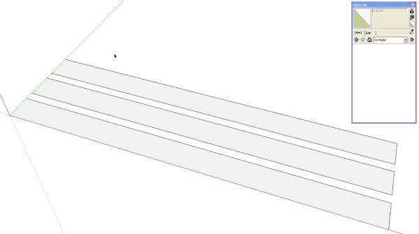
Now in SketchUp, I drew a rectangle nine feet long and of some arbitrary width. The length is the only critcial dimension in this case since the material length is known. I made a couple of copies of the rectangle. One for each material image.
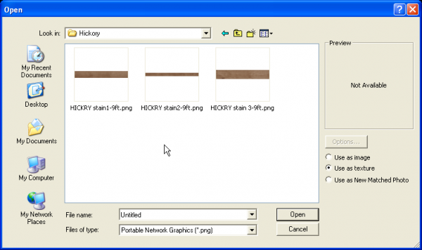
Under File>Import, navigate to the saved images. Select one and make sure Use as Texture is selected. Click on Open.
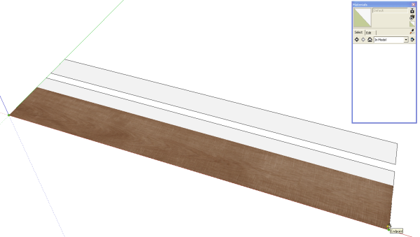
After clicking on Open you go back to the model. Click in one corner and drag the image out to the full length of the rectangle. In the example, above, the image is wider than the rectangle but that’s alright. By creating a face of the right length and dragging the material out to that length, the material is automatically scaled correctly.
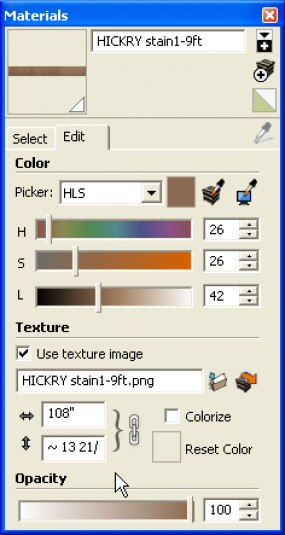
If you don’t make the face to match the known dimension of the material you can scale it afterward by editing the material in the Materials browser. You can see in the above image that the hickory material is 108″ long and 13 and something wide.
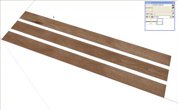
The process is repeated for the other wood grain images I’ve prepared. The materials are only in the In model library at this point. In order to make them available in other models we need to save them into a different library.
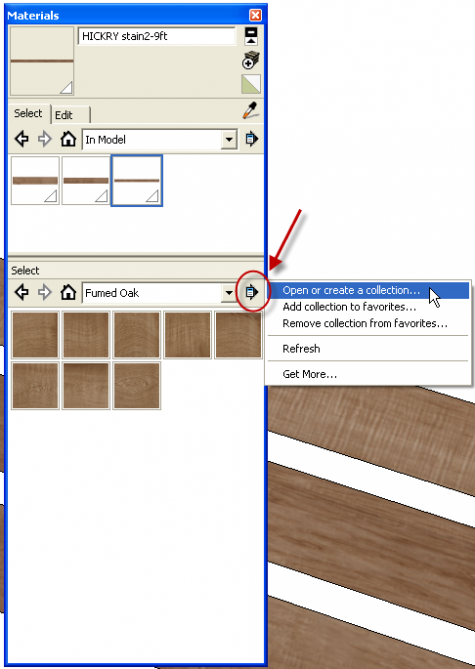
In the upper right corner of the materials box click on the little white plus sign on the black field. This opens the seconday pane. Choose the desired destination library or create a new one. I’m creating a new library for hickory so I click on Open or create a collection… and navigate to the location in which I want to create the new collection. I add a new folder called Hickory. With that new library shown in the lower pane, click on the arrow to open the Detail menu and choose Add to Favorites.
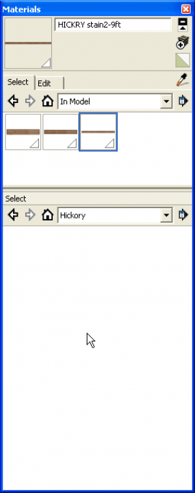
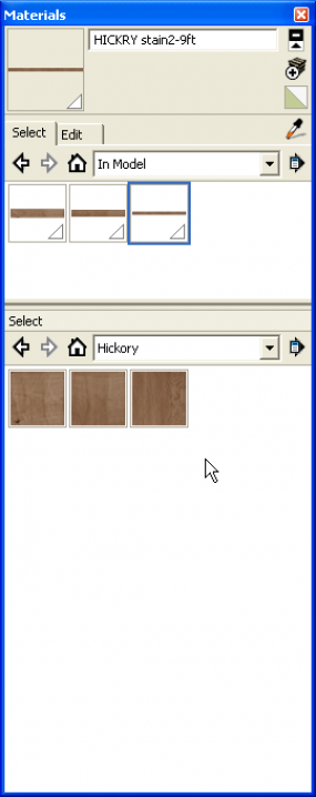
Now the bottom pane shows the empty library. To save the new materials into the desired collection, Click and drag the thumbnail from the top, In Model pain to the lower pane. Now they are available for use in various models.
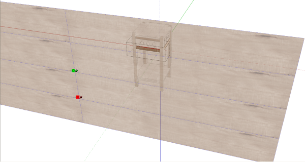
For this example I am applying the hickory material to the fern stand I drew some time ago. In this image I’ve applied the material to the front face of the lower rail. I then right clicked on the face and chosee Texture>Position to display the full size of the texture image relative to the rail. At this point the material can be moved around to select a likely portion for the rail. Doing the same thing for the legs, I can rotate the material 90° to make it vertical. The slats between the rails also get vertical grain. After applying the material to the faces of a leg components, the material’s orientation can be sampled and applied to the faces of the slats. By moving the material around, you can prevent repetition of the grain. With the image as large as this one is, the entire stand can be textured from it with no real apparent repetition.
It is important to note that inorder to have the option to adjust the postion and rotation of the material, you must use the method of applying the material to the faces which requires opening the components for editing. If you choose the method of applying materials to components instead of to the faces, you won’t have the option of making the adjustments.
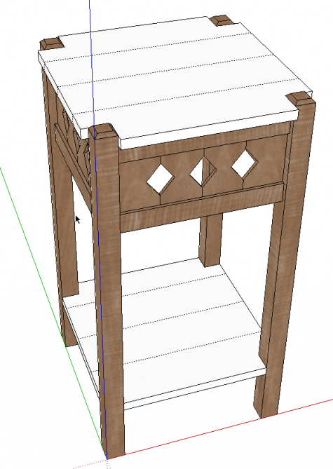
All that’s left is to paint the top and the shelf. The ribbon grain on the legs should probably be changed. It looks like the grain is running horizontally. I can select a different portion of the board or another of the three materials.
In the image above, you can see the hidden lines I’ve drawn on the top and shelf to represent the edge-glued boards. By hiding the lines they won’t be visible as edges but they allow the material to be split into narrower parts and each part can then be adjusted for material position.
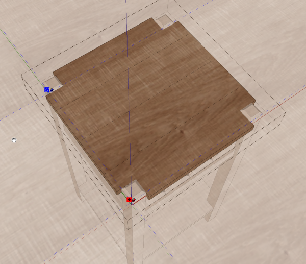
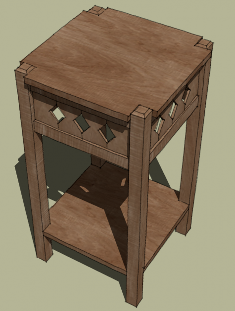
You can see now that the material appears to be from a single board but there’s no pattern of repetition on the top or the shelf and no need for a seamless material.
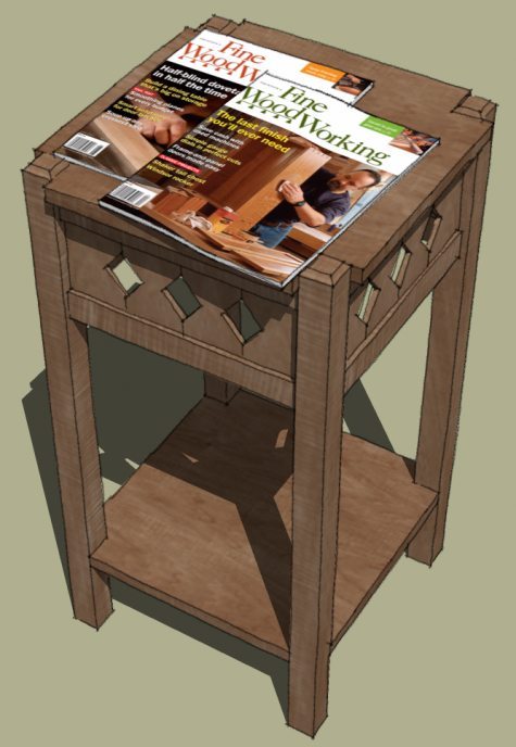
To create the magazines on the top of the stand, I used the same method described above. I drew rectangles to the actual size of the magazines and then applied those images as textures. In this case I saved the magazines as components and siince it is unlikely that I would need the cover images without the magazine components, I didn’t bother making a material library for them. I could save the magazines as components, though using essentially the same process as for saving materials.
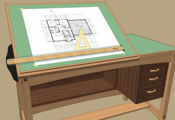
Here are a couple of additional examples of images used as materials. The drawing on the drawing board is a found image and even the bits of masking tape at the corners are images applied as textures to faces and used as components. In that case there are four different bits of tape








Log in or create an account to post a comment.
Sign up Log in