
Consider your audience. Why are you making the drawing in the first place? Is it to communicate to someone else what the project will look like? They probably won’t care about the joinery and hardware so don’t bother adding those things. If the project is still in the design phase, leaving the joinery out will make it easier to modify the model. In the early phase of the design process you could probably get away with a simple box sort of drawing with no internal structure. Once the design is finalized, go ahead and add the details.
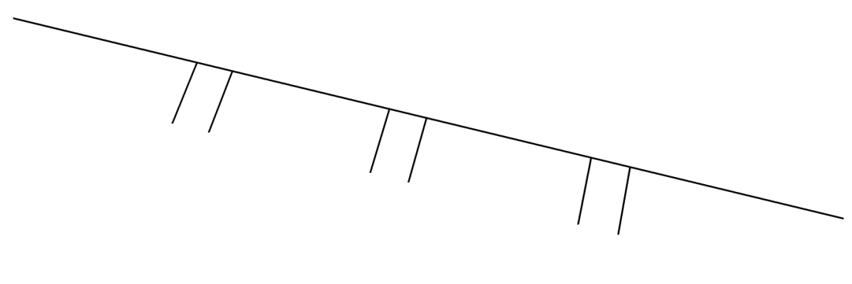
Keep it simple. Before you start drawing, figure out what information you need in the drawing and only draw that. There’s no need to add superfluous details. A few years ago I was built a simple ski rack for my wife’s skis. I was making it from some scraps of oak I had on hand. Being naturally lazy, I wanted to make it with the least number of cuts possible. While waiting for my coffee to brew I made the following simple sketch to lay out the sockets for the sliding dovetails. I then used the Tape Measure tool to get the distances for each socket. I wrote the numbers down on a scrap of paper and went out to the Router Boss and zipped out the sockets in a couple of minutes.

That’s probably an extreme example of keeping it simple. One of my clients is a cabinetmaker who chooses to buy doors for pieces he builds rather than make them himself. When I create plans for his pieces, I don’t bother to detail the doors. All the other parts of the piece are drawn to show joinery and other important details but the doors are just drawn like a slab door with a slight recess for the panel. They are quick and easy and they relay enough information to do the job.
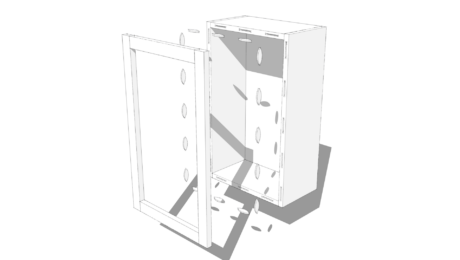
You want to weigh the return on your investment of time spent drawing details. There’s value in drawing the tenons on the ends of the rails and stretchers but maybe you don’t need the mortises. Perhaps it would be useful to draw in a biscuit or a screw to make sure you won’t hit it later when shaping the pieces. You probably don’t need to add all of the biscuits or screws you’ll use in the project.
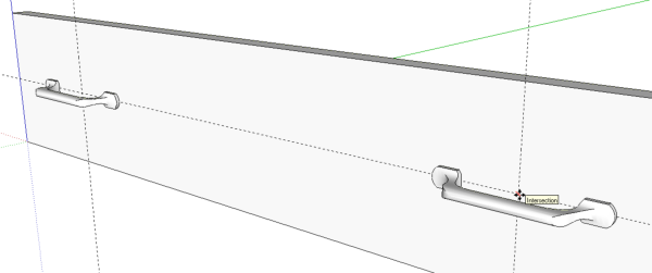
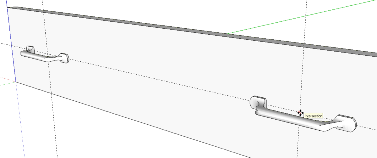
Don’t draw anything twice. Take advantage of components and the ability to save them for later use. If you draw something you think you might be able to use again, save the component into a library for later use. When you make the component also consider options for making it simple to insert into other models. In the image below, the draw pull is a component I saved into a local library for later use. When I made it, I set its insertion point at the base of the pull and centered so that I can quickly snap it to an intersection of crossing guidelines. I don’t have to move or rotate it after placing it into the model. It just ends up located correctly. It’ll take a few minutes to set the insertion point when you make the component but if you use the component more than once, you’ll easily recover that time.
It is often possible to make components that can be easily modified to get different sizes. For example, even a detailed frame and panel door can be resized as needed for the application. If you need detailed door models with individual rails, stiles and panels and you often use the cutters for making them, draw up one door and save it as a component. Resize it as needed in future projects.
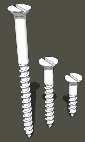
Although I don’t generally put screws in models I draw for myself, I do use them in plans drawn for the Digital Plans Library here on Fine Woodworking. These screws started out as the longest one. I drew it so it can easily be modified to make any other size I might need. When I need a length I don’t already have, I modify the component and then save it for future use as well.
You might also find that someone else has drawn a component you need and uploaded it to the 3D Warehouse. You can find some gems there but in fairness, you can also find components that need a lot of work to be usable. It’s worth checking, though.
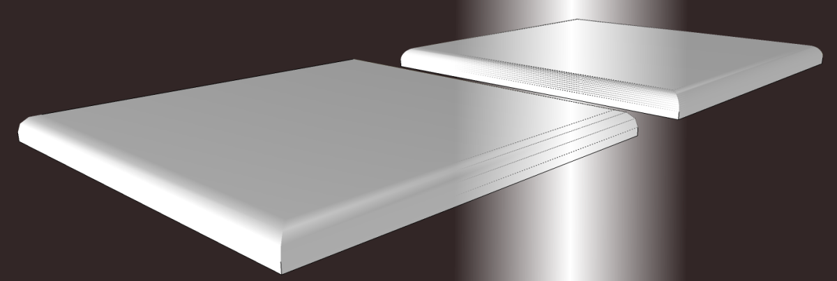
Keep Entity Count Low. Your computer has to process all the lines and faces in the model and the more there are, the longer it takes to process so don’t create more than you need. As you probably know, SketchUp uses a series of short line segments to represent circles, arcs and other curves. For small radius curves such as round overs you can probably get away with 3 or 4 segments instead of the default 12. In the next image I’ve drawn a ½ in. radius round over on each of the “boards”. The near one has only 3 segments for the arc while the far one has 12. You can see that the one with fewer segments looks just fine.
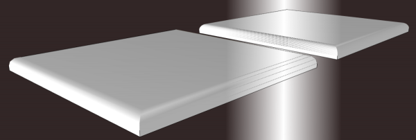
Of course a round table top would benefit from more segments than the default 24. Choose what is appropriate for the part you’re drawing.
Wait to Paint. Your computer also has to process the images used as materials in the model. As with lines and faces, the more images there are, the longer the processing takes. Also, high resolution images take longer to process than lower resolution images. You’ll speed up your drawing work if you wait to apply materials until after you’ve got at least the majority of the drawing work completed. You won’t be sitting there waiting for the computer to process the images every time you orbit around the model. If I’m not making drawings for others, I will often skip adding materials altogether and save that time.
When you do need to apply materials, open the components for editing and paint the faces. This will result in all instances of the component getting the same treatment and give you the ability to adjust the position and orientation of the material on the faces.
You can probably think of other ways to speed up your drawing process so you can get out the shop and start cutting wood to make the real thing.






Comments
That thing about having the axis fortuitously located will come in handy. I never knew that was how it was placed when doing a 'Paste'. Thanks Dave.
I started a 'Component' file a while back but it never went far. I'm starting it AGAIN. Thanks for the prodding.
Log in or create an account to post a comment.
Sign up Log in