Asymmetry: The Designer’s Secret
Use this dynamic effect to add life to your furniture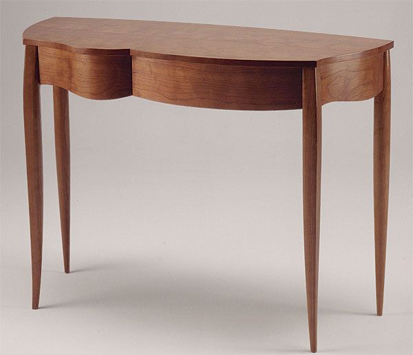
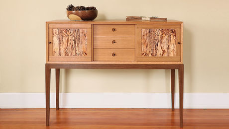
Synopsis: Perfect symmetry is easy to find—in faces, in furniture, in architecture, even in nature. It appeals to us, and gives us a sense of balance and harmony. That’s why things that are not symmetrical immediately catch the eye. Asymmetry is a compelling design element, and the result can be extremely appealing or simply a mess. The key is to use it sparingly, and to find ways to establish a visual balance without complete symmetry. Here are a variety of successful furniture designs that use asymmetry well, from cracked-ice cabinets to live-edge tables, interesting door and drawer layout, decoration, and beyond.
From Fine Woodworking #222
If you open a history of world furniture and leaf all the way through from Ancient Egypt to the present day, you’ll find examples of perfect symmetry on nearly every page. In furniture—as well as in buildings and cars, toasters and tweezers—we almost always create designs based on bilateral symmetry: If you draw a line down the center of the object, everything to one side of the line is mirrored on the other side.
Perfect symmetry is the most direct way to achieve a gratifying visual balance in a design. Its appeal is likely wired into us—our faces and bodies, after all, are examples of bilateral symmetry, as are the plants and animals that surround us.
Because we’re so conditioned to see symmetry, anything asymmetrical immediately commands our attention. In furniture, too, asymmetry can draw the eye. Too much, though, can make a piece simply look a mess.
The trick is to use asymmetry sparingly, and to find ways of establishing a visual balance without complete symmetry. This might be done by containing an asymmetrical pattern within a symmetrical frame; by creating a strongly symmetrical piece with just one or two asymmetrical elements; or by balancing the visual weight of asymmetrical elements. Here we’ll show you a variety of successful strategies furniture makers use to elevate their designs through asymmetry.
Soon after George Nakashima set up shop as a furniture maker in Pennsylvania in the early 1940s, he began using live-edged planks in his pieces. In tables and chests he would pair the often wildly asymmetrical slabs with simple turned legs or with understated, rectilinear bases and carcases. Trained as an architect, Nakashima had worked for several years in Japan, and his live-edge furniture designs echo the sparing use of raw branches among planed timbers in traditional Japanese interiors. This extraordinary Windsor settee blends Nakashima’s Japanese heritage with his reverence for a traditional Western furniture style.
Timothy Philbrick designed this two-drawer hall table, he says, “by taking the forms of a very curvy Louis XV desk and pulling them around” until he found a pleasing asymmetry. Philbrick achieves a visual balance by pairing a long, shallowly bowed drawer with a shorter drawer that has a rapid S-curved shape. Philbrick made swelling, S-curved side and back aprons as well, though none of the curves are quite the same. By keeping the curves and contrasts balanced and subtle, Philbrick created a piece that feels both classical and slightly subversive.
For the full article, download the PDF below:
Fine Woodworking Recommended Products
Drafting Tools

Stanley Powerlock 16-ft. tape measure
Blackwing Pencils









Log in or create an account to post a comment.
Sign up Log in