Good design takes courage
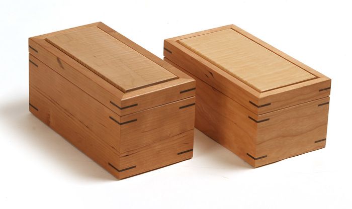
Boxes before and after. The left box was a first attempt that just didn't look quite right. With some minor alterations, the box on the right didn't bug me so much.
It’s a scary thing to look at a finished project. After weeks or months spent making it, to really look at it and ask yourself “does it fit the picture I had in my mind when I made it?” Because, for me anyway, the answer usually is “not quite.” It seems that in everything I make there is something, sometimes a small thing, that nags. A leg that’s too fat, an overhang too long, a drawer pull just a little small… Sometimes the proportions are not quite right or the overall scale is not what I had imagined.
Designing in wood is just tough. It’s a treacherous journey from inspiration to sketch to mock up to full-sized plan and then to the final piece. There are many pitfalls along the way and no step in the design process is really adequate to guarantee success. The consolation, slow in coming, is that the more furniture I make and the larger my catalog of missteps becomes, the better I become at anticipating the final product. But it all starts with the courage to look my furniture in the eye and ask “is it what I intended?”
Once in a while I design a piece I’m happy with and I think that I have the battle won, that I’ve finally tackled this design thing. But no sooner do I finish patting myself on the back when a project as simple as a mitered box jumps up and pulls me back down to reality.
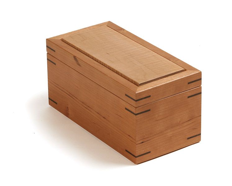
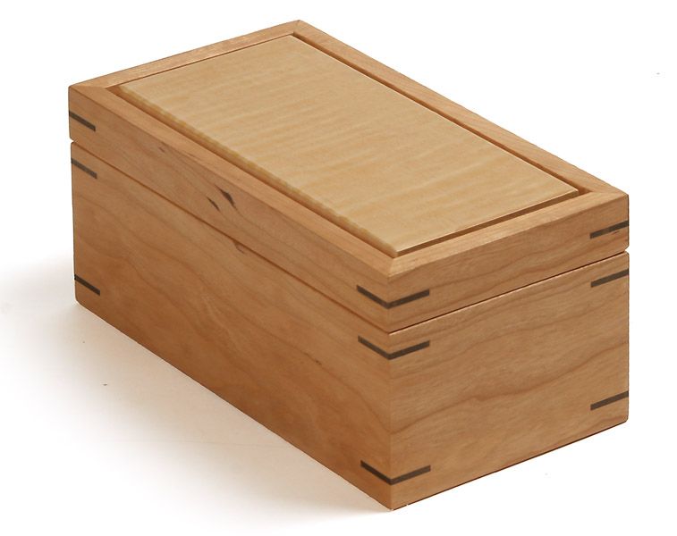
I’ve made many variations of this box, it’s dimensions determined by the tea bags it holds. So I didn’t anticipate any problems along the way. But after it was finished, it struck me as a bit odd and clunky. I tried to dismiss it, but the feeling didn’t go away. For me, the first step in becoming a better designer was to accept when I missed the mark. A comforting quote from Michael Fortune always comes to mind at this point “If you always hit your mark, maybe the target is too close.” The second step, then, is learning to assess exactly what went wrong. In this case, a few things stood out. The box was a little too tall, giving it a narrow look. Also, the sides were too thick. This created a clunky feel and added to the narrow look by diminishing the width of the top panel. In addition the spline grooves were too deep, making for splines that were too long. Fortunately I had spent hours, not days on the box, so I had a chance to try it again (not so easy on a dining table.) I headed back out to the shop and put my theories to the test. I made a second box that was 3/8 inch shorter, with sides 1/8 inch thinner. The thinner sides meant a shallower spline groove and shorter splines. The resulting box seems to sit a bit more comfortably. When I look at it I think, yep, that’s a box. No fireworks or anything, but not a crick in my neck either.








Comments
Interesting article. I'm just curious. Was the first box spot on to the mock-up and full-sized plan. Or, were there changes to the original plan made during the build process (by intent or by forced design enhancements) that caused the finished box to be less pleasing than the mock-up and full-sized plan.
If the finished box was spot on, I wonder what there is about a finished project that would make it appear so different from the mock-up and full-sized plan. Is it the color and grain? Or, perhaps our sensibilities change and become more refined.
Wood Jack- The boxes weren't a great example of the design process in that I didn't need to create a mock up or full-sized plan to make them. However on large projects I've always drawn full-sized plans and, more recently, have been making full-sized mock ups as well. I find that mock ups and plans work well in tandem. The mock up gives an idea of the scale and proportions of the piece and the plan helps dial in the relationships between the components in the piece.
You're right, the discrepancy between these and the finished piece often lays in the details, the wood and grain selection, the offsets and resulting shadow lines between individual parts which help define the form. You can get close, but you never know exactly what you have until you make it!
Good luck, Mike
Not much difference. They look equally banal.
It's a box meant to hold tea bags... probably made from leftover scraps from other projects.
It is interesting how small changes can make a big impact on the overall look of a project. In looking at the pictures first I would have said that there was more than 3/8" difference in the two boxes. It would have been easy to go to far and make the box to short. Nice post Mike.
What you say is very true indeed, especially if you are making something for yourself, or to order.
However... I am a professional box-maker in South Africa. Sometimes I will make a 'spec' box that I absolutely despise but the fascinating thing is... every box finds a willing buyer only to keen to clutch it to their bosom and take it home to treasure.
One man's dislike is another man's golden ratio, it seems?
Oh, and nice boxes, by the way!
Nice post, Michael! I sometimes struggle with those same kinds of design and implementation questions. I'd pay no attention to the snarky comment.
Log in or create an account to post a comment.
Sign up Log in