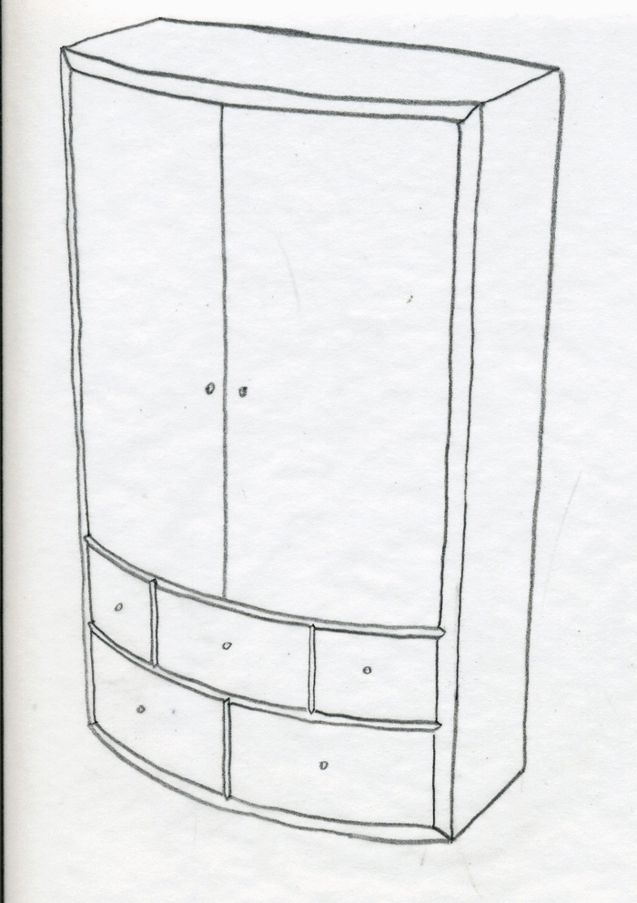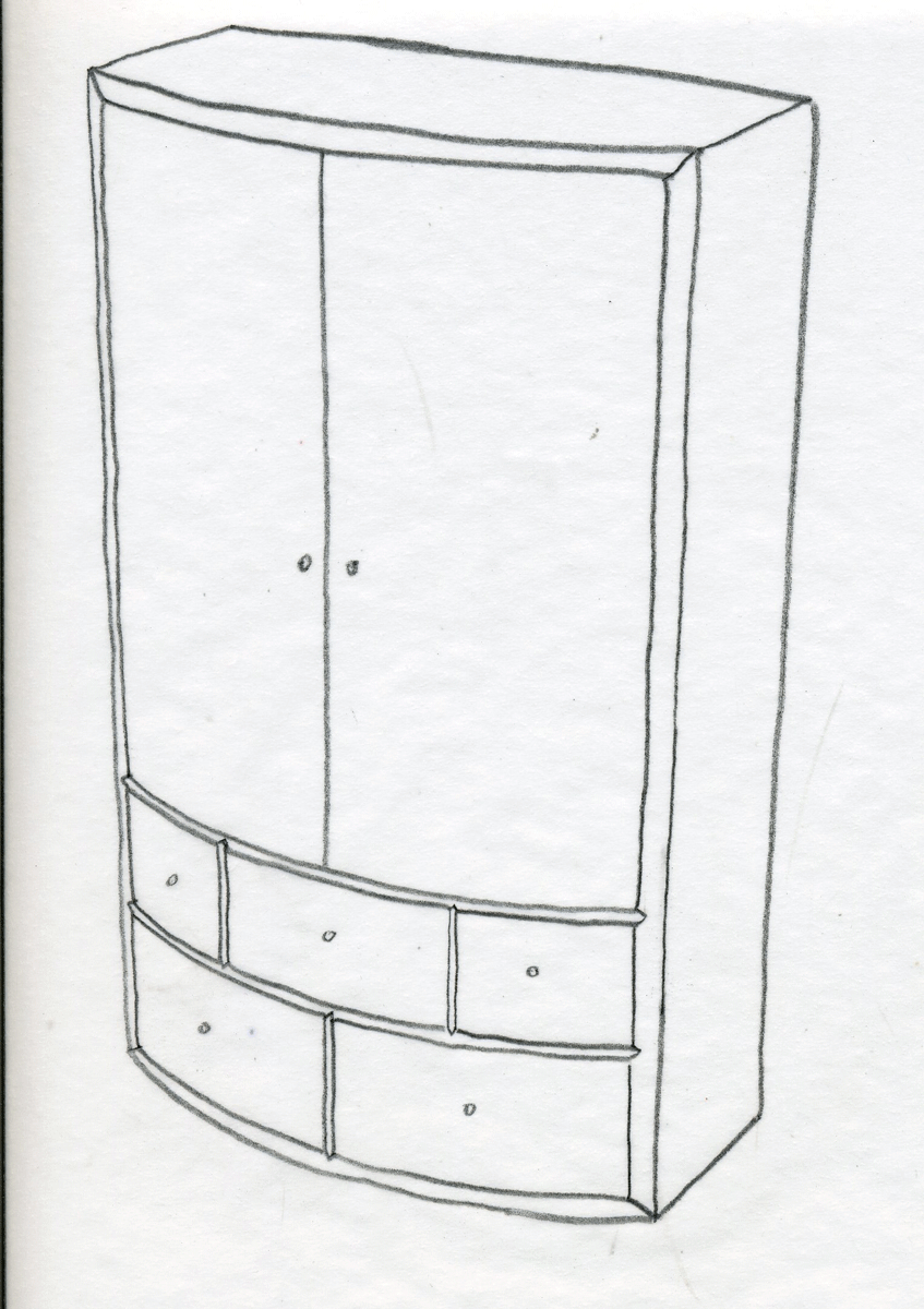
Option 1. A vertical cabinet with a regular curve across the front.
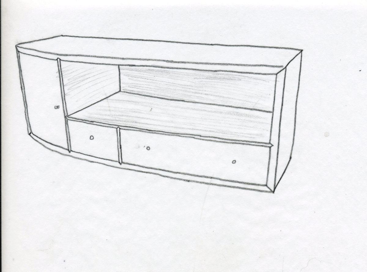
I’ll be filming a new Video Workshop soon. This time around I’ll be making a bow front wall cabinet and showing techniques for making curved doors and drawer fronts. There will also be some veneering involved–most likely shop sawn. At any rate, I haven’t quite decided on a design. I’ve winnowed my ideas down to two basic designs. I’m interested to see what y’all think about them. The first design is a vertical cabinet with a symmetric or regular curve across the front. There are two doors above two rows of drawers. The inside would be fitted out with a shelf and perhaps a row of drawers. The second design is horizontal and has an asymmetric curve along the front. There is a door on the left, which meets the vertical divider at the apex of the curve. There are two drawers beneath a shelf on the right. The overall size of both cabinets is small. The vetrical on is 12 in. wide by 20 in. tall. The horitzontal one is 24 in. wide by 9 in. tall.
As for the techniques for building the two, they really won’t vary.
So, tell me what you think. Should I make the first one or the second one? And let me know if there are any questions you’ve always had about working with curves or veneering. I’ll see if I can answer them.
UPDATE, 9/25/2012
Thanks to everyone who provided feedback. I had a feeling cabinet 1 would be the more popular choice. It is a more practical cabinet and I’m not surprised it has the broader appeal. That’s not to say we’ve made the final decision, but I think cabinet 1 is the direction we’ll go.
I’ve taken note of the various other requests made, too, and I’ll do my best to address them in the video. There are a few issues raised that I know won’t be addressed. For example, the cabinet won’t have legs. It’s designed to be hung on the wall (both are, in fact). The back won’t also be curved. It’s for a flat wall. However, if I did need to make a cabinet for a curved wall, I would use the techniques on the back as on the front, so you the video will still be helpful. Finally, there were a few request for me to show alternative methods. I’ll do what I can there. The drawers can be done at least two different ways, but the doors would be very hard to do without a vacuum press. I use a fairly inexpensive press. But I don’t want to go too far down this road right now. I’ve got to save something for the video. I should point out, though, that the cabinet would look great without the doors, too.


Comments
Option 1 interests me more, and gets my vote. The large double doors look like a bit of a challenge (making them line up right, etc.)
Option 1. Much more useful and practical. Nice design.
Option One Too!
Another vote for option 1.
Less of a dust collector. More of an opportunity to showcase some nice veneer or solid wood on the doors and drawer fronts. Even an opportunity for a bit of marquetry in them..
Interesting to see Matt do marquetry on the bow fronts...
Hopefully the veneering will be Latta style - hide glue and a veneer hammer..
Definitely the first design. The alignment of the doors as well as the hinge installation would be very, very useful.
On another note, regardless of the design or project you choose for a Video Workshop, please do your best to incorporate footage of situations where you anticipate problems and mitigate mistakes. At the very least, discuss them at some level detail. Tim Rousseau does an excellent job of this in the Small Cabinet Video Workshop (realizing of course that he's probably built that cabinet 50 times and has overseen the construction of hundreds). I feel like I learned more listening to Mr. Rousseau discuss mistakes - actual and possible - than I did watching him build the cabinet.
The first one, although I would love to see a video of a civil war field desk. It wouldn't be that much different and think of how much fun that would be.
I like the first design also. Can I ask what happened to the work bench video workshop that was supposed to premiere at the end of the summer.
I like the first design also. Can I ask what happened to the work bench video workshop that was supposed to premiere at the end of the summer.
Option 1 for sure
Option 1 Matt. Thanks for asking.
Option 1 please.
I lean towards option 1 like the others, but there is a case to be made for the more Euro design look of option 2. Looking again at both options, I think option 1, is, well, kind of boring. It's nice looking, but boring. I'd like to see the asymmetric curve built on option 2, despite the fact that the techniques aren't much different. So, I'll vote for option 2.
I think Option 1 is the better choice.
Option 1 for me too please Matt. I've not done any veneer work so I'll be fascinated to see how you go about this whilst ensuring the piece can stand up to day-to-day use.
Option 1 is more pleasing to the eye.....
How about just a new video workshop...
Lessons from option 1 could be applied to building option 2.
I vote for option 1. I think it has a few more issues to deal with. But I am sure either one will be very interesting and educational.
Yeah, I am an option one guy as well. There are similar plans out there but not tutorials to help. I have never done veneer so that seems interesting. If you do this one, I will probably adapt the interior to be a home for my planes; from joiner to block, maybe chisels plus odds and ends. Thanks for the option for input.
I vote for #1 also.
Option 1, I really like it and would build it.
Are we going to have to buy a vacuum press to build the doors?
Option 1 is my preference. Thanks for asking.
Wow, I guess I get to be the 1st to say - #2! I like the asymmetry, and the mix of open space with the door and drawers.
I think I'd like to see what techniques you could do with option 2
The elegance and classic lines suggest that design #1 would be my choice!
Option 1 because I think you need a special space for option 2 and I think more people would want to build option 1.
Option 1 would get my vote. The design seems more suited to educational possibilities. Also seems more impressive as a completed project.
Option 1 is a kind of "deja vu" project.Option 2 is quite different but you should use the empty space to add something more pleasing to the eye.What about sliding doors?
Option #1 !
I like Option 1
Option 1 wins.
When you do this would you show us alternative ways to do some of the work. All of us do not have expensive machines.
I vote for Option 1. It looks more interesting than the horizontal version.
I prefer Option 1. I would also build this project.
Another vote for Option 1, more versatile end use option I think
Option 1 please
#2 cabinet, I have been toying with a new cabinet for the flat screen, this could be it.
I like option 1 best , but I would suggest some feet to get the bottom drawers off the floor
Option 1 please.Also as others have said put some feet on to get off floor.Option 2 I just dont like the design.Very odd.looks more like a shop storage cabinet than a fine piece of furniture for the house.Does anyone agree?
I actually like both, they would fulfill different needs. but option 1 gets my vote
option 1 gets my vote just for aesthetics.
- and thanks so much for the previous video workshops - i have learned so much from them.
I like the vertical, option one. I want to make it as a jewelry hanging chest.
Option 1 gets my vote. I like the design and think it would look beautiful with the right veneer.
option 1 gets my vote looks like a fun project
Both are cool, but I'd be more likely to build option 1 myself, so that's the one I'd like to see in the video workshop.
Option 1 gets my vote.
I really like the proportions of option 1..but since most new video displays are hung on the wall and too large for a cabinet I go for option 2. What about adding short legs to give the cab a little lift and move the proportions closer to a golden rectangle and give us a shot at a bowfront skirt.
Option 1 is my preference.
I vote for option 1.
Will the back be rounded as well, or could you show how to do that if one wanted to? I have a walled helical staircase (with vaulted ceilings, think of a silo) that leaves some portions of the upstairs area with curved walls that I could definitely use a piece of furniture like this if I could get it to fit right!
I like the first one.
I'm tempted to say #2, but if I were to build something along the lines of what you'll be doing, I'd want a vertical cabinet. Horizontal wall cabinets take up too much wall space, which is at a premium in our house.
How about an option where the doors have glass panels (flat glass)?
Option 1. It has more applications for the king of things I do. A pair of curved doors as well as drawers.
Yowza! Lots of votes for #1, but I'd be more intersted in #2.
I think I'd like the vertical cabinet.
I also vote for number 1.
Option 1
The large doors show off the curve more tha the horizontal cabinet. That gets my vote.
Definitely option 1.
The horizontal one gets my vote
Option 1, vertical, would be my choice. All those drawers really accentuate the curve. I would like to see one more row of drawers actually.
I like option #1. Great design, great looking piece. For either piece, I'd be interested in seeing, or at least hearing talk about, any alternative methods to acheive the curved piece work. Very interested in the veneering.
Option 1 would be more useful to me.
Look forward to watching the video..
Option 1, pls.
Thx,
William
Why not combining both ?
Log in or create an account to post a comment.
Sign up Log in