Creating a Cabinet
Inspiration, input, and pilfered details converge in a compelling design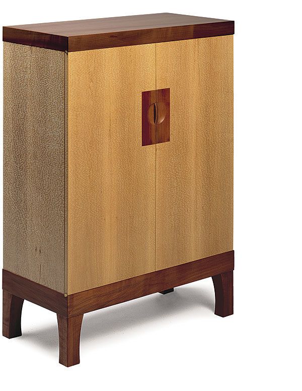
Synopsis: Sam Norris wanted his liquor cabinet in light and dark madrone to stand out from the other designs in his class at the College of the Redwoods, so he got inspiration from a sculpture by Hiromichi Iwashita. He used a gouge to texturize the panels of the cabinet and bring vibrancy and life to his design.
One flash of inspiration and— bam!—the design flows into the sketchbook with all of the details, proportions, and material choices worked out. Well, perhaps design doesn’t always work quite that way. Maybe it’s a grueling process of searching for an idea and then redrafting and reconsidering every detail. My own design process often has elements of both extremes.
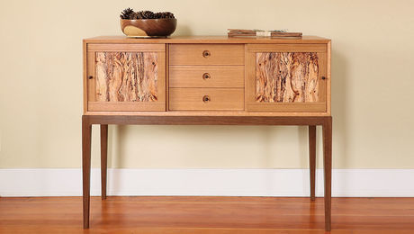
When I designed this liquor cabinet in light and dark madrone, I was a student at the College of the Redwoods. I wanted my piece to stand out from the dozen or so being built around me, but I had no idea where to start. I did have a few advantages that often lead to creative discovery—I was constantly on the lookout for inspiration from a range of sources, I had trusted colleagues and teachers to tap for advice, I had a consistent work schedule with time to explore my ideas, and I had the constraint of a set deadline.
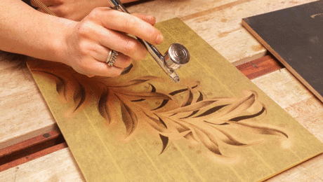
The bam! for my liquor cabinet came in a San Francisco gallery when I saw a sculpture by Hiromichi Iwashita. The piece was a wall-hung triptych of large basswood panels, and Iwashita had covered the entire surface with broad gouge marks, then colored it with red gouache and graphite pencil. The effect was stunningly vibrant, and I was captivated by the idea of adding depth and life to otherwise fairly mundane wood. I drew gouged textures that were simpler and more regimented, intentionally different from Iwashita’s work, and I planned the cabinet to frame these textured panels.
The proportions for my cabinet I lifted, more or less intact, from a successful piece by a classmate. I was open to the time-honored approach of outright pilfering as long as I could put stolen details in an arrangement I had not seen before. By changing the materials, adding distinctive pulls, and gouging the surface, I’d make my cabinet clearly different from the one whose dimensions it shared.
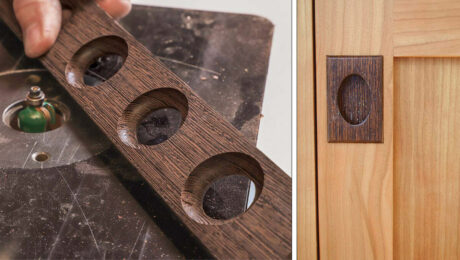
The design of the door pulls started with images of round windows in Japanese architecture. I struggled to adapt the idea to a pull design, but critiques from instructors and fellow students helped me work out the details.
The construction of the cabinet moved along smoothly. But no amount of searching produced a pleasing design for the feet. I tried a plinth base, a Chinese-inspired base, a tapered, angular Shaker foot, a square foot, and got no closer to a design that fit the cabinet. This was grueling. That is, until I learned a lesson that has served me well since: Take cues from the piece itself. I realized that the door pulls—as the one curved element in an otherwise rectilinear piece—called for a curve somewhere else, just as the dark wood in the latch plate called for dark wood in the top and base. with this insight, the base, with its subtly curved feet, took shape naturally.
For the full article, download the PDF below:
Fine Woodworking Recommended Products

Stanley Powerlock 16-ft. tape measure
Compass
Circle Guide






Log in or create an account to post a comment.
Sign up Log in