
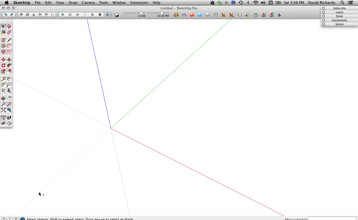
In my previous blog post I wrote about setting up SketchUp to suit your preferences. I showed how I make my setup on the PC. For the most part everything is exactly the same on the Mac. The key differences involve toolbars. Here’s my Mac screen when I first start up.

There’s not much in the way of tools compared to my PC version. I have the large tool set displayed on the left side and some tools across the top. On the Mac you can only have one row of toolbars across the top but you can customize that row and show only the essential tools.
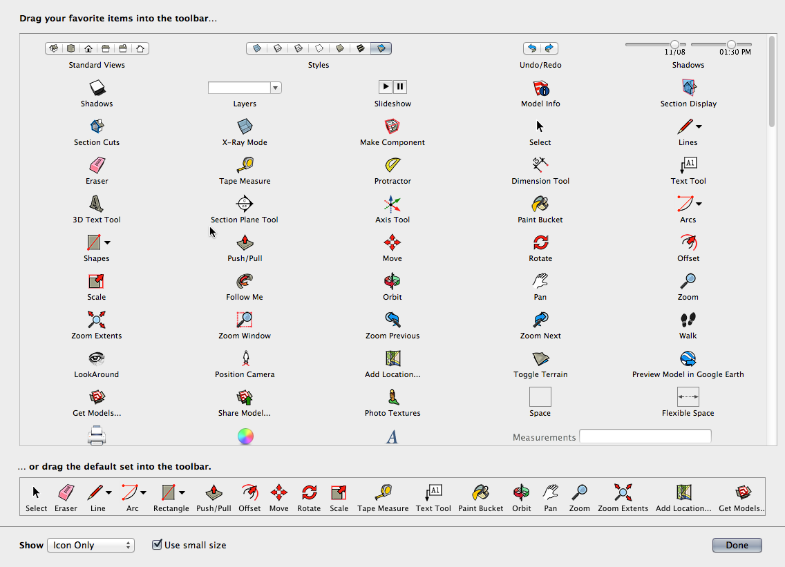
When you click on View>Customize Toolbar, you’ll get a large window that looks something like this:
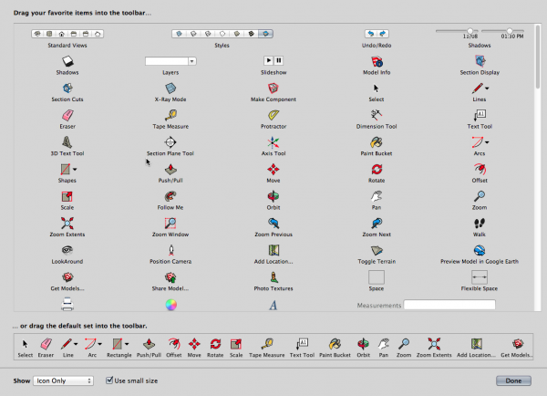
With this screen open you can drag icons to the top toolbar as needed. If an extension or plugin you have installed has toolbars, the icons should also be displayed here and they would be available to drag out on to the top. That’s great when there’s perhaps only one or two tools out of a set that you’d use frequently enough keep out.
Of course you can also bring out individual toolbars for the various plugins that have them. You’ll select them under View>Tool Palettes. Of course the list will be dependent upon the extensions you have installed.
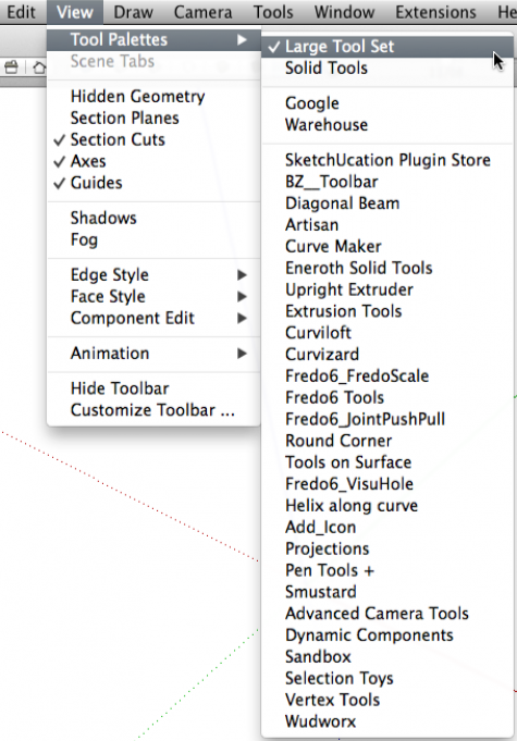
Since my Mac is a 15 in. MacBook Pro and the screen is fairly small, I generally only bring out toolbars when I need them and get rid of them when I don’t. These toolbars don’t dock like they do on the PC so its easy to have a mess of floating toolbars on your screen. If I was working on a larger screen, I would put more of them out and push them off to the sides. You can do what you like, of course.
After you’ve made these toolbar choices, setting up the units and your default style are basically identical to doing it on the PC. And just like on the PC, when you’ve finished making the adjustments and have it looking the way you want it, remember to use File>Save as template to save it so you’ll get the same look the next time you start a SketchUp session.
–Dave










Log in or create an account to post a comment.
Sign up Log in