Chair Design Reinterprets Classic 80’s Icon
Isaac Thompson (24) is from Orange County, California, and a sculpture graduate of Bates College, Maine, but his current project takes place as a furniture student at the Chippendale International School of Furniture in Scotland.
“I came across the Chippendale School while I was working for a sculptor in Brooklyn, New York. For as long as I can remember I have been surrounded by creative minds.” Three of his four grandparents were woodworkers, including one grandmother, and that gave him an inherent pull towards furniture and design. “The Chippendale School was the perfect combination of artistic freedom and practicality for me,” says Isaac.
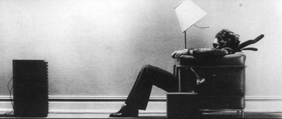
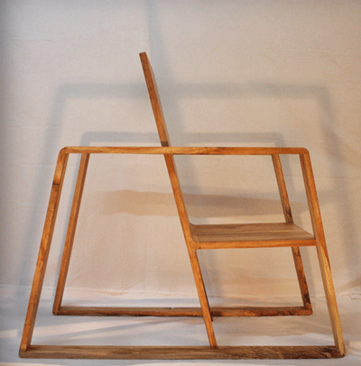
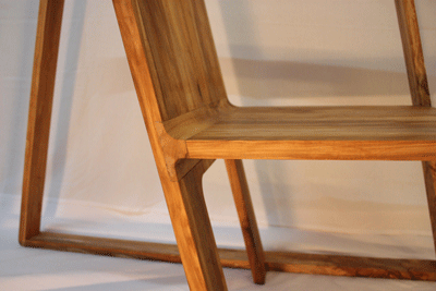
In designing this chair, he’s set out to create something iconic- a chair that looks like it’s moving even while it’s sitting still. The design was inspired by the exaggerated lines and movement from the image in a classic Maxell cassette tape advertisement dubbed the “Blown Away Guy”… “I liked the idea of sliding into the chair, reaching for my martini, pressing play, and listening to my favourite music,” says Isaac. Start to finish, the whole design and build process took him about three months to complete.
His video even recreates the classic 1980’s Maxell “Blown Away Guy” TV ad:
He carefully chose his material spalted cherry, for a reason:
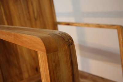
“Spalted cherry has a beautiful grain, a grain so intricate that it looks like a hand-rendered drawing. Spalted is another word for rotten – so at first I worried I was making a chair already past its prime, but the outcome has amazed me. The fungi in the wood ‘battle’ each other and collide in a way that creates dark lines and rich colours,” he said.
Designing the chair presented him with a lot of challenges, but in the end, it worked out well.
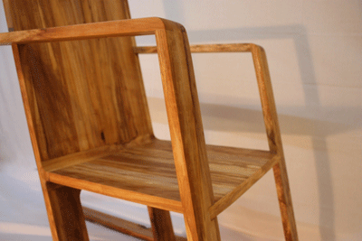
“At first it seemed there would be many hurdles to jump when building this chair. Judging by its steep angles and over-sized arms I thought my initial design might be rather difficult to create. Eventually, I found I was over-thinking the construction of it.
“I wanted the chair to simulate movement, so when joining the seat to the back I hand routed a channel and created a curved insert that connected the seat to the back in a seamless way. To create the curves of the seat panels, I used two separate templates. I connected the back and seat together with rub joints- I liked that because they are just as strong, and less complicated than using something like dominos or biscuits.
To make the arms, he cut each plank into three pieces and joined them with finger joints, which created arms that were both strong and aesthetically pleasing. “I figured if I wanted the arms to be large and prominent I should also have them be equally strong and durable.”
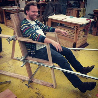
Shaping the corners was simple- he rounded them off with a disk sander, which made it seem even more aero-dynamic. Getting both arms glued together at the same angle was a challenge for him too- they needed to be exactly the same angle, and exactly the same height. With a little “forced” pressure, and the help of very long clamps, he got them to be where they are, and to good effect.
If this left you feeling inspired, click here for tips on designing your own chair.







Comments
I expect a lot from a chair. But the front page title of this article makes me think this chair goes above and beyond.
Yes, rather unfortunate title shortening there
Woodworking and carpentry are excellent and practical skills to have. Like any other skill, it needs to have passion and soul inorder to create something unique, beautiful yet functional. I recall a classic walnut storage unit that looks flowy from the outside, but sturdy when being put into use. I like to have such unique pieces in my home. It gives my home a character and sets it apart from the rest.
Log in or create an account to post a comment.
Sign up Log in