Out of Nakashima’s Shadow
A chest designed with deference and difference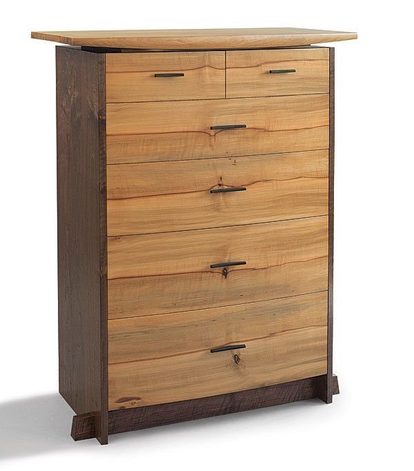
Synopsis: This chest by Stewart Wurtz was designed to go into a home owned by avid collectors of George Nakashima’s work. Wurtz wanted to honor Nakashima with the design while bringing his own sensibility to the project. See how he did it.
I built this chest of drawers for a couple near Seattle who have been avid collectors of George Nakashima’s work since they bought a live-edge dining table from him in the early 1980s. Nakashima’s vocabulary is a powerful presence in their modest waterfront home, and I wanted to honor this in the furniture I created. But I also wanted to bring my own sensibility to the project.
At heart, Nakashima’s furniture is about celebrating the material: what the plank has brought to the piece. I really respect that, but deferring to the wood leaves a lot up to chance. I wanted this chest to have a similar emphasis on great wood, but I wanted the form, not the wood, to be in control.
I begin my designs by making rough concept sketches. These are gestural drawings, quick and informal, done in my sketchbook. Rather than pinning down details, I try to envision the overall design and capture a sense of what the stance and feeling of the piece will be. Even when I make presentation sketches for the client to review, the drawings are still fairly loose, because I think a freehand sketch is much more personal wood, to be in control. than a scale drawing. When I get the go-ahead, I make scale drawings to refine details and proportions. And when it’s time to build, I make full-scale working drawings.
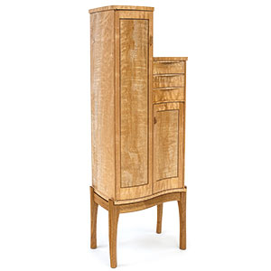
This tall chest was part of a suite of furniture—a bed, two low dressers, and the chest—and I used the same materials throughout. I made the top and the drawer fronts from madrone, and framed the drawers with a carcase of claro walnut. The rich dark walnut, with its flickers of red and green, brings out the warm peach tones of the madrone and provides a contrast that accentuates the structure of the chest.
I slightly bowed the front of the chest to echo the curve across the top of the bed’s headboard. I’ve always admired the bowfront form in period furniture, and I wanted to try using the concept in a modern context— no drawer dividers, no beading, just a clean and simple sweep of drawer fronts. I bent-laminated the drawer fronts, sawing the madrone into veneers and creating a cascading series of bookmatches down the front of the piece.
To keep the chest from looking heavy and monolithic, I designed the top to float above the case, tapering toward the ends and extending far out over the sides. I created the top’s taper by shaping the underside to a curve that harmonizes with the curved drawer fronts.
Photo: Timothy Aguero
For the full article, download the PDF below:
Fine Woodworking Recommended Products

Drafting Tools

Stanley Powerlock 16-ft. tape measure
Drafting Tools








Log in or create an account to post a comment.
Sign up Log in