Reinventing a Classic Chair
Curves and cane anchor a radical revision of the planter's chair.
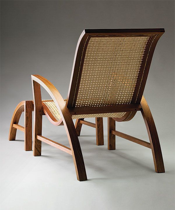
Synopsis: Traditionally, the planter’s chair has a woven seat that curls from seat to back on a smooth curve. The design typically is rather chunky, with flat level arms and stock rear legs. In redesigning the chair for a client who wanted a more refined look, Christopher Solar used bent lamination to keep the parts light, with simple, continuous lines from back to matching ottoman. Solar fleshed out his design in SketchUp, made a mockup from MDF to test the comfort of the chair, and was soon on his way to building the version shown here.
A few years ago I was approached by a new client who wondered if I would be able to make her a set of plantation, or planter’s, chairs. She said she’d always liked them but had been searching for something, “more refined … less country kitsch, more Japanese.” At the time I honestly had no idea what a planter’s chair was, but since this sounded like my ideal design brief I didn’t hesitate to say yes.
A little research told me that the essential aspect of this style of chair is a woven seat that curls from seat to back in a single, smooth curve. In keeping with my client’s direction and my own aesthetic, I sought to strip away anything heavy or excessively ornamental and keep the focus on those flowing lines. I did quick pencil sketches to try a few different ideas, then moved to the computer to refine the design in 3-D.
Where the traditional chairs typically have chunky curves sawn from solid wood, I used bent lamination to keep my parts light. Planter’s chairs often have flat, level arms connected to the seat back, and stocky rear legs under the seat. I wanted simpler, more continuous lines, so in my chair the back legs sweep upward to become the arms, which then turn a corner at a splined miter joint and become the front legs. The curve of the seat profile is thus intersected and complemented by the line of the arm and leg. I think curves are more effective when they’re played off against harder edges, so for that reason the remaining frame elements are all straight lines.
The commission included an ottoman, so the chair had to look good and work well either by itself or with the ottoman. I designed the ottoman to mate closely with the chair, basically transforming the chair into a chaise lounge. The seat and the top of the ottoman merge into one continuous surface, and the ottoman legs, one curved and one straight, mirror the legs and arms of the chair.
To make the chair more dynamic and welcoming, I wanted the arms to splay out slightly at the front. At the same time, I wanted the front leg of the chair to line up with the back leg of the ottoman, and I
wanted the stretchers on both pieces to line up as well. I resolved these conflicting constraints by putting a kink in the front leg. The bottom portion of the leg is mostly vertical, matching the ottoman’s leg, but at seat level the leg veers outward to meet the end of the splayed arm. I think the kink also adds an element of tension that wouldn’t be there if the leg was a smooth curve or a straight line.
The materials I chose for these pieces are essentially traditional: a rich tropical wood (jatoba, in this case) and natural cane for the woven seat. I did not want to use the standard “sixway” caning pattern since that would have introduced diagonal lines that I didn’t think fit with the rest of the chair. Keeping in mind my client’s request for a Japanese influence, I took inspiration from a woven tatami mat, with its rectilinear weave and wide border, and devised my own pattern, a three-by-three basket weave. That gave me the gridded look I wanted and ensured the woven surface would track the seat profile as closely as possible, because I could string all the side-to-side strips first before adding the curved front-to-back strips.
For a chair, of course, I also had to think about ergonomics. Unfortunately, my computer model was not going to tell me anything about how comfortable the design was, and I could not predict what that curved seat would feel like to sit in. So I made a crude mockup with a series of flexible slats of 1⁄2-in. plywood fastened between two MDF slab sides. The slats followed the seat curve I’d drawn in my model, allowing my clients and me to test drive the seat. I repositioned the slats as needed to adjust the curves and angles, and once everyone was happy, I fed the data for the final seat profile back into the CAD model.
There were a lot of challenges when it came to building these chairs (weaving those seats, for instance!) but the design process was really satisfying: taking an iconic, traditional item, reducing it to its essentials, and figuring out how to make it my own.
For the full article, download the PDF below:
Fine Woodworking Recommended Products
Compass
Dividers





Log in or create an account to post a comment.
Sign up Log in