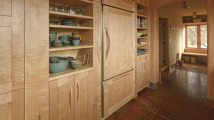
Synopsis: A room full of built-ins doesn’t have to be symmetrical and standardized. The space can have plenty of shapes, tones, and textures to please the eye and attract the touch. Dean Pulver designs built-ins with a balance of straight lines and curves, hard shapes with softer ones, and smooth planes with textured surfaces.
Some woodworkers lament doing kitchens, which can seem like so much utilitarian drudgery. But to me a kitchen represents an irresistible opportunity— i think of it as a chance to design and build a large sculptural object while being paid a fair salary. Just because I’m creating a room with lots of built-ins doesn’t mean I have to succumb to an overly symmetrical and standardized arrangement. it’s true that I build a lot of utilitarian plywood boxes along the way, but i relish the challenge of making those boxes add up to a space that, while functioning like a skillfully engineered machine, has a flowing, organic feeling to it and has plenty of shapes, tones, and textures to please your eye and attract your touch.
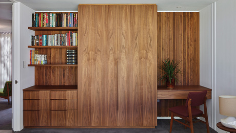
I built this kitchen, the adjoining office space, and a pool-house bathroom for a house in Oregon. As I do in all my work, I aimed to balance straight lines with curves, harder shapes with softer ones, and smooth planes with textured surfaces. I built the rooms for a client who grew up in an old house with excellent woodwork, and with that in mind I chose traditional frame-and-panel as the foundation of the kitchen design. To lighten the effect of all that frame-and-panel, I used flat panels with minimal reveals and built them of maple.
The kitchen is a long, narrow space, so I punctuated the main wall of cabinets with two sets of open shelving. By introducing open space and a splash of bright color from the ceramics stored there, I brought variation and visual punch to a wall of cabinets that might otherwise have seemed overlong and monotonous. I used shelving at both ends of the sink counter in a similar way, adding open space, color, and a couple of curves to balance out the row of closed cabinets below.
I often use areas of carved texture in my built-ins to give them personality and approachability, and to create a lively interaction as light changes during the day. This client didn’t want carving, however, so I left the cabinets untextured. To capture some of that responsiveness to changing light that carving offers, I chose maple that had a very vibrant curl.
For the full article, download the PDF below:






Comments
I got my copy of the magazine yesterday and thought this was a most interesting article! One of the things that has SO VERY DEFINED fine woodworking magazine (no, rather, the very essence of the Taunton Press) has been the use of photography to capture BOTH the aesthetic feel of a piece and technical details. But the photos in this article are such a tease! So incomplete! I can't tell what's going on! I sense the handles are assymetrical and no two alike, but how are the arranged as a pair? Or repetition through the run of cabinets? Such careful attention to the wood figure! But what is the mix solids and veneers!? How tight are those reveals in the flat panels!? Such oblique angles!? We can see how the cabinets terminate at the ceiling or the toe kicks below!
And, I for one, was surprised (amused?, saddened?) that the authors was so curiously defensive about building built-ins...and the commercial success and prosperity that this work brings him. Why? Has he experienced dismissive attitudes and condemnation from other woodworkers? The work is gorgeous and clearly at the highest end of custom client work...does anybody doubt for a minute that he's been asked (or will be soon) to build tables and chairs to complement such kitchen/office spaces?
Sorry, CAN'T see the ceiling or toe kicks.
Maybe, just maybe too much tiger stripping. Too much of a good thing?
Log in or create an account to post a comment.
Sign up Log in