Designer’s Notebook: Mike Korsak’s En Pointe
Mockup leads to a masterful piece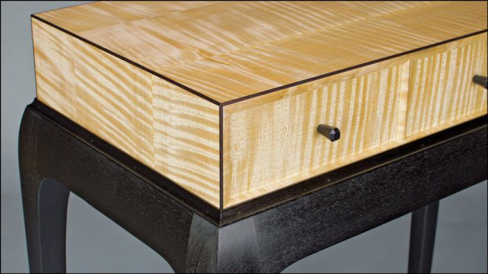
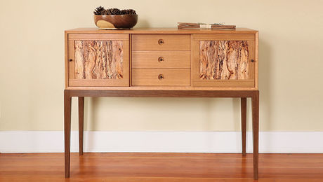
Synopsis: Having long admired the cabinet-on-stand form but wanting to design his own version, Mike Korsak worked through several versions before he got the design he wanted. From sketchbook to mockup to finished piece, he walks you through the design process for his low chest on stand.
This chest began as a response to seeing a lot of cabinets-on-stand, all very similar and clearly inspired by the work of James Krenov. I admire Krenov’s cabinets, and I was interested in building a cabinet-on-stand, but I wanted to deviate from this familiar form. I was also intent on designing a stand whose legs and base were “just right.” In some of my past pieces, the legs had not quite met that elusive standard. Building them, I learned that a design can look fine on paper but totally different in three dimensions. So this time, to guide the design process, I invested the time in building a leg prototype and a full-size mockup.
My initial idea was for an upright piece with two asymmetrical doors that would open to reveal shelves or drawers inside. At some point it hit me that the overall design of the piece closely resembled the work of other makers—the very opposite of what I had intended. I scrapped it.
Going back to the sketchbook, I roughed out an idea for a wider base, borrowing some of the shapes from the original concept. My new case design began as something more complex with fluted, or undulating, sides and top, and multiple rows of drawers. Through more concept sketching and some rough full-scale drawings, I arrived at a simpler case that seemed to harmonize better with the relatively quiet base. I liked the contrast between the two—a rectilinear case atop a curvaceous base.
Once I had a full-scale front elevation that looked right, I made a template of the leg profile out of thin quartersawn cherry. I then used the template to layout a prototype leg in solid wood. My aim was to shape the prototype to the same extent as an actual leg, minus any joinery. In areas that needed refinement, I modified both the prototype and template, because later I would use the template to shape the actual legs. Next came the full-scale mockup. I built it using the prototype leg and three legs made of 3⁄4-in. MDF. I cut out the MDF legs quickly on the bandsaw, with no cleanup of the cuts. For the aprons, I attached 3⁄4-in. MDF to the legs with pocket screws. I built the case with 1⁄4-in. MDF over a skeleton of scrap solid stock. When I had the mockup built, the piece seemed a bit tall and narrow.
For the full article, download the PDF below:
Fine Woodworking Recommended Products
Blackwing Pencils

Drafting Tools
Stanley Powerlock 16-ft. tape measure









Comments
Forgive me.
It looks like a slice of cheese on a legged turd.
I've read the article and I've looked at this piece several times trying to figure out what seems so incongruous about it. It certainly got my attention.
I think it just doesn't look like a finished piece to me. It looks like components of two pieces in progress that were stacked out of the way while someone worked on the rest.
I bet I've clicked on this article's thumbnail nearly every time I've seen it while visiting the FW site. I keep thinking there has to be something I'm missing or not getting. To my eye, the top and bottom just seem to want to repel each other.
I don't usually make negative or critical comments. I don't blame you if this one gets deleted. There's just something about this piece that keeps getting my attention and it's like a puzzle I can't figure out.
Well, that's enough of that. I don't hate it. I'm not trying to be cruel. (Let's just blame the second sentence of my post on the bad influence [via podcast] of Dr. Kinney.) By all means, continue to explore down this design road. Who knows where it leads? Vast expanses of awesome could open up around the next bend. You never know.
While I think the base is heavier than it needs to be in order to visually support the case I really like the veneered case with the contrasting rosewood trim. I'd like to know more about how the legs were milled and how the drawers are actually structured. Perhaps all this is/was available in another issue?
I liked the piece at first glance. After reading the article, I like it more. It's perfect for a piece of art or flowers on top. I would really like to see how you constructed those drawers...
Log in or create an account to post a comment.
Sign up Log in