Designing a Rococo Slant-Front Desk
Explore the design process behind Curtis Erpelding's version of a Rococo slant-front desk.
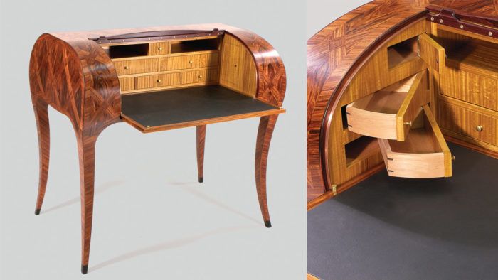
Simply put, French Rococo is fancy stuff. By the early 1700s it was seen in all forms of artistic expression in France, including painting, sculpture, and interior design. Rococo furniture, grand and highly decorative, often incorporated asymmetry, curves, and gold finishes.
To modern eyes Rococo design can seem luridly overdecorated—plastered with gilding, flamboyant carving, and all kinds of competing squiggly forms. However, beneath all the eye candy often hides a sophisticated and stunningly beautiful form. Lines curve continuously and when a line does break, its continuation is often a reversal, concave to convex, like a musical counterpoint. Line, proportion, and overall form create harmony.
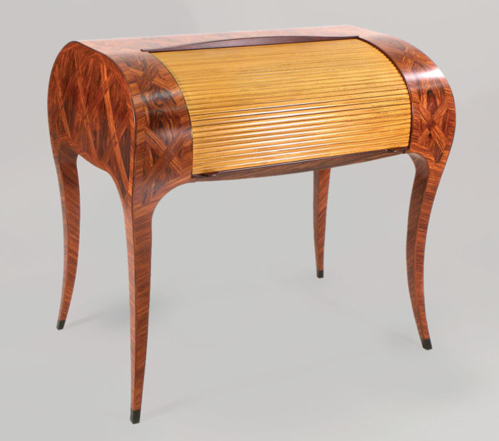
This version of a Rococo slant-front desk is clearly not an exact reproduction. Rather, it’s an attempt to modernize and personalize what appeals to me, both in terms of design and technique.
As far as the design goes, I pared down the bells and whistles of an original Rococo desk, limiting
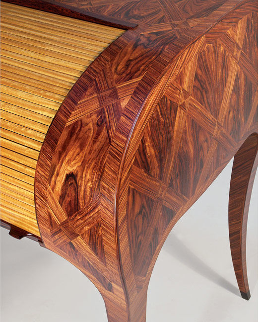
the flair to two elements, the parquetry pattern and the tamboured front. While this desk is still ornate, it is understated in comparison with the originals.
There’s a certain irony in the idea of using digital technology to build a piece of furniture that is steeped in old-world inspiration and takes a form that may become extinct given the use of laptops, tablets, and smart phones. But use digital technology I did, and lots of it.
CAD (computer aided drawing) and CAM (computer aided machining—in this case a CNC router) influenced nearly all aspects of the design and build.
In the past I have often built full-scale mockups. A mockup works great for establishing scale and proportions and nothing beats it in giving a sense of the volume that a piece will occupy. However, because of the difficulty of mocking up complex curved surfaces, and because of the speed with which options can be explored and changes made, I decided to rely exclusively on 3-D CAD drawings and renderings.
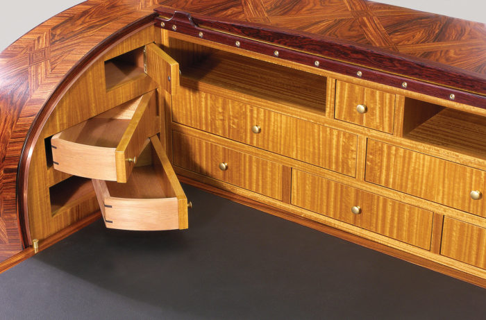
One place where CAD was integral was designing and laying out the parquetry patterns. Software enabled me to take the curved 3-D surfaces of the desk I had drawn and unwrap them onto a two-dimensional plane. I could then create the parquetry design on a flat surface knowing that it would fit perfectly when folded back over the 3-D contour.
From Fine Woodworking #267
Download the PDF below.
More on FineWoodworking.com:
- Designer’s Notebook: Ross Day’s Wishbone 2
- Designer’s Notebook: Duncan Gowdy’s Contemporary Chest with Colonial Roots
- Designer’s Notebook: Mike Korsak’s En Pointe
Fine Woodworking Recommended Products
Drafting Tools
Circle Guide




Log in or create an account to post a comment.
Sign up Log in