Chippendale furniture for today’s designer
Celebrate this furniture designer's birthday by learning how his aesthetic choices nearly 300 years ago can improve your own designs today.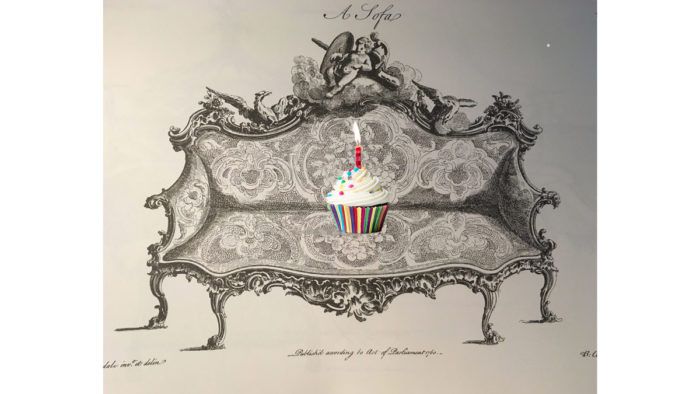
Maybe you threw confetti, sent cards to loved ones, or jumped out of a cake wearing nothing but a bowtie. Perhaps you went to a museum exhibit or carved a cabriole leg instead. Regardless, you did not let June 2018 pass without celebrating the 300th birthday of Thomas Chippendale, right?
Well, in all likelihood you did let it pass (or wrote a belated blog post about it). While he is one of the western world’s most celebrated furniture designers, Chippendale often poses a serious challenge to 21st century eyes because of his work’s ornate and aristocratic bearing. Therefore, it’s likely that all but the most ardent period furniture enthusiasts took note of this tercentennial. But is this the way it should be? Can his designs still have value for folks who may prefer cleaner lines? Of course, they still hold real value and can inform anyone serious about furniture design. Museums and historians continue to champion Chippendale not only because of his designs and work for Lord and Lady Fancypants a long time ago, but also because the designs themselves illustrate a mastery of fundamental aesthetic principles with timeless appeal. Below I will outline one way for modern makers to approach Chippendale, which highlights the commonalities his work shares with us today.
While there are many surviving pieces attributed to his London workshop, Thomas Chippendale’s fame rests primarily on The Gentleman and Cabinet-Maker’s Director of 1754, the first English pattern book devoted exclusively to furniture design. The book’s high-quality designs and exceptional engravings prompted subsequent editions, including a revised and expanded one in 1762 that is most familiar today. Chippendale’s name is more regularly used nowadays to refer to a mid-18th century Anglo-American furniture style than to the man himself, but this was not so during his lifetime when he was only one of many designers drawing from the same vocabulary. His name, because of his book, became an umbrella term for an entire style a century later when historians began to consider the period.
So what did people call this furniture when it was new? Often enough, they used a generic phrase like “in the modern taste.” Sometimes, however, they described a piece by its predominant source of inspiration. Chippendale’s generation looked to places like France and China or to time periods like Classical antiquity or the Gothic era in architecture for inspiration. A chair might be described as French or Chinese, while a bookcase could be Gothic. Designers often mixed elements and principles from this plurality of styles into coherent wholes. Chippendale himself was a master of synthesizing these elements. Tracking this component of his work is one of our most useful ways of understanding it.
We approach new designs, whether of our own or someone else’s creation, in this way all the time: as a composition of outside influences and personal invention mixed with notions of utility and practicality. Below, let’s look at a handful of Chippendale’s designs and observe his careful orchestration of diverse style sources.
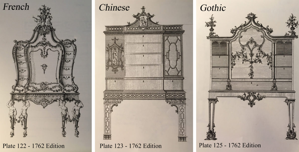
First, we can see what French, Chinese, and Gothic meant to Englishmen in the mid-18th century. Each of these cabinets is unmistakably from its time and place, but the overriding source of inspiration is also clear. The French influence was decidedly rococo: curvaceous forms, wildly organic sprays of flowers and acanthus leaves, an embrace of asymmetry, and an overall sense of lightness. Throughout Europe, stylized Chinese design motifs became an important component of the overall rococo movement – sometimes it was more overt than others. While the cultural infatuation with Eastern decorative arts predates Chippendale by generations, he and his contemporaries drew from this source material in particular ways. For them, the Chinese style was characterized by geometrical fret patterns, idyllic Chinese country scenes, stereotyped human figures, and architectural elements like pagoda roofs. England experienced something of a Gothic revival in the mid-18th century in which designers pulled elements like pointed arches, trefoils/quatrefoils, tracery, particular fret patterns, and bundled columns from their inherited medieval architectural traditions. All of these styles were shot through with classical proportions – “the very soul and basis” of the cabinetmaker’s art according to Chippendale.
Many of the most successful designs feature novel combinations of these influences. Chippendale’s mastery of this kind of synthesis is evident in the three cabinets illustrated above. In fact, the full plate of the Chinese cabinet illustrated above makes this integration clear.
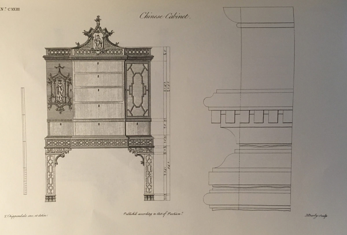
The cabinet’s proportions and molding profiles are explicitly derived from Classical designs (ogees, dentils, and the overall design of its entablature). Similarly, its graduated drawers, like those on the French cabinet, betray a classically oriented design philosophy. Of course, the classical figures that hold up the French cabinet and frolic atop it blend seamlessly with the rococo exuberance on display elsewhere. Meanwhile the rigid verticality of the Gothic cabinet is amplified and softened by the rococo elements that ornament its form. The flowing C-scrolls and acanthus leaves, tattered shells, and sprays of flowers don’t seem grafted onto the cabinet as much as they seem fully integrated and organic to this design. Similarly, Chippendale also worked rococo ideas into the Chinese cabinet (the door panel variation at left, the leg brackets, and the crowning central motifs).
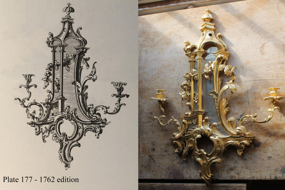
The girandole (sconce) featured here alongside a version made by my former supervisor at Colonial Williamsburg, Mack Headley, is a great example of how thoroughly styles could be intertwined by a designer of Chippendale’s caliber. The organic, asymmetrical flow of leafage wraps around a winding staircase from idyllic Chinese country scenes and Chinese-style columns with upswept capitals to reach a pagoda-style roof. Two design aesthetics with very different origins are made to make complete sense together. If all of this seems a bit too much for the type of work favored (and afforded) by even the wealthiest of colonial Americans and modern-day period furniture makers, then perhaps this library bookcase will serve as a good example.
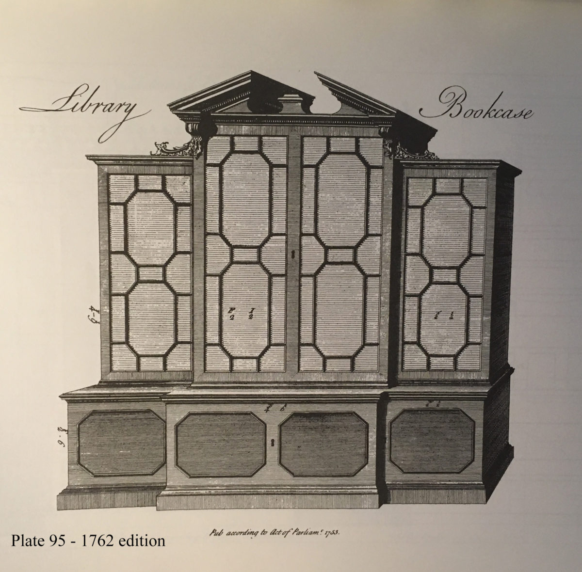
Here, we have a piece that seems emblematic of the mid-18th century Anglo-American world. It’s the kind of thing people likely think of when asked to picture a Chippendale-style bookcase. Looking closer, we may observe that it too is a remarkable synthesis of styles. The overall piece is clearly inspired by Classical architecture (its molding profiles, overall proportions and form, its broken-arch pediment), while the geometric patterns of its glazed doors are inspired by Chinese patterns. Period price books refer to these as “Chinese doors.” Topping all of this off, the transitional brackets that link the flanking cabinets to the central one are full-on French rococo designs. None of this seems out of place and that is due, in large measure, to Chippendale’s great ability to integrate disparate influences into a logical whole.
You may still not like the highly ornate designs pictured here, but that’s not the point. What matters more is that we look at one of history’s most influential designers and try to make sense of his work. Chippendale offers many great lessons, and while we’ve barely scratched the surface here, we can begin to get a feel for how we may come to terms with these complex pieces. As we create new designs, we’re often acutely aware of our influences and inspirations, but struggle to employ them in meaningful ways. Chippendale offers a great example of how to do this well. That in and of itself makes his work worthy of our attention even though we may not be the aristocratic crowd he targeted. That may even be worth celebrating. So, to paraphrase one of those 18th century aristocrats, let us eat cake! Happy Birthday Thomas Chippendale.
To look closer at Thomas Chippendale’s designs here are a couple of links to free, digital editions of his Director:
Also, if you’re in New York City check out this exhibit at the Metropolitan Museum of Art
More on Fine Woodworking.com:
- Survival of the Prettiest – Sometimes the worst thing you can do while copying an antique is to actually copy the antique
- Bill Pavlak and the case of the shrunken drawer backs – While reproducing a piece from Colonial Williamsburg’s collection, Bill stumbles upon a mystery that can only be solved through imitation
- Measuring a period piece – Many museums, collectors, and antiques dealers are welcoming to furniture makers looking to learn from or even replicate a piece of furniture, but make sure you use your time, and tools wisely
Fine Woodworking Recommended Products


Drafting Tools

Dividers








Comments
Great article with lots to digest. Thanks walking us through the history and giving such a practical perspective.
Log in or create an account to post a comment.
Sign up Log in