John Hartman, illustrious illustrator
Our talented illustrators make the projects featured in FWW easier to understand. Here, we show off some favorite illustrations John Hartman has done for us over the years.I was first introduced to Fine Woodworking magazine when my mother-in-law bought me a subscription as a gift. The first thing that struck me was the real, hand-drawn artwork. I was immediately interested in the articles and the layout design drew me in, but the artwork was what I appreciated most.
Years later, now working in the art department myself, one of my favorite parts of the job is placing final art in a layout. When I start to work on a layout I read and re-read the text to get my head in the project. Then, when adding photos, the story starts to become clear on another level. Something in the subject usually inspires a design idea and I’ll start to move things around. Then I’ll move things back, then move things around some more. Incorporating illustrations adds the final level of detail and clarification, because sometimes a photo just isn’t at the ideal angle, or you might wish you could see something right up close or even better, see through it.
The process of adding illustrations goes a little like this: When the layout is close to being complete, I’ll sketch rough art in a certain perspective and place it where I think it works best in the article, then send it off to an illustrator. We collaborate on what I was imagining for the drawings and then many times, they’ll have suggestions of how to make it even better. This is the case with illustrators like John Hartman.
When I get the final illustrations back, placing them in the layout is the last (and my favorite) step. After 13 years and quite a few completed layouts, it never gets old.
Here are some of my top picks of drawings John has done from past issues and even the current one.
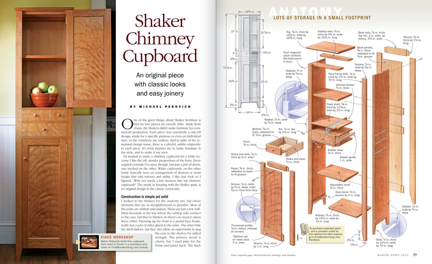
“Shaker Chimney Cupboard” by Michael Pekovich, issue #232
The color in this illustration is great and I love the cutaway treatment to show various details from different angles.
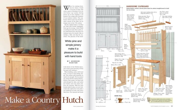
“Make a Country Hutch” by Andrew Hunter, issue #242
This illustration packs a whole lot of information in a relatively small space. It’s a good size project yet everything you need to know to build it can be gleaned from that one page.
“Bedside Table” by Garrett Hack, issue #253
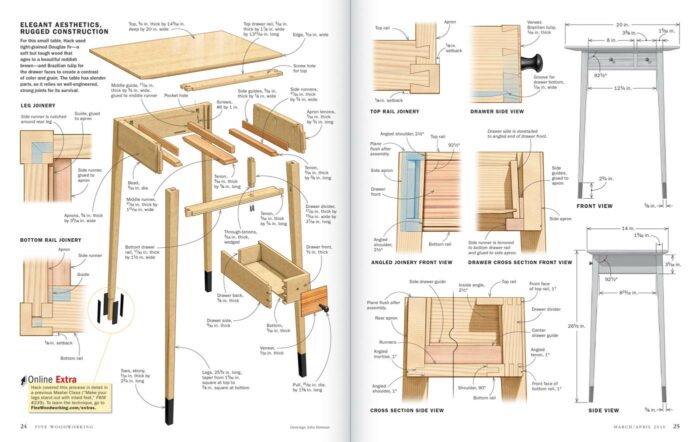
A beauty of a table illustrated in a two-page spread with an exploded drawing and detailed drawings of classic joinery. I’m not sure what else to say.
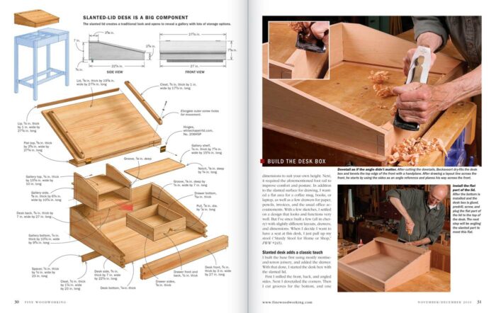
“Stand Up to This Desk” by Christian Becksvoort, issue #257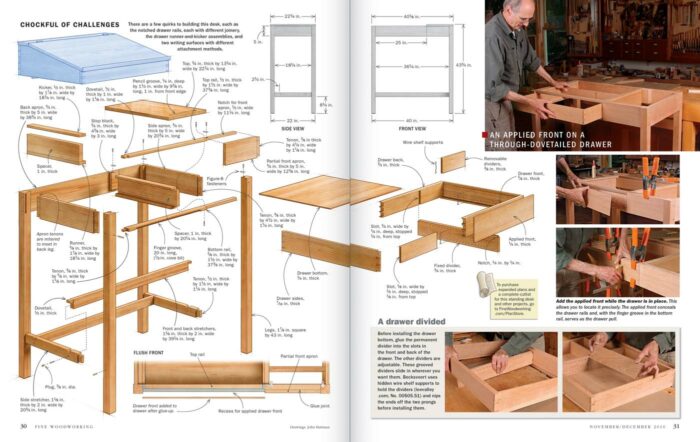
This project is basically two projects in one. It’s a lot to show in one illustration even if it sits on two pages. The base is covered mostly on one page but the drawer is still shown by jumping across the next page. The blued out top hints that there’s more to come.
The next two pages show the blued-out base for orientation and then moves on up to the top.
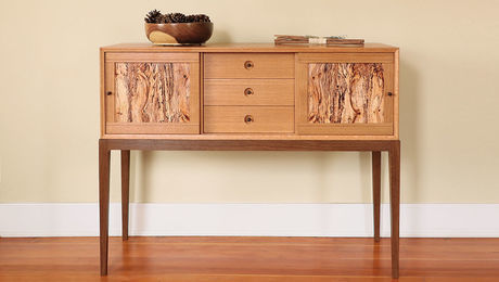
“Strong, Stunning Sideboard” by Chris Gochnour, issue #277
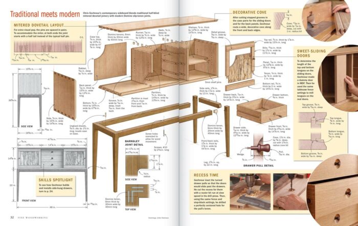
With a half-blind mitered dovetail case and gunstock legs, this project has a lot to love. How often do you get to see a drawing of live oak veneers sliced from a spalted firewood log?
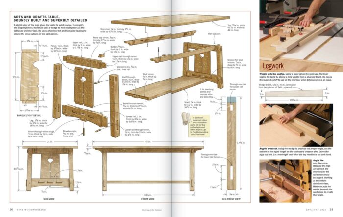
Arts and Crafts Coffee Table” by John Hartman, issue #289
I love the look of actual quartersawn oak in person, but I think I like drawings of quartersawn oak even better. I’m still not sure how John does it. I have to say on this layout, it was pretty fun to ask the author to illustrate.
-John Tetreault
*originally published April 7, 2021, updated June 28, 2023








Comments
Very nice post! This is one of those things that gets done so well, you take it for granted. I have always enjoyed the exploded views but never explicitly realized the detail and skill that went into it. It's that level of talent, attention to detail, and professionalism that engages me with the pages of FWW. Thank you, John H., for such a job well done. Thank you, John T., for bringing attention to what should have been obvious to me in the first place.
Loved the video. Thanks Ben for sharing. I do indeed spend a lot of time looking at the illustrated drawings in FWW. It's nice to get a behind the scenes tour. Recently discovered at one of the local city/junior colleges where I live, they have a number of drafting classes I can take for either free or nearly free. They're on my list of things to take. My brother took a drafting class in high school and really enjoyed it. Kind of wish I had taken it but I was filling my electives with more STEM related content (not that we called it STEM back then).
Ditto Satxwoodworks.
I just like to add that this has been a hall mark for FWW and FHB for a long time. I was a big reader of FBH and part time reader of FWW in the 70's and 80's when I was in the construction industry and remember how much the quality of the graphics added to the information in the article. It's fun to meet the people behind the pages, that make it all come together in a clean, clear, informative and beautifully put together magazine. Thanks to all the unknown warriors that toil to make this a great publication.
i
I always inspect the illustrations in FW with great interest. I tried to learn to draw starting as a child and I have been in awe of illustrators ever since. I learned I am not an artist! I have tried several times, even followed tutorials, and I still can't get a handle on SketchUp. I sketch out my projects by hand and with rulers and french curve templates. I enjoyed watching John Hartman talk about his work, although I am quite content with my french curves and rulers.
I was so impressed by John and his skills, and most of all by his humility. Being of the same vintage as him, my eye is goes first to the drawings in the articles before the photographs. While the photos are beautifully done, the sketches give me an understanding of how the project "works."
Ben, this is a wonderful video, and you deserve recognition for the shooting and editing and all the work you put into it. It nearly brought me to tears, which is a first for a Fine Woodworking video!
So much to build and so little time, these FWW comprehensive illustrated designs and illustrations by John couldn't be any better, no need to reinvent the wheel and design or redesign anything, just build something before your time or health runs out for your legacy and minimize your regrets.
On of the first things I do after receiving a new issue of FWW is look at the illustrations and see who drew them. I regard John Hartman as one of the finest technical illustrators.
FWW illustrations are such an outstanding mix of education and art. So much information packed in, but so beautiful to look at. John's work is a huge inspiration of what the best woodworking illustrations could be. Thanks for sharing some insights into his process.
Log in or create an account to post a comment.
Sign up Log in