Designer’s notebook: Turning out of context
Enter the mind of designer Andrew Finnigan, as he explores furniture details derived from turning.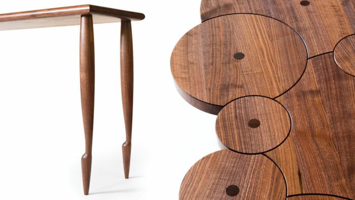
Synopsis: Enter the mind of designer Andrew Finnigan, as he explores furniture details derived from turning. Whether he is using a pommel cut to craft unique table bottoms, a series of disks to create an innovative tabletop, or creative cuts for elegant turned legs, his designs always seem to push the envelope of possibility.
Developing work is absolutely my favorite aspect of building handmade furniture for a living. For me, it’s not a rigid process that starts with paper and pencil and ends with the first version of a piece; instead, it’s a destination for daydreaming, something and somewhere to go to work through ideas. It pushes me to learn and practice and explore and experiment. It doesn’t require words or language, just the pursuit of applying an idea to wood and stepping back to see how close I came to what was in my head.
My work is filled with highs and lows, successes and failures, pretty little sanded and finished scale models as well as broken spindles, frustration, confusion, and annoyance. What it all has in common, the good and bad, is that it’s all-consuming. It’s pure problem-solving, a rare space for me where complete attention, observation, and imagination converge easily and naturally.
A meandering path
I find the particulars of designing and making new work to be a moving target. Rarely, a well-formed idea will present itself. Quick sketches will lead to a plan, a plan to a prototype, and a prototype to a finished product and debut.
More often, however, the process is much less linear. I’ll struggle to work through mock-ups and scale models to get closer to something I had pictured in my mind, only to find that I’ve fallen short, simply don’t like the piece, or that my pursuit is off-course.
One consistency I’ve managed to find in all of this has been designing from details. Much of my work and aesthetic originates from tiny features and their minutiae. Focusing on them allows me to work aesthetically from the micro to the macro.
When I lose myself in circular thought, when I don’t know where to begin, when I’ve hit a wall, the answer is usually to chase after whatever it is that makes the little burnished facet left from a sharp knife so inviting, to wonder what about a piece makes it seem to float above the floor, or to see how far I can take the hexagon.
The pommel cut explored
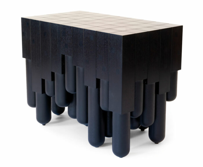
We’re likely all familiar with how a large group of turnings that incorporate the pommel cut appear; most any staircase with turned spindles would be a fine example. Some even contain pommel variations within their patterns. But how does a group of pommel cuts present in closer proximity? How can this detail be used outside its usual context? How can different arrangements and positions of this one little detail lead to wildly different designs? What can be accomplished through careful and simple repetition of this single feature? This table affords me that ongoing conversation; the design is a rough template, and each iteration of the table is slightly different depending on my answers.
A study in shape and relationship
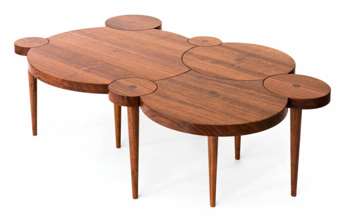
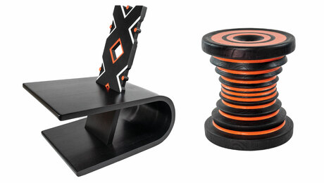
Designing this table was a way for me to more formally study the interactions of disks and to challenge myself mentally. I fitted disks of various sizes into one another, the interactions between them technically the same—always an arch of one circle cutting through at least one other. The interest for me in this design was in how the details came together in a group. The nuances of their interactions can be exploited through playing with scale and position to create an entire piece. The design allows for endless variation, and depending on the arrangement, each version can tell a different story.
The pommel evolution
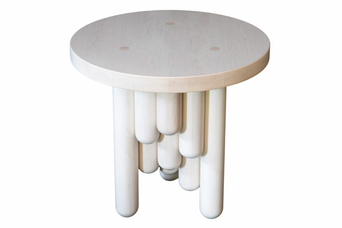
I wanted to see if I could expand the Pommel Table geometrically, not limiting myself to a square or rectangular form. After many sketches, models, and mock-ups, I was left with an array of unsatisfactory results. I couldn’t manage to merge rectangular components with hard-edged pommel cut lines with other, softer-edged shapes naturally. The details competed for attention, resulting in a design that didn’t seem to know what it wanted to be.
After much head scratching and tribulation, it became obvious to me that the solution was to further reduce and focus. The rectangular stock, the pommel cuts, the straight hard lines, and the chamfered edges on the top were all unnecessary within a cylindrical space. I found that I could accomplish what I was going for by losing the pommels entirely and simply modifying the length of the cylinders, terminating them with half-rounds at various heights. The result is a cascading series of tiered columns.
A fresh foot leads the way
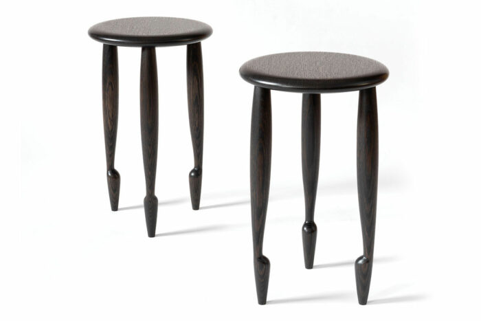
The Bourrée Series, named for a ballet step, began as a search for a soft-edged design that would work well with various color treatments and surface textures. As I worked through the concept and built models, the results kept boring me. Cigar-shape legs felt too bulky and cumbersome, as did cylinders. Tapered legs led to a visual lightness that didn’t support the top. So I began to veer from these initial simple shapes to a turning experiment that created a very rough “heel” shape. Focusing on that heel, refining the turning technique and hand-tool work, led to the development of what would become the piece’s ballet-style foot.
Andrew Finnigan designs and builds furniture in Stone Ridge, N.Y.
Photos: Andrew Finnigan
From Fine Woodworking #302
 |
Designer’s notebook: Inspiration surrounds us |
 |
Designer’s Notebook: The art of turning |
 |
Twisted and Textured |
Fine Woodworking Recommended Products
CrushGrind Pepper Mill Mechanism










Log in or create an account to post a comment.
Sign up Log in