Shaker design: Unadorned, not unsophisticated
Shakers may have been pragmatic and believed in utility first, but their designs were not simple. To the contrary, they combined natural materials, superb craftsmanship, and beautiful details.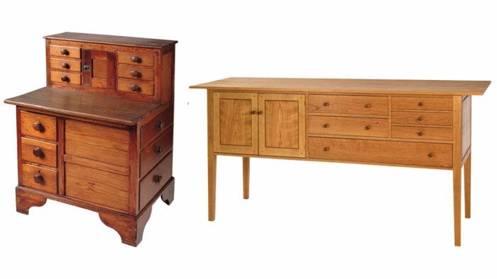
Synopsis: Shakers may have been pragmatic and believed in utility first, but their designs were not simple. To the contrary, they combined natural materials, superb craftsmanship, and beautiful details. That’s why the style is so desired today. And it’s a challenge to do it right.
Many people view Shaker furniture as simple. I built my career making Shaker pieces. It may be unadorned, but it’s not simple. The fact that it has few, if any, decorative elements doesn’t mean it is rudimentary or lacking in elegance. The joinery, often hidden, is by no means elementary; instead it is frequently quite involved and of complex craftsmanship.
The Shakers were pragmatic and believed that utility was priority number one. That does not mean they ignored design or quality. Their work was incredibly well made. Many original Shaker pieces are over 200 years old and are still in fine condition. As a friend of mine used to say, “Antiques are old because they were built right.” Combining natural materials, superb craftsmanship, and no-frills designs is what made Shaker furniture aesthetically timeless and durable. Hundreds of years after the first Shaker piece was made, the style is still sought after today.
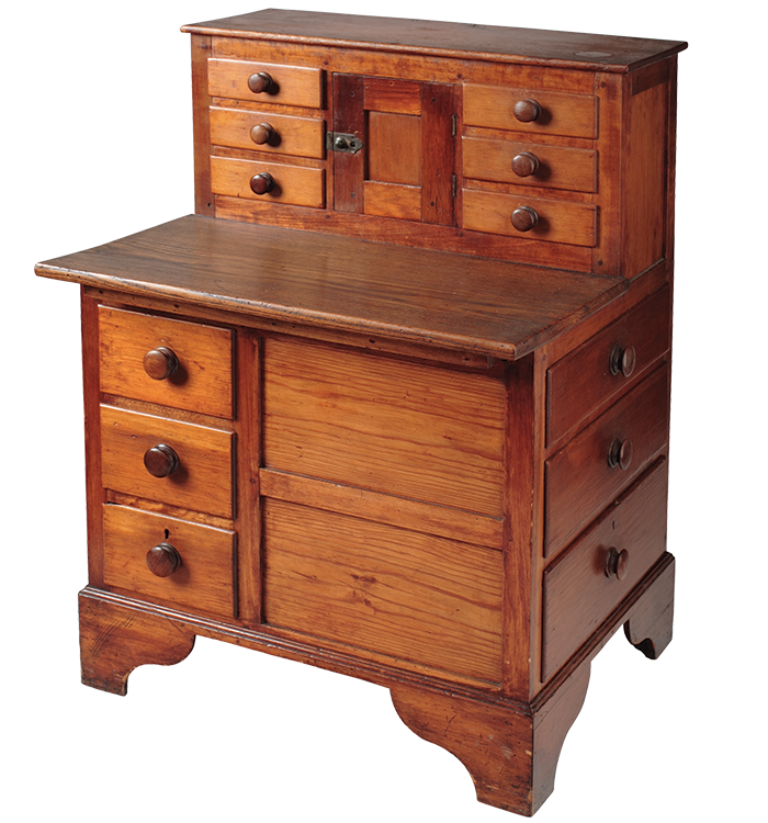
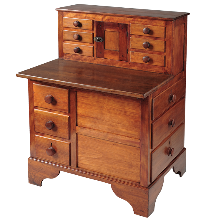
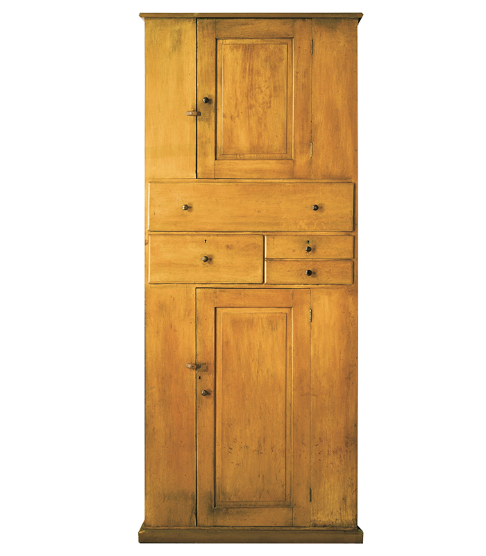
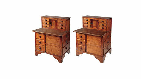
Building in the Shaker wayBecksvoort has a three-pronged approach when copying or adapting Shaker designs. His methods range from building exact replicas, to making subtle changes to originals, to bold borrowing of elements to use in his own designs. The original shaker deskThis early Shaker sewing desk was built out of pine and maple with a clear finish. The ogee curves on the base point to either Enfield, Conn., or Canterbury, N.H., as the origin. No-wiggle-room reproductionsWhen making an exact reproduction, Becksvoort is as faithful as possible, replicating the dimensions, wood, techniques, and hardware (even if it must be custom made), and using period-appropriate screws, nails, hide glue, and finish. (Linda Coit applied a period finish to one of his reproductions in FWW #203). The two pieces are nearly identical, but the new wood and finish have a different aroma. |
Clean, unadorned lines
When I first started woodworking, I built my share of decorative pieces. I’ve made a fair number of cabriole legs, carved elements, reeds, and flutes. Although in many cases I admire the craftsmanship involved, superfluous decorations are not my cup of tea. If you think about it, our personal taste determines pretty much all our design decisions from the clothes we wear to the cars we drive, the furniture we have in our homes, and beyond. My individual taste just happens to run closer to the Shaker aesthetic than, say, very ornate period furniture.
To my design sense, a smooth, clean surface is more appealing than one that is interrupted, embellished, or decorated. That’s one reason I admire and emulate not only Shaker design, but also Scandinavian and Mid-Century Modern work. They seem to share a design ethic: Keep it clean, uncluttered, and functional. Adding complex moldings, carvings, intarsia, scrolls, proud joinery, and excess hardware can detract rather than add to the overall design and function. Shaker details come in the form of subtle tapers, very simple moldings (if any at all), asymmetry, and an occasional curve.
It’s important to consider grain when you’re trying to build a piece with clean lines and subtle details. Nothing catches your eye (and not in a good way) more than flat cathedral grain running out and glued next to straight parallel grain. Your eye instantly notices the interrupted grain and tells you it’s a lousy match. I spend an inordinate amount of time grain matching boards when gluing up wider panels, and I’m sure that the more experienced Shaker craftsmen did likewise. The idea is to minimize the look of individual boards. Gluing long parallel grain to long parallel grain is the best way to accomplish that.
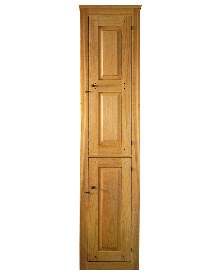
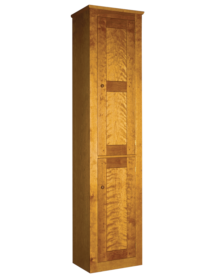
Interpretation with modern methodsWhen copying Shaker designs, Becksvoort is open to using more modern building practices. His version, at right, of an early tinware cupboard (sometimes called a chimney cupboard) from the Church Family, Mt. Lebanon, N.Y., is mostly identical to the original, but has modern hardware and a different finish. He also gave it a frame-and-panel back, while the original had individual boards. Leaving fingerprintsBecksvoort often blends his DNA into an existing Shaker design, making small changes that can have a big impact. After making his pine interpretation of the Mt. Lebanon tinware cupboard, he built this version in cherry. Not only did he change the wood species, but he used his preferred flat, flush panel doors. He kept the original dimensions but updated the look with these tweaks. |
The practical side of less adornment
As a craftsman, I much prefer to finish a smooth, flat surface than one that is interrupted by moldings, carvings, scrolls, and raised or inset surface decor. I really dislike brushing or wiping into corners, which you’ll encounter when finishing almost any piece of furniture, including Shaker. Why make life even more complicated? The only thing worse than finishing is dusting. Trying to get dust, dirt, and grime out of angles, crevices, and complex moldings is a real chore. Unlike finishing, it must be done over and over, year after year. As you may have gathered, I like to make it functional, keep it clean, make it smooth. It’s easy on the eye, and ultimately easy on the hand.
—Christian Becksvoort is a longtime contributing editor and expert in Shaker design.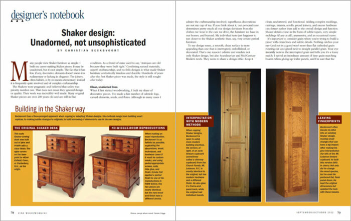
Photos, except where noted: Dennis Griggs.
For PDF layout, click on the “view PDF” button below:
More from Christian Becksvoort
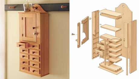 |
Build a Shaker hanging cabinetThis lovely wall cabinet is diminutive in size but large on techniques |
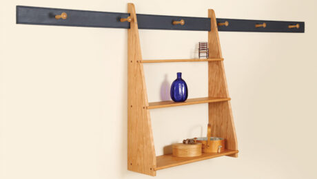 |
Shaker hanging shelfHanging shelves were a staple in Shaker homes, created in a range of sizes, materials, and techniques. |
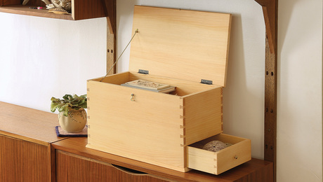 |
Shaker Chest with a side drawerManageable size and smart techniques make this a fun and rewarding project |







Log in or create an account to post a comment.
Sign up Log in