Make your dovetails more interesting with variable spacing
Erik Curtis offers advice on how to elevate your dovetail layout with a few simple tips.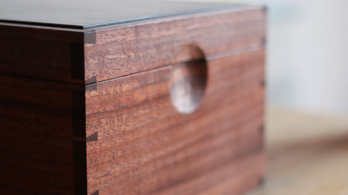
Dovetails are, for better or worse, the calling card of fine craftsmanship. Whether cut by hand or machine, they hold the undisputed title of “king of joints” (they don’t, I just made that up–but it sounds good, doesn’t it?). They are the gold standard to which every young woodworker aspires. And there are myriad tips on the internet to help you lay them out easily. But there is a problem–once you’ve seen one set of dovetails, you’ve seen them all. Tail, pin, tail, pin, tail. There is no variation. Things become stagnant quickly. So, how do I avoid that problem and keep dovetails fresh and interesting? Variable spacing.
Experiment with design
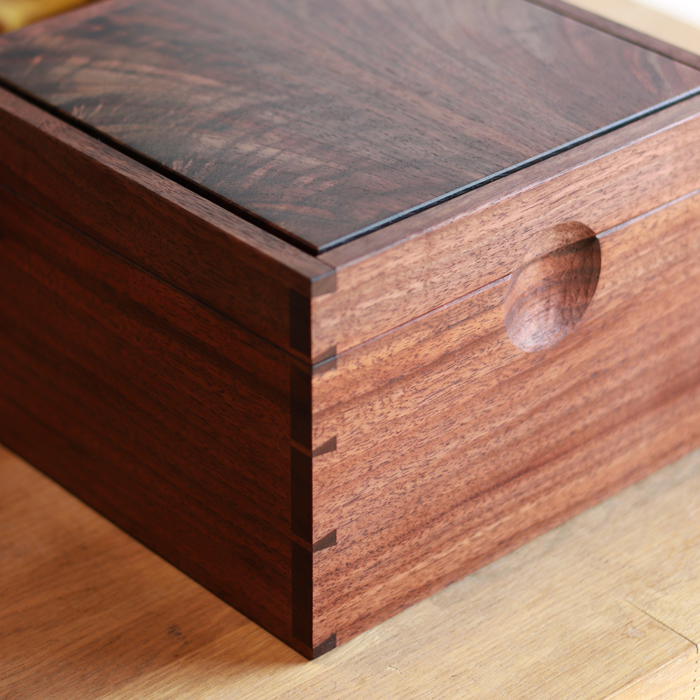
Let’s begin with a simple box. A humble container. The photo above was a commissioned box for a family heirloom, the through-dovetails at each corner its primary visual focus. But a repetition of 1-in. tail and ¼-in. pin didn’t quite sit right with me. It felt less than stellar–something I wasn’t particularly excited to present to the client. So instead I chose to make the dovetails grow, with the widest tail at the bottom and each subsequent tail growing smaller as the eye is drawn upward. This was meant to echo the growth of a tree, with its wide, sturdy base giving way to smaller branches as it grows up and finally tapering out to delicate new offshoots at the top. This gives the box a measure of visual weight at the bottom, making it feel grounded and sturdy, while avoiding the feeling of a big fat cube and giving the eye somewhere to go. It is, in my opinion, the design element that makes the box work.
Follow the rhythm
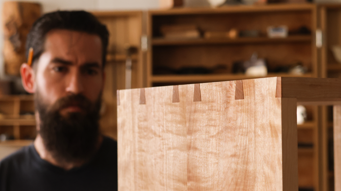
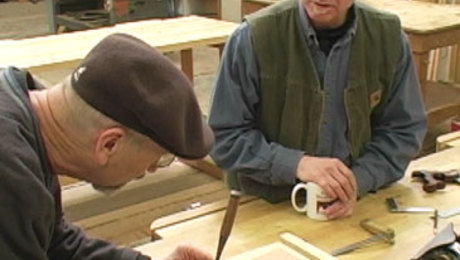
You need not always follow the same pattern of “growing” dovetails, however. I certainly don’t. In the photo above you can see that I chose a rhythmic pattern instead. In this instance I was limited by the fact that the pieces were bookmatched. Had I chosen an asymmetrical dovetail pattern for a bookmatched (and therefore symmetrical) component, it would have felt dissonant and unsettling. Utilizing an A-B-C-B-A pattern gives me the same visual interest as the growth pattern while still allowing my layout to feel centered on the bookmatch line. If you’re interested in hearing me discuss this layout pattern at length, you can check out this video below.
Shake it up
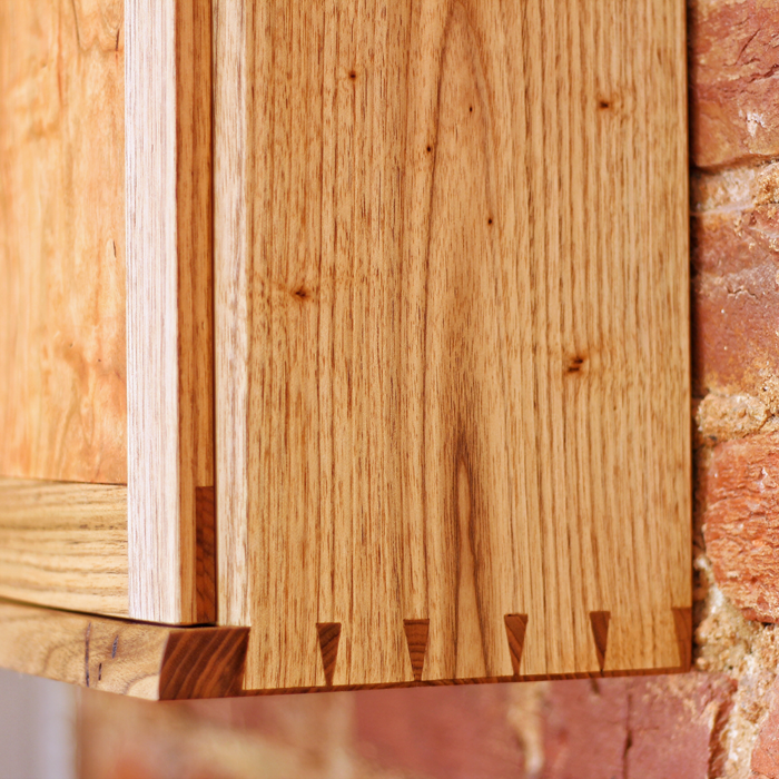
Now don’t get me wrong, there is nothing wrong with a simple dovetail layout. I’m not here to yuck anyone’s yum, after all. I’m only here to offer my experience. And in my experience, I became bored with traditional dovetail layouts after some years–but I still loved dovetails. I wasn’t ready to part with them entirely. So I found a way to keep them engaging and interesting that worked for me. It may be that in time you find dovetails to be a little less than adrenaline-inducing as well. Then again, maybe not. But if you do, try playing around with spacing. Explore different patterns. Don’t be afraid to be musical with it. It’s important to leave room for experimentation. It’s often in those moments where the greatest amount of growth occurs.
Erik Curtis
Fine Woodworking Recommended Products

Stanley Powerlock 16-ft. tape measure

Sketchup Class

Drafting Tools







Log in or create an account to post a comment.
Sign up Log in