I’m interested in starting a thread where we share the principles/strategies we use when we are designing furniture/cabinets/houses, etc. At least the strategies that can be put into words; sometimes it seems like design can be magical…
I’ll start off by describing one of my most used strategies, that comes from the music arena: theme and variations.
I like to establish a theme in my designs, which can be as simple as “all straight lines; no curves” to something more complex. A curve, a relationship between parts, etc. Unfortunately, a theme over-used can end up boring, so we turn to variations to keep things interesting. If we round over every edge in a piece with the same 1/4″ RO bit, it can be both boring and muddy. So, instead we can use different sizes for different sized pieces in the design, or we can use a cove in a few places, which is just a reverse RO. We can round over only the edges folks are likely to touch, and leave the others square.
Two sub-thoughts for this principle:
1) Try not to use a design element only once in a piece; it is likely to stick out as an unintegrated “feature” instead of part of a whole design.
2) Make the variations noticeably different. If they are just barely different, it can look like a mistake or poor workmanship.
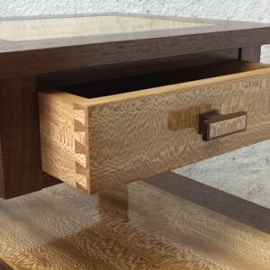
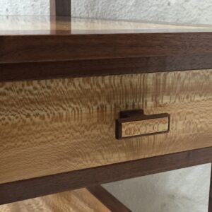
I’ll show a couple of examples. The first is a bedside table made of walnut and quartersawn sycamore. The main theme is: straight-grained walnut as a frame around the highly figured sycamore. The second theme is all straight lines. I had bought some little round brass knobs for the drawers, but ended up saying, “I just can’t put these round things in this design”. So I made some knobs within both themes; pictures follows.
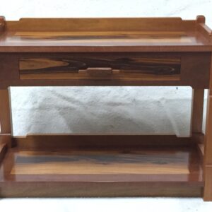
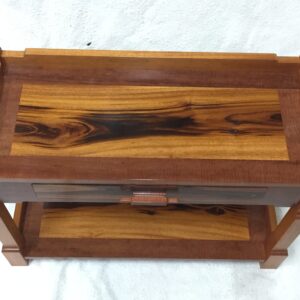
The second piece was a low side table with a drawer, made of mahogany, tiger stripe mukulungu, and a very dense mystery board from Belize, that my customer bought at a sawmill there decades ago. The two themes are a 3/8″ rounded step between levels, and the mukulungu framing the mystery board. The design was constrained by the sizes of the two boards (I had the mahogany in stock.)
So what of your design process can you put into words and write for us to learn from?




Replies
Interesting topic!
I believe in designing with contrasts. That includes contrasting shapes like rectilinear elements combined with curvilinear elements. It also includes different thicknesses, species, and sizes of the components. I like my pieces to be "explored", meaning the entirety of the design concept shouldn't be taken in at one glance. As you walk around the piece you should find some unexpected, and hopefully intriguing, integrated elements.
I've attached images of two projects.
I had a beautiful Maple slab that I figured would make a great bench. But I didn't want the "legs" or other components to fabricated of similar "slab" elements. To me that just looks boring and "clunky". My solution was to fabricate those elements out of Baltic Birch plywood. Of course it is wood, but it also has the interesting, delicate, graphic quality of its intrinsic ply layers which provide contrast to the slab's weight and shape.
The second example is what I call a "shelf stand". It's a freestanding piece that accepts shelves at different heights and orientations. The Cherry components are contrasted with the Ambrosia Maple elements which are used to support the shelves. I integrated a variety of shapes and wood thicknesses which I think provide a very functional solution with a pleasing overall aesthetic.
Good ideas there! I had a similar situation with a crotch mahogany coffee table that was a crazy piece of wood. For the base, instead of trying to find some curvy design that would "match" an unmatchable piece of wood, I made it of straight grain mahogany with very rectilinear pieces. Here are pictures (of the top in sunlight, and of the whole table in rather less light.)
To me that base enhances the beauty and uniqueness of the top as well as the overall look of the table. In other words, nicely done!
Thanks! I did a fair amount of curve-imagining before I realized that the base needed to be a base, and not more of the top. The customers agreed with me on the base design, esp. when they saw the finished table.
Tom McLaughlin is currently doing a show on Designer Legs on Shop Night Live tonight. For those who don't know you can view the taped shows on You Tube.
Tom is currently focusing on putting exotic veneer on a tapered cherry leg. He definitely is making me re-think about my poor opinion of veneered furniture.
For a number of years now, I have been thinking about how the number of design elements will place a piece of furniture into different "style" categories. This is by no means a hard science or rule, but it has helped me figure out how to design furniture to fit into different historical styles or have a particular look and feel.
Here is how I think about it.
No features: This is basically flat, square wood, no edge treatment. Nothing fancy. Flat slab doors. Pieces like this are utilitarian. These are IKEA cabinets and plywood storage cabinets in your shop.
One feature: This starts to look modern or clean. The table above fits this very well. The figured wood is a feature and a clean, simple base shows off the top. Midcentury modern, shaker, and some contemporary furniture fits into this category
Two features: Now you start adding curves and edge treatments. Figured grain and exposed joinery. This category starts to look busier than the above category. Many classic styles fall into this group: Arts and crafts, craftsman, some federal furniture, art deco.
Three or more features: This furniture looks busy and it can make a statement. It can pull you in to really study the furniture. Here is where you have complex moldings, curves, veneers, carvings, complex fabric designs, etc. I think this really describes Chippendale, some federal, some Victorian, and many other classic styles.
As I mentioned, this is not an exact science, but when I start designing a piece I think about the overall look of the space it will be in, the feeling I want the piece to convey, how I want to feature certain aspects of the wood or design and then pick a number of "features" to add.
For example, most of the furniture I build has flat panel doors. This is construction frequently falls in the one or two feature design category depending on other aspects of the piece. It tends to look clean and simple. I recently built some large barn doors for a bar. I wanted the doors to make a statement. I wanted a heavy look so I went with a very standard flat panel door construction, but added a nice figured veneer to the panels and bolection moldings around the panels. This small change in construction dramatically changed the look and feel of the door.
I work backwards in a sense.
I determine if a piece is to be art or utilitarian or a combination, I determine if it needs to fit a style culture or genre, I look into what woods could or should be used, then I decide on the construction that will facilitate everything that preceded it. Once I figure out these (very basic) questions then I can begin.
In a nut shell, If I know what is expected of a piece and a general idea of what it should look like, I can go from there.
Another very obvious factor in design is will the end product be for you or will it be for a client. If you are working for a client they will certainly have input into the function and aesthetic. They may want the piece to match some existing styles or colors in their environment.
Yes, in fact I greatly prefer to see the space that the piece will start its life in, in the hopes I can pick up at least one or two design details that will help it feel like it belongs there. Nothing worse than a beautiful piece looking like a sore thumb.
I enjoy the challenge of getting into my clients' heads, to figure out not just what they think they want, but to take it farther than they can imagine to a place that thrills them. (I try not to present the bill until they have seen their new piece...) Seeing the environment that they have created for themselves gives me part of the information I need.
I have also made pieces to complete an existing bedroom or dining room set, where there was virtually no design except determining the dimensions. There the hardest part was always matching the factory finish without the factory finishing facility.
Out of curiosity Harvey, do you have any formal design training? Several of the approaches you outlined in the above post lead me to believe that you do.
A little. When I was a senior in college, I was a math major, and needed some non-math courses to complete my degree. I took a 2-dimensional design course one semester, and a sculpture class the second. As a beginning student, I was honored that a couple pieces (one from each class) made it into the end-of-year student show. (Also took a music appreciation class, where theme and variation was even bigger than in the art classes.) Besides what I learned in the classes, it got me looking at and thinking about art, esp. 3 dimensional art, as I wandered around the Western Hemisphere after I got out of school. (Lived in Italy and Mexico.) I went to a lot of museums and public sculpture installations in Europe, and got a very different art to look at in Mexico. I'll post a concept I learned in the 2-dim class at the end of the thread.
Really nice looking designs here, but way over my head. Being retired (76) and a mere hobbyist, I just follow the plans in FWW and hope my efforts turn out as good as the magazine pictures. The guiding principle for my home decor is "hodge-podge", so it usually fits in somewhere just fine. Paraphrasing Doc "Bones" McCoy, "Dammit Jim! I'm a woodworker, not an artist!" Even so, I am partial to a modest "arts and crafts" design - strong and useful.
Nice headboard Bluemo! Looking at the beautiful inlay work you've done I'd say that you are an "artist".
Thanks. Design credit goes to Kevin Rodel, who based it on a Gustav Stickley original.
https://www.finewoodworking.com/2017/02/08/arts-crafts-bed
I altered the bed size to go from a queen to a California King to accommodate two tall adults and two long weenie dogs.
Another concept, that I learned in a 2-dimensional art class, is that your eye wanders around when you are looking at something, rather than staying in one spot. When looking at a design, as your eye wanders from the middle to the edge, a strong design has an element at the edge that encourages your eye to move back toward some part of the middle (possibly a different area than it came from.) I'm sorry that I don't have an easily accessible example to show this. I will say that when I'm designing a bas-relief carving of vines and flowers, I typically have the vine at the ends curve back toward the heart of the design, to encourage the viewer's eye to linger on the design. I'll include a picture of a church kneeler where the ends of the vine tendrils tend to recirculate you back into the carving. Apologies for the poor picture quality. Also note that the leaves next to the central carving encourage your eye toward the center, like hands saying "look here".
I go in two directions:
1.) What is the end need, table, chair, cabinet, etc. Function. Then how to make it to work and to be sturdy. Next will be the materials. Finally will the the visual shape, something that will be in concert with the above.
2.) The other principal will be what wood do I have on hand, and how can I maximize it to it's fullest potential. One example I mentioned in a previous post was how to use the walnut sap wood into small tables. Another example was the quilted maple charcuterie board that looked nice but could not be fit into another project. Final example would be making small tables with tile tops with reclaimed lumber.
I've used similar concepts and order when designing chairs. Both times the chairs were made to the measure of the recipients. The first time, it was a pair of chairs for a couple getting married (a deadline!). I had them send me various measurements and designed a chair that worked for both of them (I actually made 4.) I had some nice 4/4 and 8/4 walnut, so that made the wood choice easy.
The second chair was designed for a friend who is a dwarf. I made a fitting chair (as described long ago in FWW) and adjusted it with him sitting in it until it was just right for him. Then I had to design something reasonable-looking around his measurements. I had one 8/4 ash board that was just enough lumber, and was the only ash I had. It had been sitting around with me wondering what to do with it; this was a good use for it.
I cheat.
Lacking any talent whatsoever at design, I find a bunch of photos of furniture that I like and try to incorporate those elements.
More often than not, my wife will see a pic of an item she likes and ask me to build something like it, usually in a particular wood, or to a particular size. Bit like Norm Abrams that way I suppose.
The attachments show a close copy of a bed I made - the original in the store in pine and ply, the interpretation with drawers and a much taller foot at the request of the recipient in solid heart rimu with baltic birch for the slats and drawer boxes.
There is almost no change from the original but because I preferred it, I turned bun feet and gave the legs an octagonal profile rather than square. In truth this is just copying a better woodworker's design, but I don't feel too bad about it. I was proud of making the bed with the only 'plans' being the image in the catalogue.
Where I do original work, it tends to be an adaptation or extension of a design as opposed to something totally novel. I am in awe of those who are able to manage that and make something truly new.
I have a formal design background and enjoy the creative design process as much as I enjoy the build process.
What a coincidence that Harvey's design examples were chairs. I'm in the middle of designing and building a rocking chair for my wife, at her request. I couldn't find much info on designing a rocker because there are so many variables to consider. Seat and backrest angles, center of gravity, radius of the rockers, and human factors. So I decided to build a prototype using MDF, screws, and bolts. I have been constantly calling my wife down to my shop for test drives. After her input I make modifications and start the test drive process again. You can see some of the modification drawings on the prototype itself.
I think I finally have the design dialed in and am currently in build mode.
I want the design aesthetics to be contemporary and unique and I had a concept in my head before I began working on the prototype.
I like your prototype. What kind of joinery are you thinking about? Will joinery replace some of the nuts and bolts?
Yep, the prototype is MDF joined with nuts and bolts to facilitate repositioning of the components as I attempt to get the final design figured out.
The actual rocker will have the seat and backrest made out of curly Maple. Those parts will be captured in dados that will be cut into the side pieces. I'm also going to add some thru floating tenons to help secure the seat and backrest in the dados. Half of the seat and backrest will be cantilevered so I'm a little worried about strength. The rockers, sides pieces, and armrests will be made of Cherry.
I've attached a hand drawn front and side elevation of the rocker with some dimensions and notes added. I'm currently using the drawing for the build.
Another design aspect that we haven't talked about yet is asymmetry. Sometimes we use symmetry in very visible and striking places, like book-matched slabs for a table top. Other times we use asymmetry to provide visual interest, and a little startle for the viewer. The trick for me is to find some kind of balance within the asymmetry. When I'm designing flower, leaf and vine carvings, I look for the different parts to feel balanced even tho they are not symmetrical. I'd enjoy seeing some examples of asymmetrical things you have made, and your thinking behind the final design.
An aside. You may be using the term "symmetry" to refer to "bilateral symmetry" or mirror imaging. This is not what the term means historically in architectural design from ancient times. The word symmetria/symmetros from its origin meant something more closely related to mathematical, geometric, proportional (ratios) "harmony". In classical architectural studies today this is how we use the term - to basically describe design ordering principals. Vitruvius would say elements in proper agreement. As an example Leonardo da Vinci's "Vitruvian Man" is a diagram of organizing ratios vis a vis the human body.
“[Deleted]”
I also like little surprises Under the edge of a small entry way table i carved adjacent small groves.Invisible unless your hand roames under the lip,it never fails to have people bend over to see what it is.Another was a suggestion from a teacher friend to put a subtle tapered ridge under the he arms of a dining room chair.It always delights me to feel that invisible ridge
People do touch the underside of tables. I learned that early on (1981) when a customer (a woman) approached the cherry strip-laminated ("butcher block") kitchen counter I had made her, and touched the underside rather than the intimidating top. Almost 40 years later, she first touched the underside of a crotch mahogany coffee table I made her and her husband. And in between, lots of others have touched the undersides of tops as well. I guess if you want folks to find your signature, carve it into the underside of the top where they can feel it.
It seems like most of the posts so far have been referring to design aesthetics.
Aesthetics aside, another really import component of design is function. I find the function component is very much dependent on how you define the project. If you say "I'm going to build a chair" you already have a partially imbedded preconception in your head and it probably includes a seat, four legs, a backrest, etc. If you say "I'm going to build something to sit on." you might be looking at a clean design slate with no preconceptions in front of you.
I find working without any design preconceptions is a very interesting and challenging way to start a new project.
This forum post is now archived. Commenting has been disabled