I’m designing a sideboard and would love to hear your feedback on proportions and design. It’s somewhat inspired by Chris Gochnour’s piece published in 2019. The piece is about 40″ wide x 38″ high x 20 deep, with the dimensions specific to where this will be placed. It’ll be used for odds and ends (napkins, placemats, etc), with no contents dictating dimensions. I’m thinking that it’ll be constructed of cherry, white oak, or ash. The door slabs may be veneered with a parquet design to add interest to the piece. I’ll work out other details later, just working on the basic design right now.
Would love to get any feedback on what you like and what looks odd.
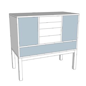
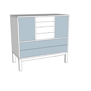
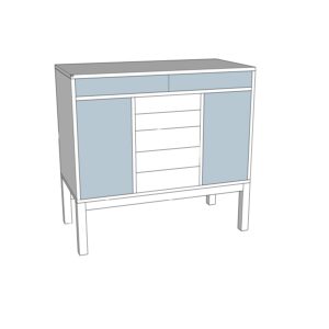
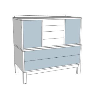
4 designs:
1. Chest on Stand with one lower drawer
2. Chest on Stand with two lower drawers
3. Chest on Stand with one top drawer
4. Chest on Chest
Thanks in advance!
Ken




Replies
I find the first and third most aesthetically pleasing. A sideboard is as much a tool as a piece of furniture so your needs must be met. Wide drawers in a lower position are ergonomically awkward IMHO so the third one gets my vote. I would consider three top drawers though for visual effect.
To my eye, the first is the most pleasing. My personal POV is that sideboards are best with a bit of clear space underneath and some visual lightness -- when then come down closer to the floor then they start looking more like a chest of drawers (bedroom) or stacked china cabinet/breakfront. This is especially true when playing with a more modern, rectilinear design like the one you are working on.
FWIW - Ive found the article "Sideboard Strategies" written by Will Neptune immensely helpful.
I'm with Matt. I built a sideboard for myself a couple years ago, and my construction was similar to Will Neptune's article.
I also like less height in the upper box, and more room underneath.
https://www.instagram.com/p/CDbtC5ODUGK/
That's an interesting, asymmetrical design. I haven't thought of that before, and I like it!
I like asymmetric. Shakers did that pretty often.
“[Deleted]”
I looked at "Sideboard Strategies", and it was helpful. There are some really good project articles in the FWW library!
Three possible different woods
May have veneer or parquet pattern
Four different styles
Every element, wood, treatment and style directly affect one another
That's a minimum of 36 different configurations. I think you need to refine your choices a bit.
I agree.
Good design requires constraint. The design of Japanese gardens is a wonderful example of constraint.
The observer appreciates the elegance of the design slowly and unconsciously. It is said that a Japanese garden design is complete when nothing else can be removed.
“[Deleted]”
"every element, wood, treatment, and style directly affect one another"Yes, absolutely second the above.
1 and 3 are the most balanced, to my eye. The other two seem bulky to me I think the drawers are the top of 3 are more ergonomic.
I'd personally pick #3 :)
“[Deleted]”
That's a beautiful design. Do you have pictures of the finished piece?
“[Deleted]”
I vote #1, followed by #3.
Emphasise the horizontal and not the vertical.
Aim to create a lower centre of gravity.
= #1
Better still, no long drawer.
Also, if you are building a wood-on-wood drawer (i.e. not using slides), then the long drawer needs to fit very well. Any looseness to the sides will cause it to rack. Racking is more likely when the width exceeds the depth of a drawer.
Regards from Perth
Derek
I'm not a fan of the full width drawer aesthetically - it's a bit much for my taste. Even so, I'd pick 1 as my favourite - just make the drawer thinner.
Thanks again for all of the thoughtful feedback! I honestly thought that I had a great design with #4, and I'm so glad that I asked for thoughts. You gave me a lot of really good advice on proportions and aesthetics. I re-read Will Neptune's article, at @mattk41's advice, and when combined with your observations, his advice on proportions make a lot of sense. @robes_pierre design is really inspiring.
Here are variations of #1. Both cases are shorter, but overall height remains the same. Drawer width is driven by dimensions of placemats which they'll hold.
A. Shorter case. Split bottom drawer which is not as high.
B. Asymmetrical with door on just one side
I like B.
As I tried to mention earlier, the aesthetic will change when you decide on wood species and/or treatment.
What looks good in grayscale may not translate to cherry or oak and can throw off the entire look of the piece.
I would find out what would look best in it's final location first before I commit to cutting.
Just a friendly suggestion
I couldn't agree more! Right now, I'm just trying to figure out the general design and proportions. I know that it'll basically be a clean, mid-century/Shaker design. If it's cherry, then I might turn the legs like @robes-pierre did. If it's ash, I might add interest with a mosaic, veneered door panel. Really appreciate your comment that the design will be greatly influenced by the wood selection.
Love your suggestion. Thank you.
If you are on IG look for @dhphillips latest post. It seems to be a similar aesthetic to what you are trying to accomplish. Very light and modern with some well some classic design elements.
A 1:1 cardboard model is a great way to work on items made for a particular placement.
That's a beautiful piece! Thanks for letting me know about @dhphillips.
Good luck!! Since John C and Robes P were sharing, and I mentioned building based on the article….here is my build from 2017
That's a BEAUTIFUL piece! You're more skilled than I am ambitious. I think that I'll use my sideboard project as a reason to buy a Domino, rather than learning how to do dovetails. Ha.
Very nice.
#1 gets my vote.
#'s 2 and 4 seem too complicated.
#3 would be second choice but seems upside down. I would normally think of putting larger/wider pieces towards the bottom. Like a Christmas tree shape.
My opinion on design is worth what you paid for it.
This forum post is now archived. Commenting has been disabled