I posted last week. Taking in the comments and revising, I’ve come to these 3 designs and would really appreciate hearing your thoughts.
For context, the width of the piece is defined by the space it’ll occupy. About 42″ wide, 20″ deep, and 38-40″ tall
I just bought a Festool Domino and want to use it to construct the case and base.
I need several 4-5″ tall drawers for placemats which measure about 14″ x 20″.
I’d like to do some veneered slab doors. I’ve been inspired by Tim Coleman’s recent posts with circle designs, but straight lines would be fine too. The drawings are just representations.
1. (2) narrow doors (9″ wide) and large exposed drawers. – Doors seem narrow and the box will be deep, and am concerned on the practicality. Also, the case seems too massive.
2. Single door on one side and multiple drawers. – Practical design, but not very interesting
3. (2) wide doors (15″ wide) and shorter case. – Seems more practical and interesting, but less storage area.
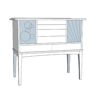
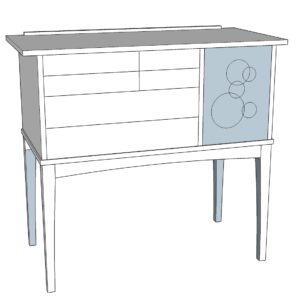
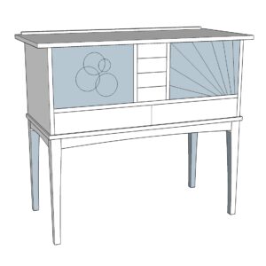




Replies
IMO, I like #1. But it depends on what you're going to keep in there. #2 looks like tool storage cabinet or desk to me. The drawers in #3 look too small for keeping a lot of stuff. There's another option you may have already considered: three doors but with drawers inside at least one.
It's funny that you say 2 isn't interesting. I think it's the most interesting of all, to my eye!
(Tangent, and I dunno if you know this already but hide glue (from chips not a bottle) is wonderful for veneering. Much better than modern glues because you don't need to clamp/vacuum it. The glue pulls tighter as it dries. I like using the bed of my 3D printer to heat it).
That's interesting. I've been using a homemade vacuum bag and PVA glue and it's working out. Appreciate the advice!
I just need to point out the spectrum going on here... you're using the bed of a 3d printer to heat hide glue. Slow clap begins...
I like #1. I'd do the circles on both doors.
I like 2. I'd change the drawers slightly to make them graduated a little from top to bottom.
You should do some full size mock ups. Get some cardboard (or other suitable material) and start cutting. Make some different variations and see what you like, and what fits with the room and decor. You might also play with the doors and drawers interacting with angles or stepped sides. Play with the mock-up until you are happy.
That's a great technique. I love me a cardboard mock up
Great post!
I like all, but for 2 would keep the top drawers symmetrical.
1 is probably my favourite shape, but 3 works better with the sunburst design.
What is going to be in the drawers though? Just make sure they are going to be of a suitable size to contain what needs to be in them.
I think first has most potential as a design. It has the most coherence. Another suggested repeating the circular motif on right side - and this is a great idea...the original is distracting. The drawer heights in upper middle I would probably resize slightly...instead of 2 of same height, then 2 of same height...maybe bottom largest, next up slightly less, then maybe 2 of same. That said, each version looks like a "chest set on top of a coffee table" - the "top" of the base interrupting the design in my eye. Not a fan of that.
I'd be interested to see your SketchUp file of these pieces and possibly have a play.
I like the overall proportions of #2 and #3 --less so #1 as, I agree the case seems big. One other observation about #3 is that the doors, as drawn, are wider than they are tall. Sort of like traditional doors turned on their sides. This is not a problem visually...but, having made a few of these, I would caution that this style can be difficult to mount. Particularly using mortised hinges. The wider/shorter dimension of the door will accentuate anything other than a perfectly true "swing." Put another way: if after you've glued up the case and fitted the door (the reveals are perfect), they might look great when the doors are closed but when open --one end might swing a little high or low. On a door that is narrower than tall, not only are the hinge pivots farther apart, but the swing of the door's outside edge is shorter...so the effect isn't as noticeable. Offset knife hinges are particularly tricky on this as they typically get cut into the case frame before glue-up.
Ok, how about #1 without the lower two drawers?
Thought about that too...Mmm
Jim Toplin and his writing partner (whose name escapes me at the moment) have written a fair bit about whole number ratios as part of good design. They have a website called byhandandeye.com. I'd go look there to see if that helps. I also know that the Shaker's to my eye had nice designs, often with mulitple drawers on pieces so that also might be helpful.
This forum post is now archived. Commenting has been disabled