My Contemporary Queene – Please critique
My goal is to make an interpretation of a classic period piece. I’ve marveled at many previous works in the magazine, which has served as inspiration. The piece I want to make is a Queene Anne Sideboard. I love a challenge!
So here goes.
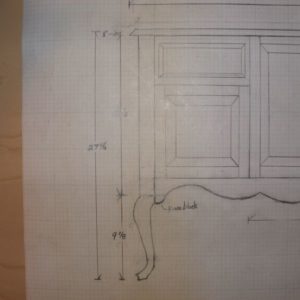
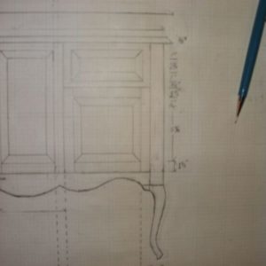
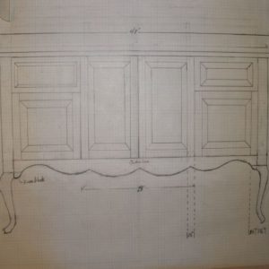
I have attached some rough sketches of my interpretation. I’m particularly concerned about proportions of the piece with respect to doors, drawers and overall size. I haven’t the means to make the cabriole legs but have some made by Ethan Allen that I would like to incorporate into the design. They are only 9 1/8″ tall so I envision a base construcion with the cabinet portion on top.
If you folks would have a look at my drawings and let me know your thoughts I would be most appreciative.
The intention of the piece is to house our A/V components in the center with media storage on each side and a Flat Panel TV on the wall above and behind. The overall dimensions are 27 5/8″H x 45″W, depth to be determined but seems to be about 18″. Each end will be raised panels with a flat panel back, unless otherwise advised.
Don’t hold back,
Bob @ Kidderville Acres
Kidderville, NH
A Woodworkers mind should be the sharpest tool in the shop!




Replies
Nice! My only suggestin is to make the raised panels on the right and left sides to be the same width.
Other than the fact that you are now alive, what makes this a contemporary piece?
sapwood, I'd say nothing.
KiddervilleAcres does state the following in the opening paragraph, "--- make an interpretation of a classic period piece. -----The piece I want to make is a Queene Anne Sideboard."
I'm not sure what point you are making. Perhaps you're suggesting a traditional looking item might look odd juxtaposed with contemporary A/V equipment, such as a flat panel TV?
You might be right, but I think the design and all the peripherals would need to be put into the context of the room setting to be sure. Slainte.
Richard Jones Furniture
Edited 7/15/2008 8:21 pm by SgianDubh
I was responding to the title he gave this discussion. Contemporary can mean a lot of things to different people. I certainly have my own definition that is, judging by prior discussed points on this forum, not shared by all. So, since I don't see anything obvious, I'm wondering what he means.
Thank you all for your contributions. After I had uploaded the drawings I realized that I'd goofed and have since revised the drawers. I'm still digesting Jeff's response and looking at it again, it does appear top heavy to me as well.
Again thanks and if you know others that could weigh in on this, I wuold be most welcome.
Bob @ Kidderville Acres
Kidderville, NH
A Woodworkers mind should be the sharpest tool in the shop!
In the Queen Anne pieces I have seen, when there are short feet as you propose, this is generally on a chest on frame or desk on frame construction. You were planning such a frame structurally, but haven't reflected it in the design. So make the base frame with legs, and then set the top on it so that it steps back a notch, being framed by moldings to make the transition between the rails of the frame and the sides and front of the the top.
Hi Steve,
Your suggestion is right on.
Ed had suggested a third leg and I was trying to figure out how to incorporate it. I was thinking about doing as you suggest, i.e. a chest on base arraingement and this would allow maintaining the same basic design as I have started with. I will make the change(s) tonight and post an update soon.
I also have to work on the apron and top, and now the base. I have posted Rev. 2 and I envision there will be additional Rev's as I proceed.
As this is the first real piece of furniture I have designed, I'm sure it will take many refinements to get it right. Everyone has been great with suggestions as is to be expected from visitors here on Knots.
Great group of people,
Bob @ Kidderville Acres
Kidderville, NH
A Woodworkers mind should be the sharpest tool in the shop!
I'd like to step back from the design details and consider function. The piece is 27" high. To access anything stored therein you will have to bend over or kneel. Is this acceptable?
IMO media and electronics should be accessible with minimal stooping, squatting or kneeling. A vertical form (highboy, secretary) will do this for you.
If it must be horizontal, consider getting closer to a sideboard form by using longer legs. I don't recall seeing any Queen Ann sideboards and don't know how to incorporate a visible middle leg on one. Steve's suggestion to hide it is good but this is not possible if the legs are longer. The Federal (Hepplewhite/Sheraton) period abounds with sideboards with 6 or 8 legs, as do later styles. I suppose you could put a steel plate behind the apron on your design to stiffen it.
Unless your room (or wife) dictates, there's no technical reason for the cabinet to be below the tv set. If you can separate the functions it will give you more design freedom.
Ed
Slainte/sapwood,
Slainte, thank you for your kind words.
sapwood, I suppose that my choice of words as a title to the thread should have been better composed B4 I posted. In retrospect I'm thinking that perhaps a more appropriate title might have been "Adapting Queene Anne Furniture to Contemporary Use or perhaps Modern Functionality", and as such I appreciate your contribution. I will choose more wisely in the future.
ALL: Quite simply, my wife and I want a of piece of furniture that will house our A/V equipment, not a massive "thing", AKA an Entertainment Center. We feel EC's (Entertainment Center,s) present a dominance that we don't like, as we've had several manufacturers interpretations of what one is supposed to be.
I have come up with what I'm calling Rev. 2 of my design for everyones review and critique. As I am pressed for vertical space in the cabinet portion, I've added a center-top drawer to house our Yamaha Cd player, and cut down the doors to accomodate it. Also modified and "slimmed" down the bevels on the raised panels and added some detail to the stiles & rails. I still need to work on the profile of the drawers and the top.
I have a somewhat clear vision of what we want, just takes time to morph it into the final product.
Please have at it with the attached.Bob @ Kidderville Acres
Kidderville, NH
A Woodworkers mind should be the sharpest tool in the shop!
Bob,<!----><!----><!---->
<!----> <!---->
Far be it from me to critique another man's drawings after considering my own, but since you've asked for help, I would make a suggestion.<!----><!---->
<!----> <!---->
Unless it is an effect of the camera angle, it seems to me that the edge lines of the doors below, when extended upward by eye, don't appear to be centered between the drawers. The stile between the drawers on the left side appear to be not the same width as the stile on the right side. I think that I would find a way to draw half of the piece and flip it so that the piece remained symmetrical in my drawing.
<!----> <!---->
Also, for symmetry, I think that I would make half a template of the skirt and flip it end-for-end when committing the design to the wood. The knee blocks should be the same size.
Hope this helps. You are doing good.
Monte
Monte,
I'm a clutz! I was trying to hurry with the mods for Rev. 2 and goofed it. I have since repaired the drawer/door alignment. Thanks for pointing it out.
Also, the whole bottom end of the piece is in the process of being reworked as per SteveSchoene's comments. I have also received several emails that have suggested some changes too. One suggests incorporation of cyma curves that I'm currently wrestling with. Found some examples from Highboys but, being somewhat less than a good artist it's taking some time to get it right.
Yes I will fold the shapes over to create the reverse or opposite sides; thanks for the suggestion. Sometimes I get so involved with the goal that I don't see the forest between here and there!
Now, back to the preverbial drawing board,
Bob @ Kidderville Acres
Kidderville, NH
A Woodworkers mind should be the sharpest tool in the shop!
You asked for it, But I won't be too rash. Do a little reading up on the Golden Section (the "magic" number of 1.618) It's not a well known design procedure but still a very old technique that works for getting ascetically pleasing proportions. Plug in some numbers and you will be amazed at the results.Work Safe, Count to 10 when your done for the day !!
Bruce S.
Bruce,
I used a ratio of 1.6:1. That yielded a height of 30" for a 48" wide top. The wife thought it would be too high for what we are trying to do. I managed to get it down to 27+ with much discussion surrounding the optimum viewing height for the flat panel display to be placed on the back wall behind the cabinet.
I googled the "Golden Section" and was quickly lost in the math. Tried to find a "WEB calculator", but no luck. I then basically sized the drawers/doors "by eye", then modified it as per suggestions posted here. As you can see, I have a ways to go. Don't waste any time with Rev. 2, it has too many errors. Haste makes waste on my part.
Thanks for your help. If you can explain the Golden Section in a manner that a mathless old fart can understand, please do.
Regards,
Bob @ Kidderville Acres
Kidderville, NH
A Woodworkers mind should be the sharpest tool in the shop!
Sounds like you were on the right track with the top. But the Section can be broken down into multipals. Example = Three or four sections (doors or drawers) on there sides for the width. Follow ?Work Safe, Count to 10 when your done for the day !!
Bruce S.
Bob,
As far as the golden mean is concerned, it is a good place to start. But many of the classical examples often cited as "proof" the old timers slavishly adhered to it are a matter of fitting the architsture into the rectangle, by ignoring moldings that project beyond the boundaries here, and including them there, to make the system work. Like that fellow Procrustes got everyone to fit into his bed. Maybe we should call it the Procrustean proportion. If your space, or usage require a deviation from the ideal, I wouldn't get too angst-ridden. (And don't allow yourself be biscuit ridden!) I once built a chippendale style tall chest for a client, who specified the dimensions. Way too tall and skinny. When I delivered it, it just covered an unused doorway at the end of a hall. In place, it looked great. Anywhere else, it would be an abomination.
As far as the criticisms of the piece being too top heavy for the queen anne style, I suggest that you check out a Philadelphia highboy, or the Dunlap chest-on-chests, or the desks and chest-on-chests from the Colchester CT area.
Regards,
Ray Pine
Hi Ray,
Another site that has a wealth of history: http://www.oldandsold.com/
I'm in search mode on the Internet. I'm finding a ton of sites, such as:
http://www.ejfm.com/. OK, enough of this, right?
Thanks for the leads,
Bob @ Kidderville Acres
Kidderville, NH
A Woodworkers mind should be the sharpest tool in the shop!
Bob,
Some have mentioned the potential your piece has with regard to sagging.
I find no such possibility in your drawing, at 48" wide, assuming you use good joints. In essence, this sideboard is torsion box construction- free from the problem of sagging, which would apply to a flat bookshelf, for example.
Good luck.Expert since 10 am.
jp,
I don't forsee any sagging issues either, at least I hope not! Certainly not the top, but as you stated as long as I maintain integrity with joining the pieces of the internal structure I should be OK. I'll double check everything to make sure.
The only suspect area that I can see might be the legs and their attachment to the case. I have since rethought how I will accomplish this and that is to extend the tops to be the outside stiles of the case all the way to the top of the case portion. Much like Randall O'Donnell did with his Curly Cherry Highboy base structure in FWW #117.
Hope I'm right and thanks,
Bob @ Kidderville Acres
Kidderville, NH
A Woodworkers mind should be the sharpest tool in the shop!
Hi Folks,
It's the PITA again! I responded to a current discussion and emailed dkellernc seeking inputs to this discussion. Here are his comments:
Bob - I looked (scanned) the thread you're referring to. It's fairlylengthy, so I didn't read it word for word. Feel free to post this to thethread, or leave it as a private communique.Some comments (and these are heavily prejudiced by my own opinions, so takewhat I say with a grain of salt - in the end YOU have to be satisfied withthe final result (OK, and maybe your wife)):1) I see quite a few "contemporary interpretations" of period pieces. Mostare downright abominable - typically by the major furniture manufacturersthat are trying to come up with the next big thing. Frankly, what makesthese pieces abominable is that they're trying to do a "in the style of" bygrafting individual style elements together onto a form that didn't exist,and the result is a Frankenstein's monster.2) Proportion for a period piece, particularly Queen Anne or Chippendale, isof prime importance. The golden rectangle is one such design que, but thereare others that are related to golden mean. For example, wall cabinets werevery commonly built in a 2:1 ratio of height to width, and the door of thecabinet echoes this proportion.3) Also key to a Queen Anne or Chippendale (American) piece is a sense ofthe vertical proportion. If the piece has legs that are short compared tothe height of the case, the whole piece can look squat and unattractive. Areally great reference for this sort of thing is the Fine Points ofFurniture: Early American and the New Fine Points of Furniture: EarlyAmerican by the Sacks. The Fine Points of Furniture (the original book) hasjust been reprinted and is cheap. The New Fine Points of Furniture is outof print (original publication date 1996) and is sought after and expensive.If you're at all interested in QA or Chippendale furniture, these books arean absolute must, because they give examples of pieces that are masterpiecesof proportion and some that are downright ugly, and the descriptions stateWHY they are successful or failures.4) Hardware is also important on a period piece. DON'T, for example, mixroccoco brasses with hand-turned wooden knobs, or florid roccoco brasseswith earlier, less complex queen Anne brasses. They clash badly.Regarding your design - There really isn't any such thing as "contemporary"Queen Anne, so there isn't any "wrong" way to go about it. However, mythought is that the legs in your drawing are far too short for the casedesign, and the ends of the legs should end in a pad foot that isconsiderably more extended than your drawing shows. Cabriole legs oncontemporary pieces often terminate badly. One reason is that a truncatedfoot like that can be made easily on automated equipment, and drasticallycuts down on the waste, which drastically cuts down on the cost.Don't glue up stock to make a cabriole leg unless you're going to paint thefinal piece. Glue lines on a cabriole leg are very much out of place, andthe contrast between the straight glue line and the cyma shape of thecabriole is really jarring.While it was more common than not to bevel the fronts of panels on QueenAnne pieces, you might consider reversing the panels so that the bevel is onthe inside and the front is flat. While unconventional, it will help tomake the front of the case "less busy". Simplicity and dominance of formover surface ornamentation and complexity were hallmarks of the period.Make your own cabriole legs. Even for a newbie, they're really easy. Infact, several other aspects of case construction are considerably moretroublesome (such as - do you pin the horizontally-grained sides to thevertically-grained legs, knowing that it will likely crack but be completelyauthentic, or use "modern" construction that allows the panels to float?)Hope this helps,
I've since made the legs and side panels. The legs are ~33" in length with ~17" for the post block thus making the whole piece ~33" tall.
View Image
That being said to maintain proportions it will have to be ~51" wide!
Regards,
Bob @ Kidderville Acres
A Woodworkers mind should be the sharpest tool in the shop!
Bob - Superb job on the legs. They are considerably more in keeping with "Queen Anne" than the legs you had in your drawing (I'm assuming those were the "Ethan Allen" ones that you referenced in your original post). I suspect that you've found out just how straightforward it is to make cabriole legs with pad feet. It might not seem like it from their appearance, but ball and claw feet aren't much more difficult - it's mostly following a step by step procedure.
There, is by the way, a precedent for "heavier" designs in the Chippendale periods. I'm not sure if I can find a photo of this piece on the web, but the rather famous Thomas Affleck high chests are in most of the books about this period in furniture, and they are quite stout in compared to the more graceful designs made in Newport. Nevertheless, they are considered masterpieces (and would sell for many millions of dollars if one was "discovered" and brought to auction).
Post Script - While I was searching for a picture of one of the Affleck high chests, I ran across this piece in the Philadelphia Museum of Art. It's British (Thomas Chippendale, no less), so it's really highly ornamented, but the proportions are similar to what you're making. So there is some historical precedent for the form of the case you're working on (though not for accomadation of a plasma television!).
http://www.philamuseum.org/collections/permanent/46844.html?mulR=26080
Here is an example of one of the "Philadelphia" high chests. The maker is unknown, but it's similar to the Thomas Affleck examples:
http://www.philamuseum.org/collections/permanent/59899.html?mulR=24760
Indeed! You hit the nail on the head with the Ethan Allen thang.
That Chippendale Chest of Drawers (first link) is just the ticket. Really like the proportions although mine may not be quite as long but the other dimensions are nearly identical to the one I'm building. Won't be nearly as ornate but it will be a start.
The link you provided will save me a bunch of head scratching. I was about to make a full size drawing, maybe on cardboard, to test the proportions. Just did some quick math and proportion wise I'm pretty much there.
By the way, the screen will be separate from the cabinet. The plan is to encase it into a picture frame of sorts. Now would ya happen to know where I could find one that's ~ 40"w x 23"h? We be stretchin the Golden Ration a bit on that but just a skosh.
Thanks for making my day with your comment on me legs. And guess what; they're all the same length too! :-)
Regards,
Bob @ Kidderville Acres
A Woodworkers mind should be the sharpest tool in the shop!
Edited 7/15/2008 10:29 am ET by KiddervilleAcres
You've pointed out something that challenges all of us that regularly make "period" cabriole legs - making 4 of them look consistent. That isn't necessarily an easy thing, partcularly when you consider that you typically don't want them identical (because they'd look factory-made), but you do want them to look like they belong on the same piece of furniture. Having a consistent process and working on all 4 of them in stages helps greatly in this regard - took me a long time to realize the wisdom of that advice.
One other comment, but I think you already know this - you always buy the electronic components before making an entertainment center (or at least ensure that you have a model selected and know the dimensions). Nothing's quite as disheartening to have spent 40-80 hours in the shop, bring home your shiny new TV, center speaker, or whatever, and find out that it's too big by 1", which is too much to shave off the inside of the case. That could be a serious bummer!
Well, I'm no period design expert, so I'm going on gut here. To me, the front aspect of the piece seems "heavy" for Queen Anne. Maybe it's the arrangement of the doors/drawers (my recollection is that the doors are usually at the ends, and drawers in the middle) or the size of the doors/drawers, or the width of the rails/styles. I'm not sure, but if it was me, I'd experiment a bit more with some different dimensions and arrangements for these parts. Also, your drawing is lacking a top rail. That itself may add to the "odd" (to my eye) look of the front elevation. It's nice, but I'd tweak it a bit more.
As for cabriole legs, you probably do have the means to make them if you want. I've made them with hand tools only, roughing out with a bow saw. (The first set I made years ago, before nice tools were so readily available by mail or net order, I made a bowsaw out of some scrap stock and a tree pruning blade. Ugly, but it worked!) That was on a demo project for a class I was teaching at the time. (I still have the piece, which has never been glued up, sitting in pieces in my shop 35 years later!). Clean up with a rasp, planes and chisels. More problematic than actually making the legs sometimes is finding stock that's suitable. It's hard to find 3''X3" cherry, for example.
Mike Hennessy
Pittsburgh, PA
Get those pieces out and put it together! :) :) :)
I have some 8/4 and 5/4 cherry that could be glued up to make the necessary 3x3; might take a stab at it. Anyway, I will apply some of the suggestions and redraw tonight. The reason for the two middle doors is I need the width to contain the components, i.e. Satellite Dish receiver, CD & DVD player,etc.
I could also remove the drawers at the top to make less top heavy, but would rather not. I'l experiment with making them smaller on the vertical dimension, maybe that would help.
I really appreciate everyones help with this,
Bob @ Kidderville Acres
Kidderville, NH
A Woodworkers mind should be the sharpest tool in the shop!
Hi Mike,
Thanks for your inputs. God knows that I'm no period furniture maker, this is my first attempt. I would like you to know that from the outset of this project I have never felt overwhelmed; challenged, absolutely. But, isn't that what it's all about?
I'm attempting to take a period furniture style and adapt it to, for lack of a better expression, current use. It may end up that it won't work. Therein lies the challenge for me. If it does work, the wife and I will be sooooo pleased!
My interpretation of Queene Anne furniture is that it has a subtle delicacy, perhaps not manly but functional with grand presentation. I guess I'm bginning to ramble a bit here.
I've looked at some more pieces on the WEB and will try to make the top less heavy as you suggested. My cherry stock is 5/4 rough and I can mill it. Any suggestions?
Regards,
Bob @ Kidderville Acres
Kidderville, NH
A Woodworkers mind should be the sharpest tool in the shop!
For Queen Anne forms, take a look at Queen Anne Furniture by N. Vandal and Furniture Treasury by W. Nutting.
The width (48") might require a third leg to avoid sagging.
The transition from leg to skirt (you label it knee block? can't quite read it) is tough to render in a small drawing. Draw it full size and try to get a pleasing transition.
Ed
Thanks Ed,
I'm not sure how I could incorporate a third leg into the design. Might you have some suggestions? I understand and appreciate your concerns and the thought has crossed my mind as well.
To that end I've rethought the design to make the legs for the piece such that the tops would extend all the way up the sides of the cabinet portion of the case, much like as was done by Larry Dern did with his Contemporary Queene Anne article in FWW #87. I'm thinking that with proper latteral support, a middle third leg would not be necessary.
I'm still in the design stage. If you have the time, please have a look at Rev_2 of my design. I haven't incorporated the above change yet, it will be inRev_3. I'm still absorbing all these great suggestions from everyone!
Best Regards,
Bob @ Kidderville Acres
Kidderville, NH
A Woodworkers mind should be the sharpest tool in the shop!
You can make the base frame quite beefy. Use 8/4 rails for example, cutting the curves with a little reverse bevel so they don't look heavy. You also might "hide" a leg in the center, well recessed from visibility. (I've seen a period bookcase that did exactly that thing.)
Bob
Another issue to consider is that the your piece seems to be out of proportion. It's top heavy. The upper box represents 76% of the overall height of the piece, making it seem top heavy. In this era, ESPECIALLY in this era, the golden rectangle of around 60% (approx.) was used almost without question. When I'm designing a piece, whether it is a copy of something else, or a new design of my own, I like to take the time to make a full sized drawing on mdf or large paper taped down, if I have it that large. It really helps to see the piece at full scale. If you draw it full size, you may tend to agree that it's out of proportion, before committing your expensive stock to the design.
Just my .02.
Jeff
Top heavy as Jeff mentioned and the raised panels look heavy. Make the bevels on the RP doors narrower and perhaps use thinner stock too.
You're close, but not quite there.
Bob:
You can make the cabriole legs on a band saw if you have one. Make a template so that all of the legs come out the same. You use the template twice to get the curves to lay out properly. Trace the template on the blank and then turn it knee-to-knee to the adjacent face and trace it again. It's helpful to either tape the pieces together after the first cut or else leave a little "bridge" that you can trim off after you cut the second side. They will need a bit of work with a rasp and sandpaper, but it's worth it.
Jim
Thanks Jim,
You know, I think I'll give it a go.
The more I research this piece the more I like some of the legs I've seen. Then again, some of the legs I've come across might not exactly look good on furniture, but they're still enjoyable to look at!
Well, it's off to the pattern farm!
Regards,
Bob @ Kidderville Acres
Kidderville, NH
A Woodworkers mind should be the sharpest tool in the shop!
Bob:
I know you're also concerned about how much a 48" shelf will sag and I came across a free online program called "The sagulator". Go to http://www.woodbin.com/calcs/sagulator.htm and you can input your data and see how much deflection you'll get.
Jim
Bob,
Below is one that I built and I could find no evidence of a Queen Anne sideboard ever having being made in all the books I have.
I think your original drawings, as has been stated, is a little top-heavy and I think you should beef-up the legs a little.
Cabriolet legs are not difficult. Glue up some poplar and make a model. You will probably find that you will do better than you think.
A quick google turned this up as the first link, but DO NOT make the feet like the first page. The center foot on the third page is more like you would want, IMO.
http://www.woodcraft.com/articles.aspx?articleid=421
pins
pins & ALL,
I guess you might call my piece a mongrel of sorts. Not wanting to show disrespect I should perhaps call it a hybrid. I have found several pieces that are called Queene Anne Sideboards, but they are really Lowboys. Marketing appeal to the masses?
Here's a site I have frequented often, as I'm sure many others have as well. Just thought I'd pass it along:
http://ah.bfn.org/a/virtual/us/winter/queen/index.html Winterthur
google "queene anne furniture" and it brings all kinds of interesting info. Much garbage and must sort through it, but it works for me.
Regards,
Bob @ Kidderville Acres
Kidderville, NH
A Woodworkers mind should be the sharpest tool in the shop!
Bob,You can make whatever you like and call it whatever you wish. But its either Queen Anne or it is not.And as to your comment 'I have found several pieces that are called Queene Anne Sideboards, but they are really Lowboys,' I sent you pix of a lowboy which is commonly called a 'dresser' and a pix of a 'sideboard/buffet,' and I sent you the link for the plans. They are basically the same except the sideboard/buffet is extended in width and the configuration of the doors/drawers is different.Now I have a lot of period furniture books and there is no evidence of sideboards or buffets from that period. Its easy to find stuff made in later periods that are 'interpretations' of what the makers thought a QA sideboard/buffet would have looked like but they are not period pieces.And your piece doesn't have to be either 'period' or 'QA.' Just make what you think you need and get on with it. If you like it and your wife likes it that's the end of the story.pins
pins,
You're right, it is an interpretation. My wife and I like the Queene Anne style of furniture. What we're trying to accomplish is to incorporate the QA style into our perception of a piece of funiture that will accomodate our needs.
I'm most appreciative of your help in contributing to that end. I'm trying to borrow QA design elements to construct that piece. I call it a "piece" as I don't have an accurate definition of what it actually is, yet. There may never be one.
Maybe I have bit off more than I can chew here, but I like an adventure. Maybe I'm wrong, but I'm still going to make the "piece", as I'm sure you already know.
Please don't take this as a negative response to your post, it's not meant that way. It's the first "piece" that, in my mind, vaguely resembles anything relating to period furniture, that I've ever designed.
Yes, I will get on with it. We (the ladywife and I) both like it and that's what is important.
Thank you for your insight,
Bob @ Kidderville Acres
Kidderville, NH
A Woodworkers mind should be the sharpest tool in the shop!
This forum post is now archived. Commenting has been disabled