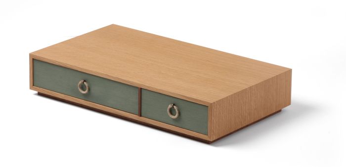
I didn’t like box 3, but I love box 4. So I’m happy this week. I’m especially happy with the proportions, as I think they fix my biggest complaint about last week’s box. Here’s a rundown of what I like about the box.
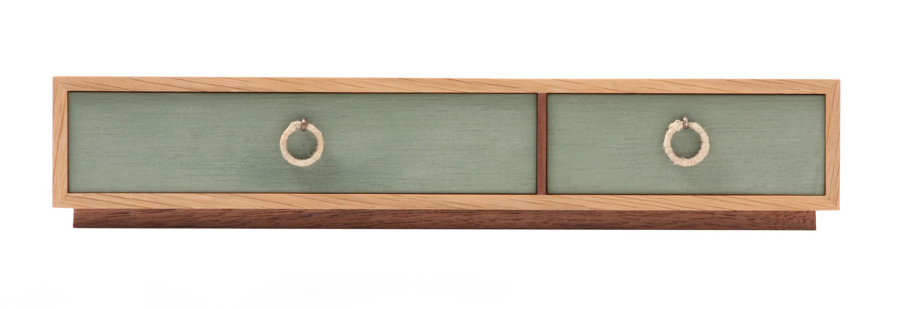
The walnut divider between the drawers. This was a risk, but I’m very happy with how it turned out.
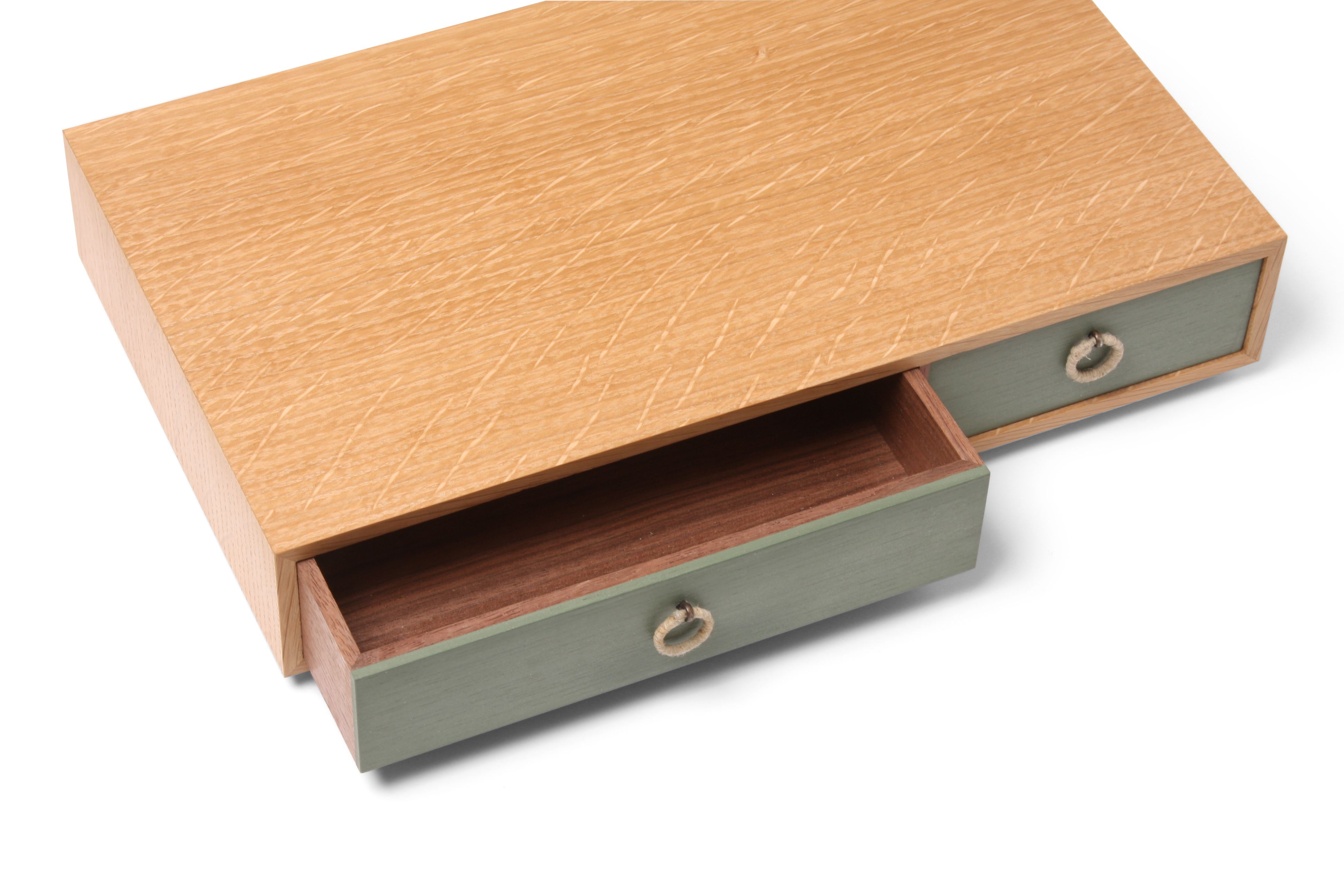
The Lexington green milk paint (mixed with a bit of snow white) looks great with the quartersawn white oak. By the way, white oak is growing on me each time I use it. I like it’s color the most. I could do without big ray flecks, though. I think the board I used for this box has great ray fleck and grain.
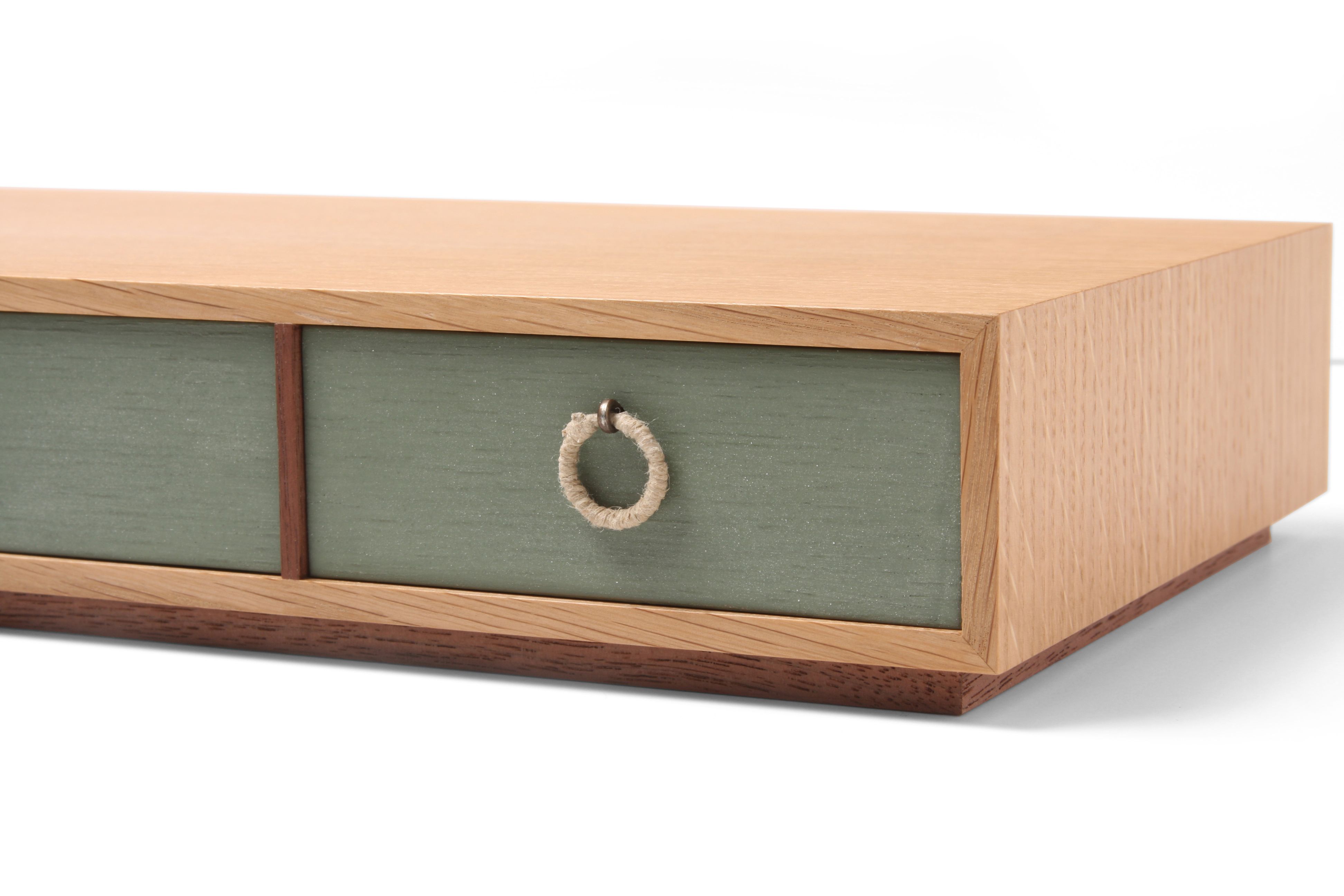
The pulls. These are awesome, and I owe some thanks to Mike Pekovich. I was going to wrap hemp twine around a larger hemp cord to make the round pulls. He suggested using some kind of metal ring. A small key ring fit the bill. And I had tied them to the drawer front originally, but he suggested a cotter pin and gave me the chemicals to blacken them.
The drawers are made from air-dried, and thus, unsteamed walnut. I love the color. This isn’t the first time I’ve used unsteamed walnut. I don’t think I’ll ever use steamed walnut again.
If I had to pick one thing that I didn’t like, it would be the lump on each pull where I tied off the hemp. Right now, I don’t know how to get around it, but I’ll look into the art of tying knots. Hopefully there is a solution out there.
If you’d like to read more about this box, check out my blog.









Comments
I am enjoying your series of boxes. To solve your knot issue, you might look at the procedure used to finish the wrap of twine on a fishing pole eyelet. The end is simply pulled under the final rows of wrap. You still have a small bump, but it would not be unsightly if placed on the backside of the pull.
Matt, This is a good box. Many things to like. I like the blackened cotter pins, AND the hemp. The grain on the top was a good selection. However, the angles of the grain on the front edge just kill it. Something as simple as edge-banding that edge with more Oak to fix it, or go with a piece of contrasting wood(Walnut). As for the bump. Hint: If you can't hide it, then accentuate it. Try sliding the bump toward the bottom to make it symetrical again. That alone may be enough. Or dye just the knot, thus accentuating it. Maybe try coffee/tea as a dye. Or just a plain ole Sharpie(but let it dry real good before letting it touch the drawer front). The miters are spot on, and the base was the right way to raise it up.
I hope you don't mind the criticisms.
I'm with Rupps Matt, that edge grain just grabs my eye, but still an excellent piece. Just my 2cents, don't get me wrong, if i made it i wouldn't trash it as its far too good for that.
Thanks for the comments, guys. I don't mind constructive criticism. Of course, I'm sure you'll understand if I don't pay it much mind! It's not grain that you're seeing. It's ray fleck, which is popping because of the photo's lighting. It's less apparent in person. And the alternatives you suggest would have, in my opinion, downsides greater than the so-called box-killing ray fleck. Sometimes, the solution is worse than the problem. (Although neither I nor anyone who has seen the box in person sees a problem.)
I keep reading the comments and then going back to the photo. What could possibly be wrong with the grain on the front edge? It looks like wood, very nice wood. It's not all 90 & 180 degree angles. Yeah, it doesn't look like it was stamped out of an imitation wood texturizer. Isn't that a good thing? It's kind of like tofu vs. beef. Tofu has very consistent texture but . . .
I like the 1,2,3,5 ratios that appear in the design.
Log in or create an account to post a comment.
Sign up Log in