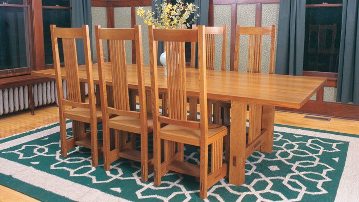
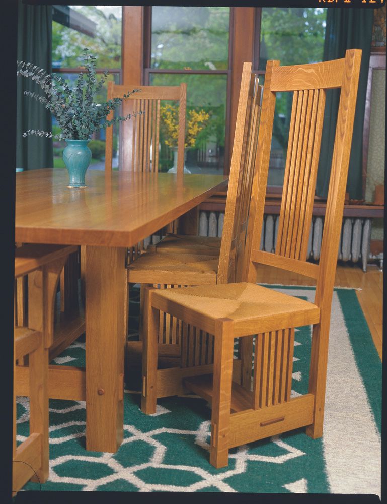
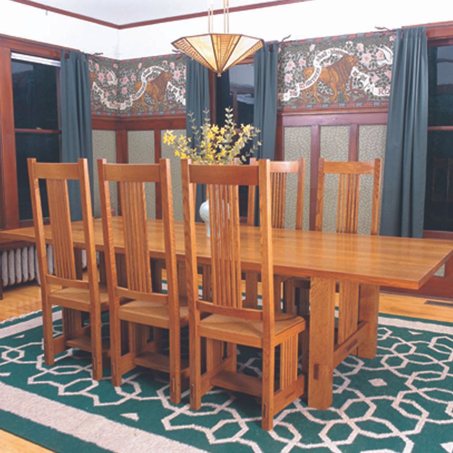
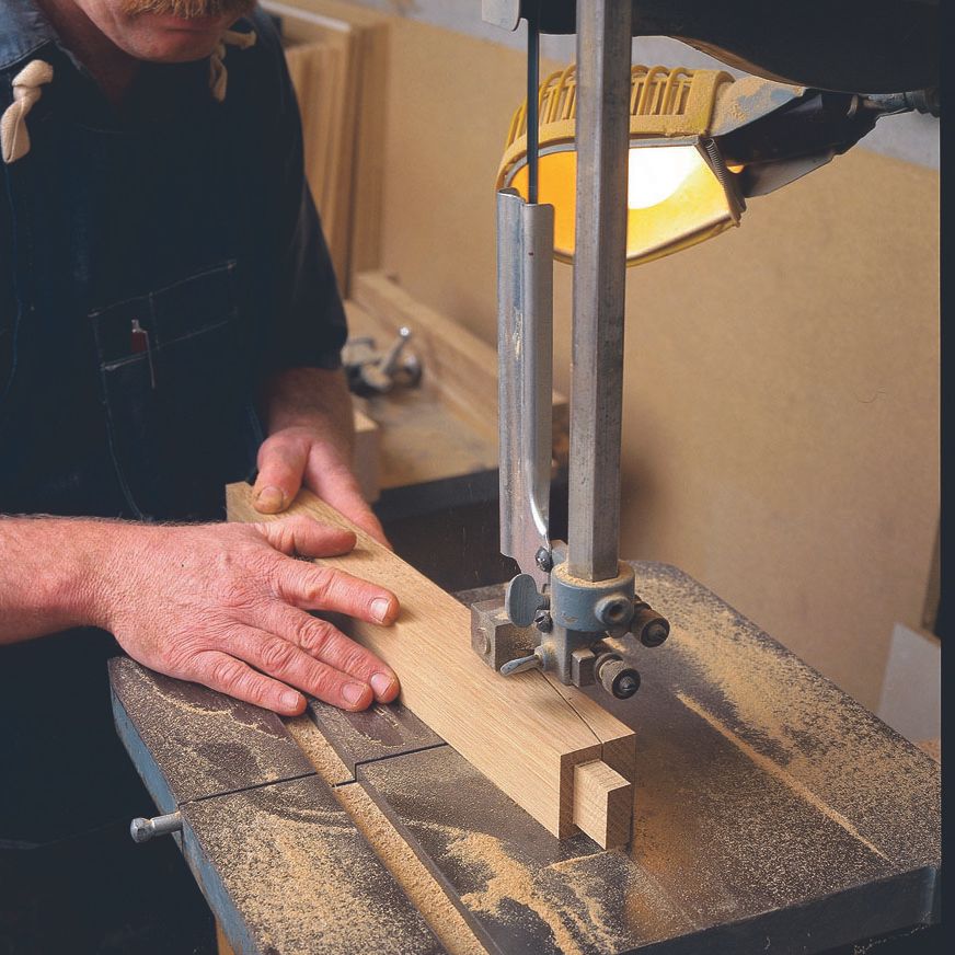
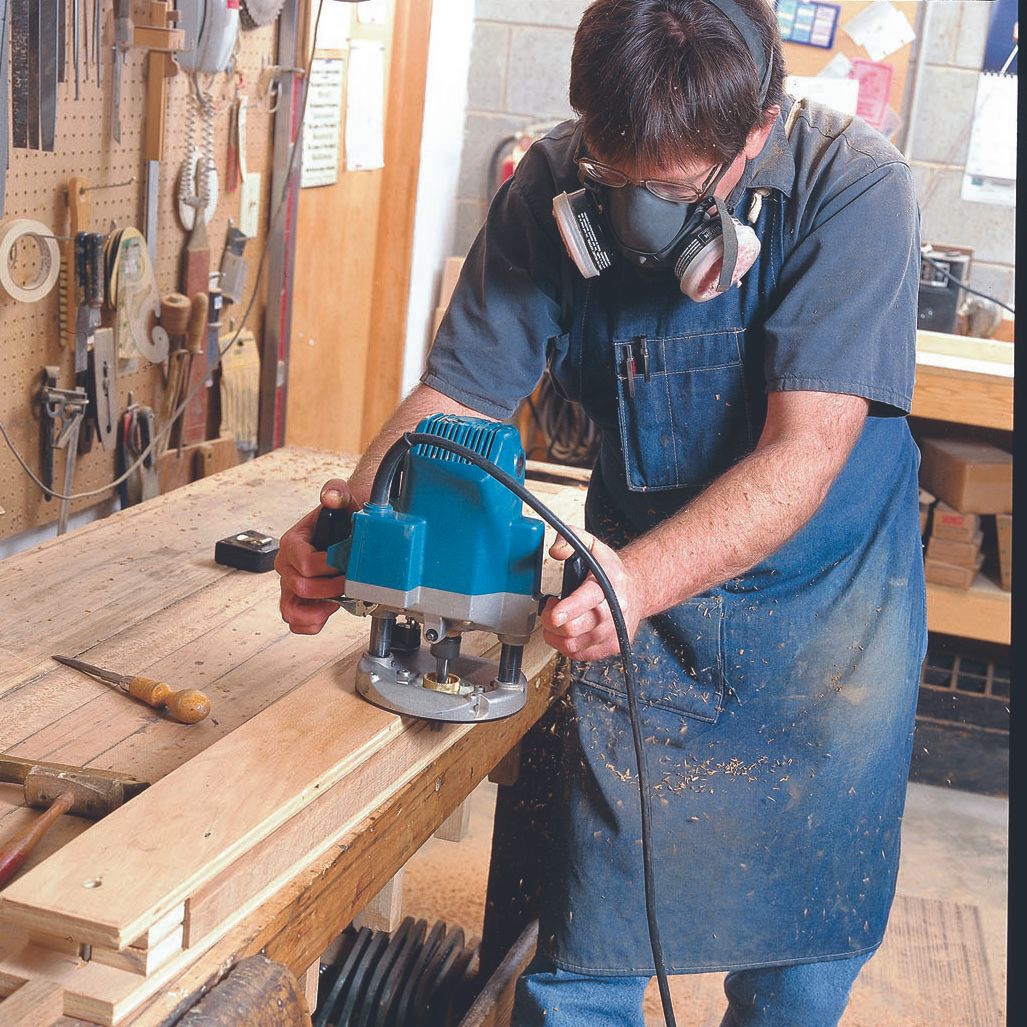
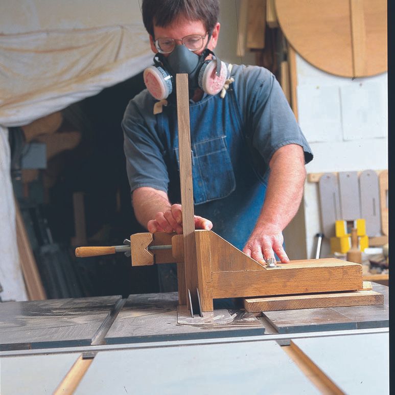
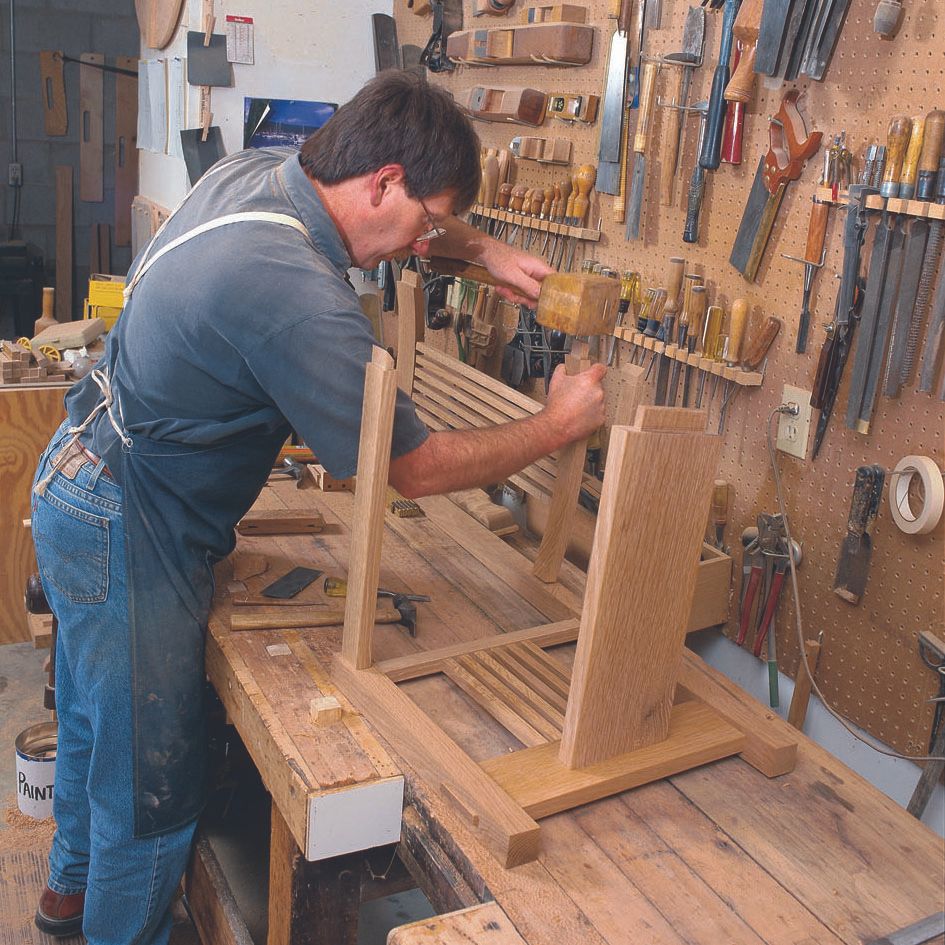
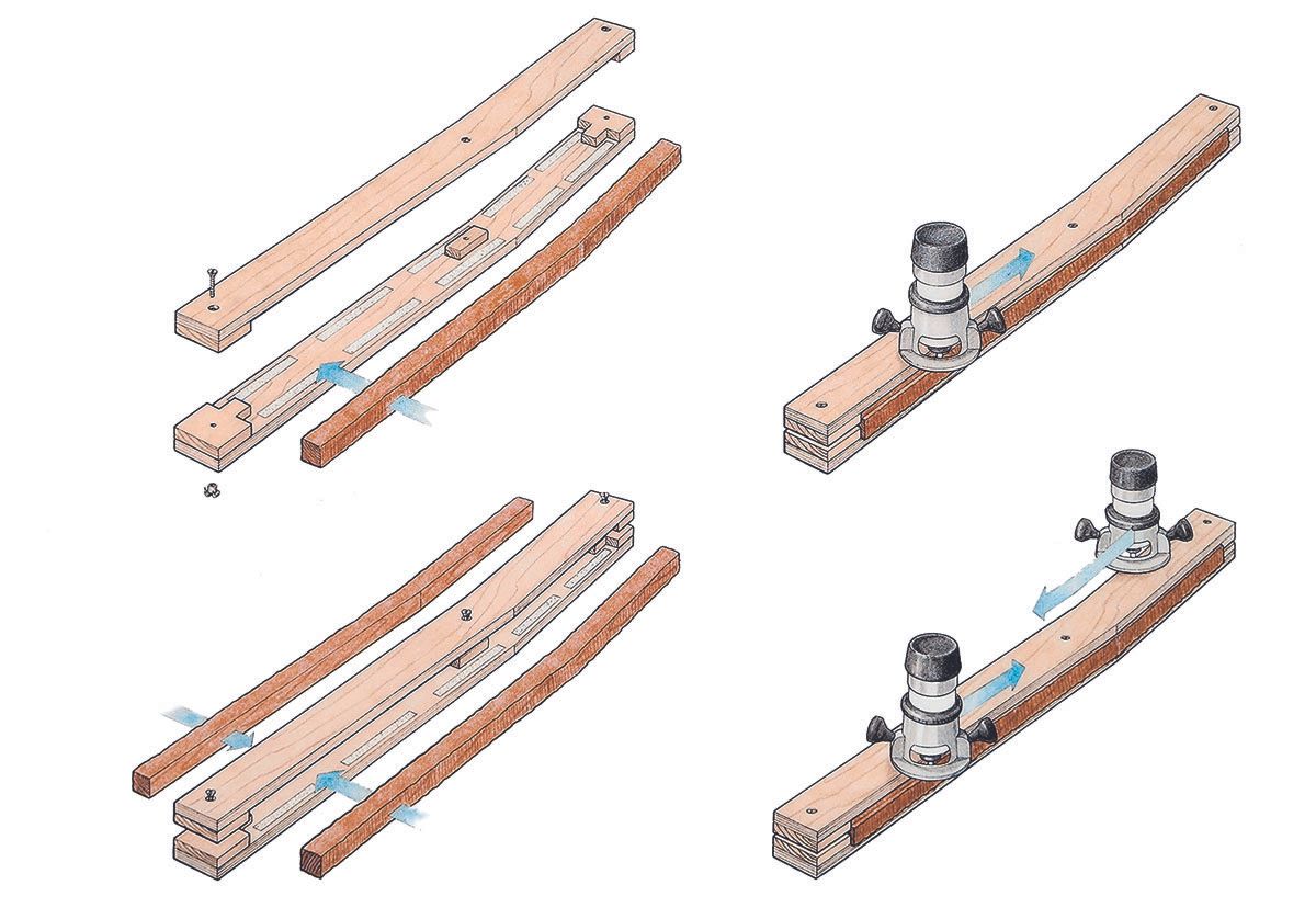
Inspired by the Arts & Crafts movement, Rex Alexander built this set of dining chairs with rush seats and vertical slats on both the sides and back. Detailed project plans clarify all 35 parts. Alexander has a very smart approach to construction, moving from building the prototype to milling the parts, and cutting the joinery. He uses jigs to ensure consistency and precision. He also tells how to fine-tune and dry-fit the parts and how he finished the chairs with Sam Maloof’s three-part finish. You can also learn how to weave the rush seat.
This set of chairs draws on the designs of some of the greats in the Arts & Crafts period, Greene & Greene, Rocroft, Stickley, and Wright.
CLICK HERE to download the free PDF article and woodworking plan for Alexander’s chair.





Comments
Maybe it's just me, but there's something really out of proportion with the lower side and horizontal stretchers. A little research brings back images of furniture from the Arts and Crafts period with much more delicate dimensions.
THERE IS AN ARTICLE WRITTEN BY GRAHAM BLACKBURN - JAN FEB 2004 OF FINE WOODWORKING THAT CONCERNS PROPORTION IN DESIGN. LOOK AT THE ARTICLE AND THEN APPLY THE GOLDEN RATION TO THIS DESIGN. SEE IF IT CONFIRMS YOUR SUSPICION THAT SOMETHING LOOKS "ODD". I AGREE WITH YOU.
DOC
I have to agree with Branham and Twobolt, I'm not liking this chair and its proportions.
It may be a subjective judgment, but I agree it's not an attractive chair. It doesn't look too comfy to me either. But I thought the plan and technique PDF was worth a look.
The comments about proportion are understandable but taken into account that the Frank Lloyd Wright Dining Chair (accssion # 1978.189)designed for Ward Winfield Willits has similar dimensions (55 3/4" X 17" X 18 1/2") I can see where Rex was coming from. That said, I doubt that Wright felt his furniture was intended to be comfortable or much more than an extension of his interior architecture. They were always secondary artifacts to the overall rhythm of interior spaces. Taken out of that context his dining chairs are design that happen to look like chairs.
By his own accounting FLW wasn't hiding his bias.
"Human use and comfort should not be taxed to pay dividends on any designer's idiosyncrasy."(Wright, The Natural House, 1954, page 44)
"All my life my legs have been banged up somewhere by the chairs I have designed." (Wright, The Natural House, pages 172-173)
His arrogance was legendary, his funriture usually pretty uncomfortable but he is still the benchmark for the style. Go figure.
Twobolt it ain't just you. The proportion of the lower side stretchers does make one curious as to how it was determined.
The design seems to suffer from a common ailment of many interpretations of a particular 'style', the urge to do 'more'. Restraint (usually enforced through the mechanism of budget) is highly desirable when attempting to work within an established style.
Given that not everyone likes the proportions of this chair, wouldn't it be nice if a sketchup drawing was included so individuals could customize the design to their own taste?
JVD, that's a great suggestion.
I would give pdf plans less than 3 years of "useful life" in the woodworking and fine homebuilding world. Sketchup is so easy to use, allowing you to adapt plans and add your own value.
Sketchup component libraries will become essential shop tools for many woodworkers, artisans and builders, and likely become essential to marketing of products like fasteners, drawer handles, hinges, commercial lumber, plywood, etc.
I hope that Taunton takes a leadership role in this area.
Classic Craftsman chair and tables. I built a modified version of these chairs and table - the client agreed that the chairs were a little out of proportion. This set has lower back and more angle They are quite comfortable. I'm working on putting these in Sketchup and will post them to their "warehouse" in the next couple of months.
https://www.finewoodworking.com/item/2344/stickley-dining-room-table-chairs
Schroeder
I've created a SketchUp model of the chair. You can download it from:
http://www.dendroica.com/SketchUpModels/rexAlexanderChair.skp
There's a discrepancy between the drawings and the photos: The drawings show the tops of the seat rails flush with the tops of the front legs, whereas the photos show them moved downward about 3/8". In the model, I followed the photos.
-Steve
Thanks Steve! - That's a big help - thanks for putting in all the detail as well...
Schroeder
i built one of these chairs from recycled douglas fir i got an old leather coat from the sally anns to upholster the seat it,s the best seat in the house now i need to make 5 more for the table also of recycled doug fir.
Log in or create an account to post a comment.
Sign up Log in