Symmetry in Design
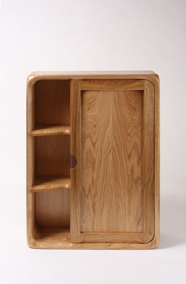
Vertical Option 2
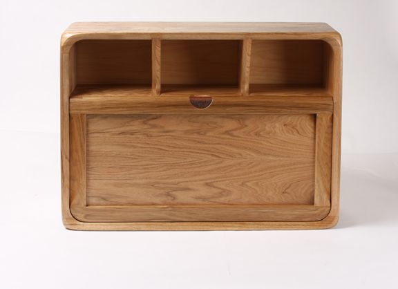
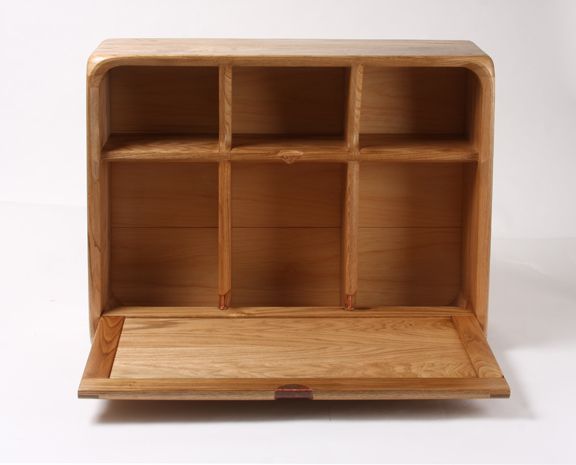
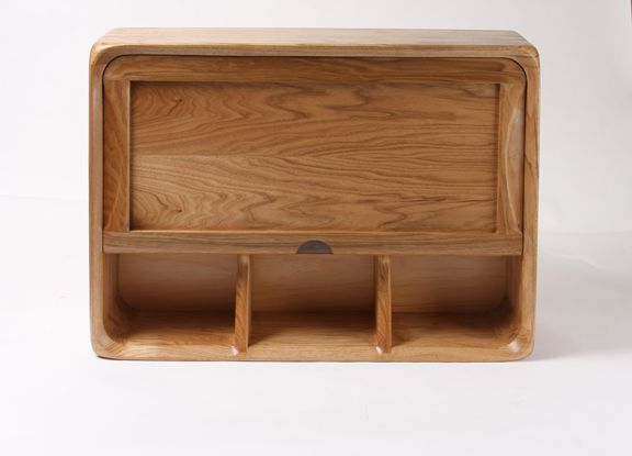
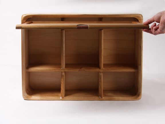
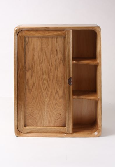
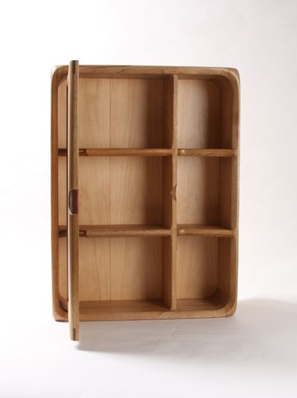
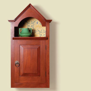
Recently, I finished a butternut wall cabinet and I was showing it to a few friends here at work. Kelly Dunton pointed out that if I had added a french cleat to the bottom of the cabinet, it could be flipped. Cool, I thought. Depending on where you wanted to hang it in your house, you could choose if you wanted the door to open to the left, or to the right. Mike Pekovich suggested it could be positioned horizontally. The drop-down door would offer a landing spot for an ipad, to be used at counter height. Or, flip it again and add a small overhead door stay to have the door open upwards.
This conversation really made me think about designing symmetrical pieces on purpose to allow for mounting options. What a great concept I thought. The piece becomes interactive. How fun would that be to deliver a piece to a client and let them decide how they want to hang it? Or, down the road, they want to move the cabinet to a different spot in the house and have the option of changing which way the door opens simply by flipping the cabinet around.






Log in or create an account to post a comment.
Sign up Log in