Three Takes on Mid-Century Chair Design
Philip Morley, Libby Schrum, and Kris Burns give their insights into how they designed a modern lounge chair, including the critical details they included and the personal details they added to the iconic Mid-Century style.
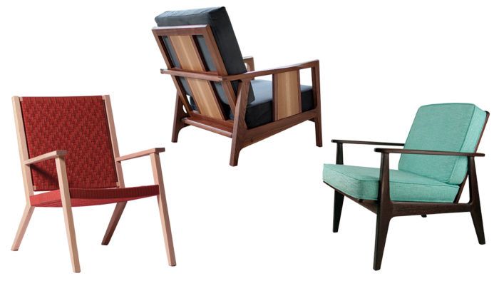
Synopsis: Three woodworkers give their insights into how they designed a modern lounge chair, including the critical details they included and the personal details they added to the iconic Mid-Century style.
The minimalist furniture movement of the 1940s and ’50s seems to have long ago moved from trend into the realm of enduring staple, particularly when it comes to seating. The style favors sleek silhouettes that are often low to the ground, unadorned, informal, and functional. These chairs have the strange ability to sit unobtrusively in a corner while at the same time reinventing and defining an entire space. What allows this form that is so rooted in one era to maintain its appeal and stay current? We asked three contemporary makers what went into designing and building their lounge chairs. Here, the makers, Kris Burns, Philip Morley, and Libby Schrum, highlight the critical details they included to add their own personal twist to the iconic Mid-Century style.
Kris Burns
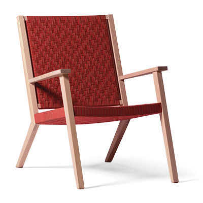
This chair, with its clean lines and simple form, is clearly influenced by the Shaker aesthetic. Having designed both a dining chair and an armchair with Shaker tape, I set out to build a low, modern armchair that blends the function of Shaker tape with the Mid-Century form of the lounge chair.
To begin, using a chair-fitting jig, I played with the angles and the height of the seat and backrest until I found it comfortable. The aim was that the chair not be too upright or too laid back. Once I had the fit nailed down, I made a mock-up out of scrap pine with pocket screws for joinery and ratchet straps to mimic the weave of Shaker tape. This gave me an idea of how the chair would feel.
For the finished chair, I chose riftsawn ash for a quiet appearance that would not compete with the colorful Shaker tape. I wanted a minimal design with a theme of parallel lines. The front leg and back rest make parallel lines, as do the armrest and seat plane, and so does the weaving pattern.
I didn’t want the Shaker tape to wrap around the back posts, so I added two vertical members inside the posts to give the tape something to wrap around. This created a nice negative space between the back rest and posts. The absence of stretchers below the seat enhanced the clean look. I added corner blocks, hidden by the Shaker tape, to beef up the floating tenons used in the seat rails and legs.
Libby Schrum
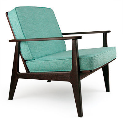
I had wanted to build an armchair for a while and when I set out to design this one, I was really into Mid-Century Modern design. I love wandering through vintage shops, taking pictures of forms I like and details that grab me. It’s fun to discover functional forms that I might not even think to design and figure out how the pieces are put together. The best designs don’t try to do too much. Clean, simple lines and ingenious little details that make you want to reach out and run your fingers over them are the hallmarks of that era. That is where I started with my armchair design.
The process began with sketching to get my ideas out. I mocked up a jig to test and adjust the seat angle and height, and the relationship between the seat and the arm. Once I found a set of angles and dimensions that were comfortable for different body types, I threw those lines into Illustrator and printed out a bunch of seats without frames. Eventually, I zeroed in on a design that I really liked and built a full-scale mockup. It sat well and looked good, so I built the chair and sent it off to the upholsterer. The mockup had used 4-in. foam, but with the added batting, the real thing looked and sat horribly. Switching to 3-in. foam solved the problem. I find there’s often a (sometimes expensive) learning curve when you’re trying something new.
Philip Morley
When I first set out to design this lounge chair, the client gave me free rein. Of course, this is always the best-case scenario for a furniture maker, and I love the feeling of full creative license. This particular chair is heavily grounded in Mid-Century Modern design, which I am typically drawn to because of its “less is more” aesthetic.
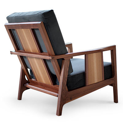
However, I feel the reason I am drawn to a lot of Mid-Century pieces is that although they look simple and don’t scream at you, they have a lot of subtle details.
In this chair, the overall scale of the piece, the tapering of the parts, and an armrest that protrudes from the arm definitely nod to Mid-Century design. But my hope is never just to copy an aesthetic but rather build upon it and add my own little touches.
To the Mid-Century bones I added little details like the sculptured joints where the side rails meet the legs, the “D” shape of the arm, a subtle, hand-shaped curve on the top of the arm, a subtle arch on the underside of the bottom front rail, and a number of others that put my distinct fingerprint on this period-inspired chair.
From Fine Woodworking #277
Fine Woodworking Recommended Products
Drafting Tools

Drafting Tools




Comments
It would have been great to have photos of the chairs from different angles.
Log in or create an account to post a comment.
Sign up Log in