On Designing Chairs
How to develop ideas in your head into working drawings.
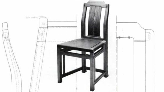
Chairs obsessed my teacher, the Swedish designer Carl Malmsten. Starting with his prize-winning piece in 1916, he designed dozens of successful chairs, mainly for production. By nature a perfectionist, he continually revised his manufactured models, periodically updating his drawings, until his death in 1972. “It’s not bad,” he’d say, “but it could perhaps be made even better.” His critiques of his students’ work were sharp, and his criteria for good chair design were pointed: (a) Is it strong and practical? (b) Does it look good? (c) Is it comfortable , not only at first but also during a long sit? (d) Is it economically feasible to make?
This article is Part I of a series. Designing seating for comfort is the subject of Part II. Part III covers aesthetic concerns—making the chair look right. But the first thing to talk about, here in Part I, is how best to use paper and pencil to draw chairs, exploring the basics of chair design.
Before considering anything carefully, I play around with chair ideas in side elevation. These are rarely more than guidelines, and I try to make them as outlandish and unpremeditated as possible. After a dozen or so of these, I choose one to develop further. Probably the final design will bear no resemblance to it, but it serves as a starting point.
From the chosen idea I work up a drawing in %0 scale, in millimeters. I find metric dimensions easier to convert to full scale. Two millimeters on the small sketch become 20 on the large drawing. On the paper I mark off seat height and depth, back angle, overall estimated height, and armrest height, if there are any armrests. I do the side elevation first. It is the most critical and will largely determine the appearance of the front and back. Into the limits marked out, I try to fit the most promising side view. This usually takes quite a bit of adjustment. Unless you are uncommonly sure of yourself, you need to erase a lot. I use a light-gray, plastic eraser, as it doesn’t smudge or abrade the paper the way pink or art-gum erasers do.
Translucent drafting paper is best for sketching. If you plan to have commercially processed copies made, you must use translucent paper. But it has another advantage: You can change the design without erasing the previous version. Simply tape a new piece of paper over the earlier version and trace it, changing as much of the design as you like. When you fold back the top sheet, you can make useful before-and-after comparisons. But even if the second version is better, don’t discard the first. Build up as many thicknesses of changed sketches as needed, saving them all. Often an element you drop at one stage will be just what you want later on.
It isn’t easy to reproduce complex curves in symmetrical pairs using standard flexible rules. A quick and accurate method is to use your translucent paper as if it were carbon paper. Lay a suitably sized piece over the curve and trace it using a 2B lead. Now turn the paper over and you have a mirror image. Position it on the drawing and trace heavily over it with your pencil. A light deposit of graphite will indicate the curve, and it can be drawn in darkly by hand.
Sometimes a preliminary drawing, of curved splats for example, turns out less than symmetrical for being drawn freehand. The halves are subtly different, like the halves of your face. Which looks better? To tell, hold a mirror along the centerline, mirroring first one half and then the other. The better version will usually be apparent. On paper, simply erase the less desirable half and use the copying method described above to transfer the better half.
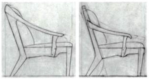
Having done a preliminary sketch to your satisfaction, tape a large piece of paper to a drafting board and enlarge it to full scale. I use discarded roll ends of newsprint, had for the asking at the local newspaper press room. Since it doesn’t cost anything (drafting paper is quite expensive) and because you’re not doing a final drawing, you won’t feel bad about consuming it. To enlarge, draw a vertical reference line alongside the side view and measure up from the floor line and over from the vertical to established points. This method is simpler and quicker than the standard grid method of enlargement. Probably, what looked great at %0 scale will need substantial revision in the blowup, so change whatever looks wrong, except the contour of the back, which is pretty much determined by human anatomy (which will be discussed in a later article). When the side view is satisfactory at full scale, reduce it back to %0 scale on drafting paper. Next to this drawing, transfer with the T-square dimensions needed for a front view. Work on this until it seems right, then enlarge it to full scale on newsprint and refine it. When you are done, simply tape a piece of translucent paper over the newsprint and make a final working drawing.
For many one-off pieces of furniture—tables, cabinets, and stands—you have the choice of making a full-scale working drawing or taking the particular planks of wood you will use and letting their size and figure shape the design. Of course, if the design is complex, a working drawing will eventually be necessary. Chairs are complex, and they must fit the human body, so working drawings are essential. Comfort can’t be left to chance; it must be carefully engineered. An advantage of full-scale drawings is that during construction you can take measurements directly from them, with ruler or tape measure.
Still, a drawing has limitations. It is impossible to see from a flat drawing how a solid element will appear in fact. Thicknesses, curves, and overhangs have an unpleasant habit of doing unpredictable things when seen in three dimensions. The width of a set-back table apron or of a chair’s front rail look fine on the drawing, but in the solid it disappears under the overhanging top or seat. It’s difficult to guess from a drawing how much will remain visible. So no matter how final the drawing, it should still be seen merely as a guideline. I always have a black-line copy made of my “final” drawing, and then I pencil in the alterations as construction proceeds. When I have completed the piece, my copy reflects all revisions. I transfer these changes to my original drawing, discard the copy, and have a new one made to keep on file for prospective clients and to enable me to duplicate the piece.
You can approximate the effects of perspective and of viewing at an angle if you stand the working drawing, mounted on the drafting board, vertically against a wall. It helps if you draw the piece close to the bottom of the paper and mount it close to the board’s bottom edge. You can look at the views from above or at an oblique angle or at a combination of both. This strategy assumes you have a board to draw on, not a fixed table. Use a piece of shop-grade birch plywood, 38 in. by 50 in. minimum. The 38-in. width will accommodate 36-in. drafting paper (which also comes in 42-in. and 48-in. widths). A 38-in. by 50-in. board is big enough for most chairs, though lounge chairs require a 48-in. by 60-in. board and wider paper.
Working drawings of chairs generally require three views, side, front and top, and they should be condensed and super imposed as much as is practical. Because the front view and the top view are symmetrical, I draw a vertical centerline to the left of the side view and show half of a front. Another centerline, drawn horizontally through the side view, either slightly above the seat or below it, locates the top view. It also is symmetrical, so only half of it need be drawn. The position of the halves depends on what’s least confusing. Some designers superimpose all three views, but the advantages are dubious. Erasures become a complex nightmare, and it is sometimes difficult to indicate clearly all the necessary information, because so many lines crisscross. I transfer dimensions from view to view with a T-square and triangle. Partially superimposing and drawing halves cuts down on drawing time without sacrificing clarity, and it results in smaller drawings that are much less clumsy to handle in the shop. To depict the back of a chair, one side of the vertical centerline shows a front half and the other a back half.
While thinking about appearance, you must keep construction in mind. Plan to make things easy for yourself. On curved pieces, leave at least one surface flat as a reference for layout and machining. To determine the minimum dimensions of a blank, draw rectangles around the curved piece, in side and top views. I leave flats on curves at points, for example, where rails or arms attach to legs. Butting one flat surface against another is easier than mating to a curved surface.
When designing arms for easy chairs or sofas, where a large curve can be pleasing, or when drawing curved legs, it is important to design with regard to available stock. If you chainsaw-mill your own lumber you can write your own ticket. But commercial wood in 12/4 planks is scarce. Bent laminations or steam-bent parts are more practical when their shape integrates two or more functions, such as combined front-leg/back-leg/armrests. An alternative to laminating, bending, or stacking, is splicing. Often a spliced joint can be a decorative feature. Sometimes you can find grain curved to match the shape you need, but most often pieces must be sawn from straight-grained planks. Because chairs take a real beating, areas of grain running across a curve should be avoided. Thus, curves can’t be too radical in solid stock.
Curves are most efficiently cut using a shaper jig. Jigging ensures exact repetition of dimensions and guarantees squareness. You can rely on the consistency of pieces through subsequent machining operations. I prefer not to settle on the final appearance of curved chair arms until after I’ve made a prototype of the whole chair. I hand-shape the arm at that point and transfer its shape to my drawing. Then I make jigs.
Some complicated shapes can be done only by hand, but drawing them facilitates repetitions. At appropriate intervals on the drawing, revolved sections, usually crosshatched, show the shape. Templates made from these revolved cross sections can be saved for the next run.
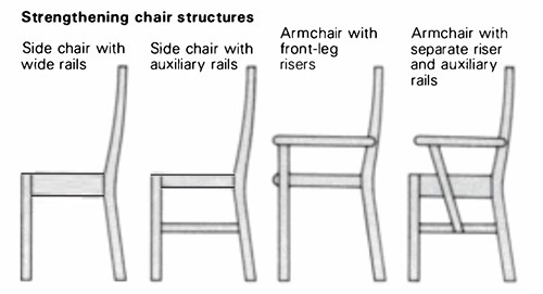
In the drawing stage, the strength of joints has to be kept in mind as well. Depending upon the relative strength of the wood used, dimensions will vary. Oak is stiff and strong, and furniture of oak could be made very slender. Pine, on the other hand, must be used lavishly.
Major weaknesses in chairs show up when the back is leaned upon heavily. People love to tilt back on a side chair’s rear legs after a good meal. This relaxes them at the chair’s expense. Auxiliary rails between front and back legs alleviate the strain. Though it is conceivable to build a side chair with seat rails wide enough to withstand the after-dinner tilt, I always suspect seat rails alone of being inadequate. Arms on chairs will provide the necessary bracing, but the method of attaching them to the rear legs should be carefully considered. Attaching directly to the front of the rear legs makes it likely that the joint will pull out. For maximum strength, an arm should attach from the side as well (see FWW #12, Sept. 1978, p. 42). When the front leg does not serve as a riser to anchor the arm in front, a separate riser can be attached to the seat rail and an auxiliary side rail added below the seat.
Make sure your design will go together properly by imagining an assembly sequence as you draw. For a conventional chair, front legs with connecting rails usually get glued up as a unit, and back legs with splats and rails form another unit. The next glue-up occurs when front and back assemblies get joined by the side rails. Arms often get glued on as a final step. In rare cases, however, it may be necessary to assemble the back only partially, depending upon the splat and top-rail construction. The most complicated chair to design and assemble is an armchair whose rear legs splay outward, at an angle to the seat rails. Knowing in what order a chair is to be assembled ensures that it can indeed be done.
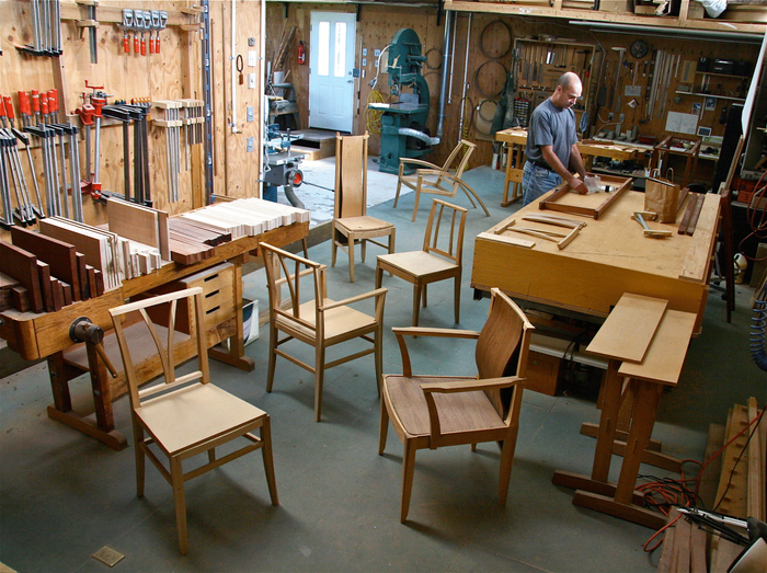
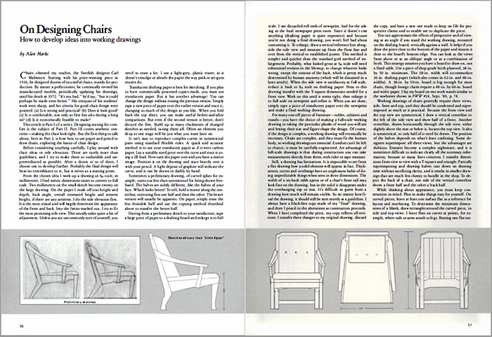 Alan Marks is a frequent contributor to this magazine. Photo and drawings by Alan Marks ©1977, 1980.
From Fine Woodworking #31
To view the entire article, please click the View PDF button below:
 |
Mockups Quicken the Chair Design Process |
 |
Reinventing a Classic Chair |
 |
Three Takes on Mid-Century Chair Design |
Fine Woodworking Recommended Products
Circle Guide

Drafting Tools
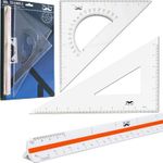
Drafting Tools




Log in or create an account to post a comment.
Sign up Log in