Altering the Colors of Dyes and Stains
Learn how to "read" the color of a dye or stain and you'll better control the color of your work.
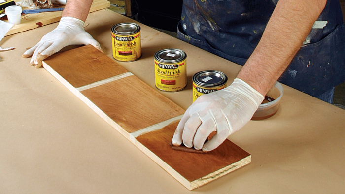
All colors are not created equal. How many times have you bought a stain or a dye and been surprised or unhappy with the results? Each manufacturer presents us with its version of a particular color, such as cherry, and the versions can be as different as night and day.
However, with a little knowledge of color theory and how to “read” colors in different ways, you’ll soon be controlling the color and not the other way around.
Learn to read a color
Before you can adjust the color of a dye or stain, you need to discover what its true color is by applying it on a white background. Oil-based colors can be tested on paper, but because water- or alcohol-based dyes are absorbed quickly by paper, they are best tested on plastic plates. Dab on a small amount of color, then drag some of it out into a thin line. Do the same with a color you think will blend well, and then with the two colors mixed together. When using any pigmented color, be sure to stir the can until all of the pigment is in suspension; otherwise, you will get an incorrect reading.
A color wheel helps dial in
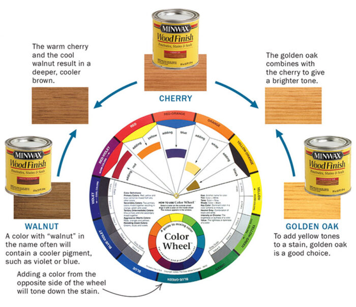
The colors on a color wheel are divided into categories: primary, secondary, and tertiary. Primary colors—red, yellow, and blue—combine to create secondary colors—green, violet, and orange. Tertiary colors combine one primary and one secondary color. Colors opposite each other on the wheel are complementary colors. Mixing a color with its complement neutralizes (reduces the intensity of) the color. For example, if a stain is too red, add small amounts of green and watch the red change to a cooler brown.
Using a color wheel, first identify the main color of a stain. Then select stains containing colors adjacent to or opposite the main color on the wheel. Use these
additional stains to mix the exact color
you want. For a quick preview, you can pick a color on the rim of the wheel and rotate the inner circle to see the results of adding different colors.
Test the color on sample boards
Once you have created a blend that looks good on a plate, it is time to test it on a sample board. Use a piece at least 4 in. wide and 6 in. long for each sample, and be sure to keep notes on what went into each color mix and how many coats you applied.
Alcohol- or water-based colors dry so quickly that you won’t have the wet finished look you get with an oil-based color. So add a couple coats of clear finish to develop the final look of the piece.
Adjusting dyes and stains
To help explain the process of adjusting color, I made a few sample boards, using a variety of cherry stains and dyes. The goal was not to produce four identical shades of cherry but to show how each original color can be changed.
Oil-based stain—very little reddish tone, or warmth, to it. For a deeper, warmer shade, I added to the cherry stain 25% of Minwax’s special walnut stain. If you want a brighter shade, add 25% of Minwax’s golden oak to the cherry stain.
Gel stain—In general, because of the density of their pigment-based color, gel stains are best used over wood that has been sealed already. However, in this case I wanted to emphasize the color, so I applied Bartley cherry stain to bare wood.
The stain had a pronounced purplish hue that I wanted to tone down. Bartley’s fruitwood gel stain is a greenish brown that resembles raw umber. I combined the cherry and fruitwood stains in a 50:50 mixture, which produced a pleasing, warm brown color. For a neutral, medium-brown color, I blended Bartley’s country maple stain, which resembles burnt sienna (orange-brown), with the cherry stain in a 50:50 mixture.
Water-based dye—For clarity of color, powdered dyes are the most versatile because you can mix them yourself, which allows you to control the concentration. When handling dye powders, make sure you wear a dust mask.
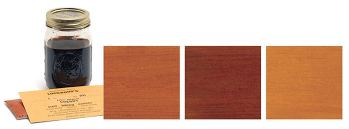
I selected the Lockwood early American cherry, which produced an orange-brown color. To create a deeper brown, I added a few drops of violet, the complementary color to orange.
Non-grain-raising stain—Non-grain-raising (NGR) stains, such as Solar-Lux, are a mixture of water-soluble dyes and solvents that don’t include water. They work well as a background color. Some start out unrealistically bright and in strong light fade faster than a campaign promise.
The Solar-Lux cherry is a warm, reddish brown. To bring out the red tones, I added about 25% of medium-red mahogany. If you want to neutralize a color but don’t have its complementary color, try adding black in very small quantities, say 2% or 3%.
Color, like food, is a subjective taste. The examples I have shown are a starting point. Don’t be afraid to experiment, and don’t get stuck using a color you don’t like.
More recipes for cherry
Bartley, Lockwood, and Solar-Lux each has a different idea of what the color cherry should look like. Using the techniques described, read the color to get a better idea of where it falls on the color wheel. Then, using the wheel, add complementary or adjacent colors to manipulate the original color until you are satisfied with the shade. It is safest to use stains or dyes from the same manufacturer in your recipe.
Bartley gel stain

Lockwood water-based dye
Solar-lux non-grain-raising stain
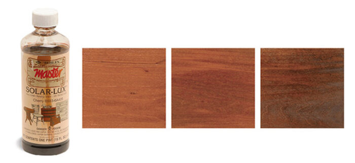
mahogany deepens the tone (center). If you don’t have the complementary color to neutralize red or orange, add black to produce a dark brown (right).
SOURCES OF SUPPLY
WATER-BASED DYES
866-293-8913
www.wdlockwood.com
BARTLEY’S GEL STAINS AND SOLAR-LUX NGR STAINS
800-645-9292
www.woodworker.com
MINWAX STAINS
Available at most home centers and hardware stores
Fine Woodworking Recommended Products

Bahco 6-Inch Card Scraper





Log in or create an account to post a comment.
Sign up Log in