Dining Table Shows Off Its Joinery
Exposed joinery, echoed shapes, and elegant curves are on display on this cherry table.
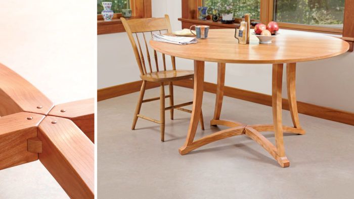
Synopsis: The stretchers on Tim Coleman’s dining table are low to the floor, so he decided to make their structure a focal point of the piece. Pretty much all the visible areas on the table are curved, which adds a bit of complication to the straightforward dowel and mortise-and-tenon joinery. The key was to preserve flat reference faces on all the parts before cutting the joints. The stretcher assembly adds an attractive detail with its four identical, curved pieces that each come to a point and are nested together at the center.
Well-executed joinery is at the heart of every piece of furniture I make, but it’s often hidden. However, when designing this cherry table, with its stretchers so low to the floor—and therefore quite visible—I made the stretchers’ central joinery a focal point by exposing it.
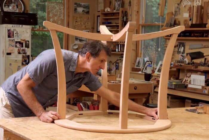
The overall lines of the table came first: the stretcher assembly rising from the floor in a gentle arc, the legs resting on the stretchers and thickening as they curve upward, fastening to a subtop that supports a round tabletop. Once I had that idea in focus, it was a matter of figuring out how to accomplish it. While the joinery is not exotic—dowels and mortise-and-tenons for the legs and a pinned bridle joint to connect the stretchers—the curved parts complicated matters. The key was to create flat reference surfaces for the joinery before cutting the curves. This simplified both the layout and cutting of the joints.
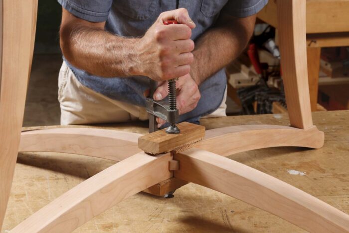 The stretcher assembly is made up of four identical pieces. Each one comes to a point so the four nest snugly together. At that joint, a single large slip tenon fits into a notch in each stretcher, and the assembly is glued and pinned. The rounded corners of the tenon are visible, making it appear to be a disk. This visible joinery is not only strong construction, but it is also an elegant design feature as the tenon echoes the circular shape of the tabletop.
To make the stretchers, I used several templates. One was to mark the angles on the ends of the blank before cutting them at the chopsaw. I used a second template to lay out the curves and the leg flats. I laid out the reference flats with a square. Later, I would use the flats to register the blank at the chopsaw and the bandsaw. To ensure the strongest stretchers—and legs—and to visually enhance the curves, the grain in the blanks should follow the curve of the templates as much as possible.




Comments
looks like a piece out of the barnsley playbook. beautiful.
I immediately fell in love with the stretcher detail when I received my copy of the magazine last week. It is a perfect cover shot and is by far one of the most elegant details I've ever seen. Simply gorgeous.
I really love this design as well. Has anyone created and templates for the stretchers that they might be willing to share?
To "user-6987257", those patterns should be pretty easy to layout full size on plywood or MDF. Or you could draw them in something like SketchUp and print them out full sized like I did here: https://flic.kr/p/25dXTcr
Log in or create an account to post a comment.
Sign up Log in