A Cabinet for Sheet Music


Get It All!
UNLIMITED Membership is like taking a master class in woodworking for less than $10 a month.
Start Your Free Trial
With its graceful curves, cabriole legs, and ornamental back splat, a Queen Anne side chair is a bucket list build for many woodworkers. Dan Faia had a very specific Queen…


UNLIMITED membership - Get access to it all
Start Free TrialBecome an UNLIMITED member and get it all: searchable online archive of every issue, how-to videos, Complete Illustrated Guide to Woodworking digital series, print magazine, e-newsletter, and more.
Get complete site access to video workshops, digital plans library, online archive, and more, plus the print magazine.
Already a member? Log in
We use cookies, pixels, script and other tracking technologies to analyze and improve our service, to improve and personalize content, and for advertising to you. We also share information about your use of our site with third-party social media, advertising and analytics partners. You can view our Privacy Policy here and our Terms of Use here.
Comments
Alan,
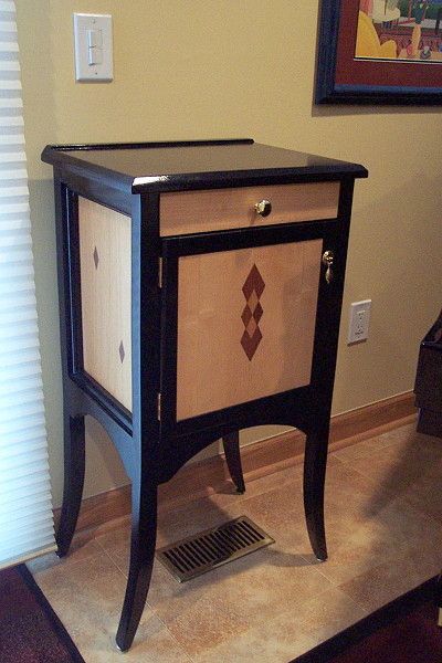
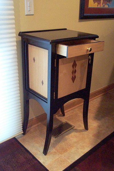
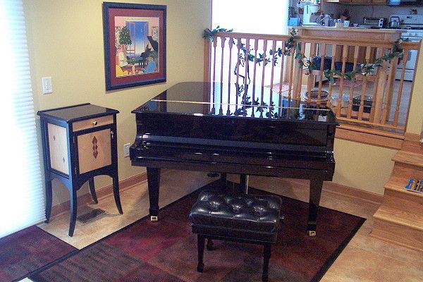
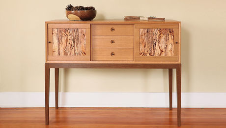
I like the overall proportion of this piece. The lights and the darks work well. It is "lite" on its feet and the bottom third is looks particularly good. The legs are very, very nice. The top seems a bit "heavy" and could have benefited from removal of some material on the underside. The width of the drawer seems off and doesn't compliment the door. I'm curious what your thoughts were upon finishing it. Overall, very nice - perhaps you could comment on the design a bit as the piece deserves some conversation.
Some personal observations on the items you bring up:
1. The top.
I think the overhang is a tad more than necessary.
2. I think the drawer width suffers in appearance because it is seen in conjunction with the door frame which disappears from the carcass frame. Different lighting highlights the door frame better and "reflects" a better and more accurate door/drawer proportion.
3. The inlays on the door could have been a tad lower.
4. The arches could have been cut at a smaller radius.
5. Legs- Well I think The legs cover if not a multitude at least a few sins :^)
6.Overall design features of light/dark-inlay design came from a piece the client saw on my webpage:
http://www.woodwardwoodworks.com/EmpireBookcase.html
She wanted that look. She also specified the size of the workings including 6 drawers with two inch spacing and a pencil drawer above. I didn't get a good finished shot of the interior. Here is a shot during construction showing the interior layout:
http://www.woodwardwoodworks.com/MUSICCABINET/DCP_7795.JPG
Interesting thoughts on the design. Often, for myself, I know where I didn't get the fit I wanted or where I messed up a little, but we seldom know where a design slipped a little. This is most often true on boldly designed pieces like this music stand. It's hard to get feedback. (I did look at the inside too - thanks)
I too think the legs make up for a lot. Interesting Empire piece. Turning all of the brass is a unique skill in woodworking. I grew up in Jackson, MI so I know there are lots of machinists around. I'd be willing to bet you were a machinist before a woodworker.
Anyway, interesting work. I've been reading a bit about design and recommend Krenov's books. I'm quite sure you would appreciate them given the nature of your work. I look forward to seeing other stuff from you and I think I'll recognize it when you post.
Log in or create an account to post a comment.
Sign up Log in