Splay leg tables
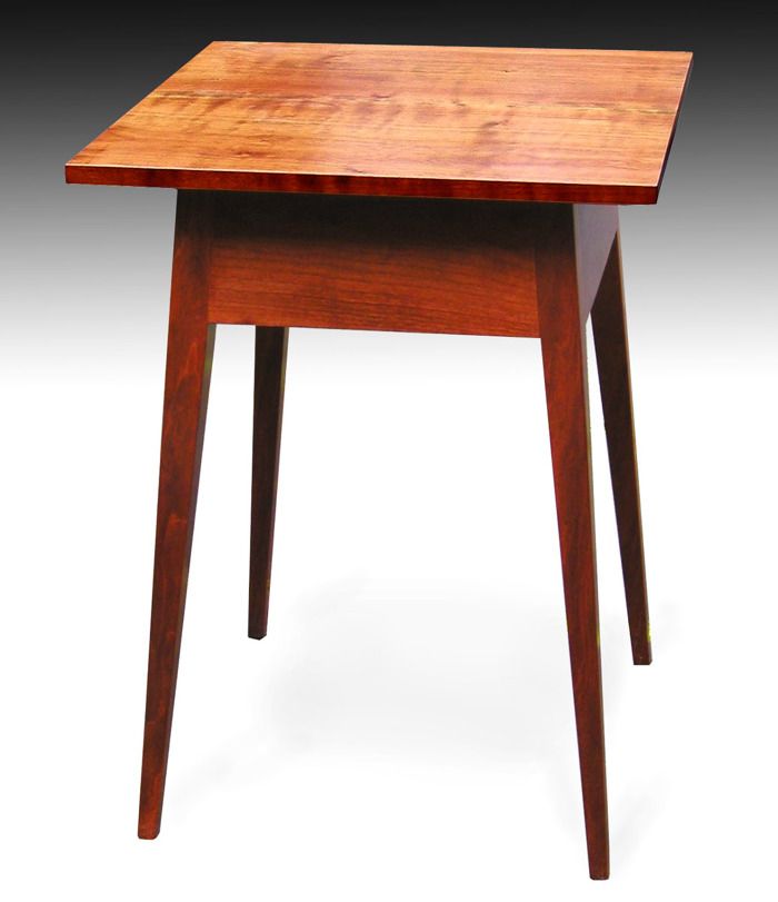
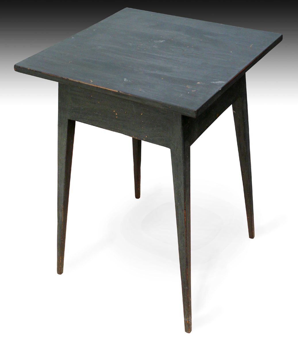
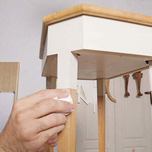
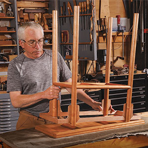
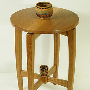
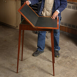
I saw one of these at an antiques fair with a price in the stratosphere, so I had to make one for myself. I made a test using poplar scraps, then a “real” one using cherry, which was then dyed and finished with hand rubbed oil and varnish. The test version was still around so I thought I’d try my hand at distressing. I’m not too crazy about that whole idea. Somehow, trying to make something well, then finishing it crudely on purpose and whacking at it with your car keys rubs me the wrong way. It also seems kind of fake. But there really is an art to doing it correctly. I wasn’t thrilled with my result, but now that it’s been around our house for a while it feels like it’s 100 years old.
I’ve been posting almost daily since March 31, but this is the last one for a while. Next project is a Shaker blanket chest.






Comments
Hi Chuck,
Beautiful work, just lovely; congrats on winning. Now that the dust is settled I wonder if you might comment on how you photograph your work--camera, lighting, backdrop, background elimination, and so forth. If you have described this elsewhere, please send me there by all means--I haven't read every post yet.
Thanks much.
Hi Pat,
Thanks very much. About the photos, some are taken with a digital camera (it doesn't matter what kind), and others were taken with a film camera. To put the latter online, I took the original print and scanned it. The whole process has basically two stages: 1) take the best photo you can and 2) use Photoshop Elements (about $60 at amazon.com) to replace the clutzy background (driveway, workshop, living room, etc.) with something that looks more like a photographer's studio. You can also use Photoshop to adjust the image's quality (light levels, color balance, color saturation, etc.), but you have to be careful not to go overboard with that. The goal isn't to improve on reality, but just to make sure the final image looks as good as the thing you're shooting. It's very common for your subject to look a lot better in real life than the image that comes straight from your camera.
In taking the picture, because I will use Photoshop Elements to create a soft shadow background, I try to take a soft shadow picture. I never use flash. Direct sunlight can be okay (it can make for a richer, livelier looking finish), but you should shoot from an angle that keeps the piece from casting hard shadows on itself. To me, bright overcast days or hazy clear days are good. One sunny day trick (see the candle sconce posted on April 15), is to place the object in the shade, but near the edge of a large shadow (perhaps cast by the roof line of a house). I then place a large piece of white mat board in the sunny area to reflect fill light on the piece in the shade. You can position the reflector in different ways to find the effect you like best. If you look at the candle sconce picture, you'll see that the wood has a nice warm, well-lighted character, but the shadow cast by the candlestick is very soft. If you have a hard-light picture of an object you can't re-shoot, don't give up. My oval divided tray (posted April 1) was shot in hard light. It still looks okay, and I'd be surprised if anyone thought, "Wait, what's that hard shadow doing there." The main photo of my sewing steps (posted April 6), was shot in hard light, but in a way that avoids shadows. The other sewing step photos were shot in soft light.
In shooting, you should also choose a good angle. Shooting something straight on can be dramatic, but it doesn’t create much sense of depth. So I always take a master shot at a three-quarter angle. Choosing the right focal length (zoom setting) can be important too. Wide angle can be dramatic, but it will create perspective distortion that you may or may not want. So I usually try various focal lengths to give myself options later on. A digital camera gives you that luxury. If your camera gives you zoom settings at equivalents of a 35mm film camera, a 50-55 mm zoom setting is about normal. Anything lower is wide angle, anything higher will be progressively telephoto. A lot of pros take portraits using a focal length in the 85-100 mm focal length. Whether or not this works for furniture is something you have to judge for yourself. It does tend to remove perspective that you might want.
As for Photoshop, it's too involved to explain all the details here, but here's the gist of it. I use the Polygonal Lasso tool and the Background Eraser to remove the background. I then adjust the image (again, within limits of reality) using Levels, Color Balance, Saturation adjustments. After that I open a new blank white background and then use the Move tool to put the original image on the blank background. I now have two layers that can be dealt with separately. On the background layer, I use the Gradient tool to create a rising, full-width shadow that reproduces the look of a studio's seamless background. I then use the brush tool (set for a soft edge and 1% opacity) to gradually build the appearance of soft shadows being cast by the object. This creates the sense that there's a surface beneath the object. I then go to the object’s layer and make additional corrections, if necessary. Then I flatten the image (making it one layer) and save it as a .jpg file.
There are several important tips and details left out of the above description. If you’ve never used Photoshop Elements, just get it, buy a book like “Photoshop Elements for Dummies” and start fooling around. You’ll pick it up pretty quickly. Just remember to make your image adjustments within reason. Some users overdo it, and it can make their pictures look tricked up.
Hope that helps.
Best regards,
Chuck
Hi Chuck,
Only 3+ years late, but big thanks for the detailed response! I left on a long walking journey just after writing you and then lost my account information--Mr. Competence here;-).
I wouldn't have guessed about the approach to backgrounds, which are a terminal distraction in most of my photos, that will be a real help.
P
Log in or create an account to post a comment.
Sign up Log in