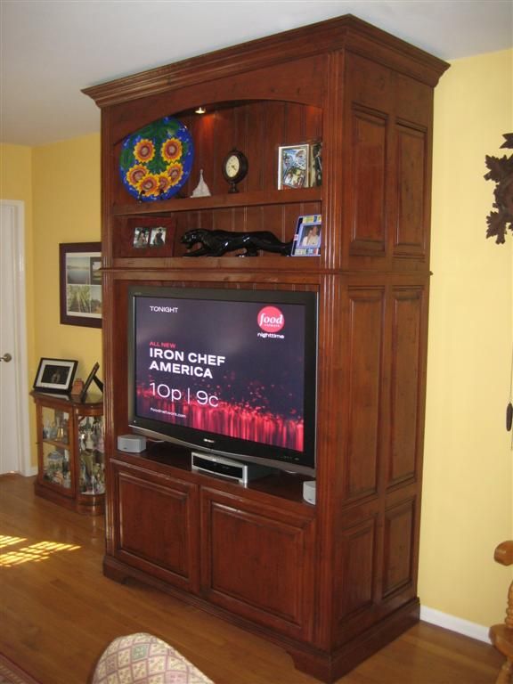
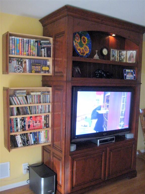
Not Your Father’s Entertainment Center, but it looks like it at first.

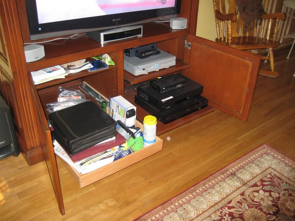
The cabinet is deep so the A/V equipment fits behind the doors.
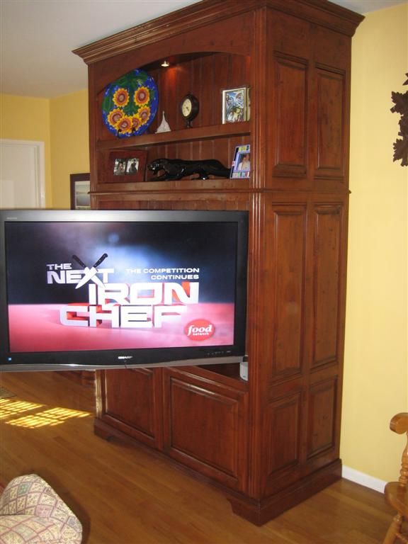
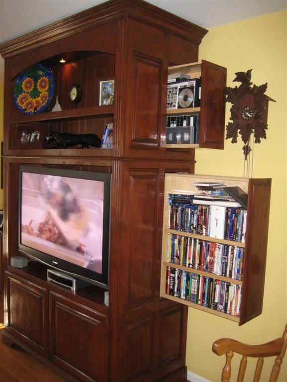
We had several criteria for designing this entertainment center. The first was that it had to look like an antique furniture piece so we picked a walnut color with distressing that included gouges, cracks and worm holes. Second, the TV needed to pivot so we could see it from the dining room. Third, it had to house and hide our audio/video equipment behind solid doors. Fourth, it needed an attractive display area for knick-knacks and finally, it had to house all of our CDs, DVDs and VHS tapes.







Comments
Great looking Entertainment center!!! I really like the pull out dvd units. Sweet Design.
Incredibly clever design. If imitation is the sincerest form of flattery, be prepared to be flattered.....this idea will be copied by several people. Thank you for posting.
I think this piece is very creative. It seems that you took what you needed it to do and created a piece of functional cart. Your solution to the storage was very clever. It's a nice clean looking piece but has style. WTG
Fine work, very creative
Awesome design and craftmanship.
You have unbelieveable talent! Like ohwoodeye said I'm sure this design will be copied by many people. Probably even furniture companies. Excellent workmanship!
Wow man, great job! I really like how the TV can swing out and still appear stable. I especially agree with the above posts on the DVD storage area. Very Well done!
This entertainment center is stunning. I've never seen anything quite like it! Another great job. I don't think you should be calling yourself an amateur any longer. WTG! Look forward to seeing more pieces from you in the future.
This is an incredible piece of furniture! This may or may not be appropriate but… would you have plans for this entertainment center? It would be appreciated.
Thanks
Log in or create an account to post a comment.
Sign up Log in